require(tidyverse)
require(scales)Tutorial 8: Line Charts
Today’s tutorial focuses on line charts. Line charts, as you should know from today’s lecture, are for showing change over time.
We also discuss how to add text and line segments onto a plot using the annotate() command, and we discuss ggplot theme options.
We review summarizing, use of factor variables, and making wide data long. We also work through an example of data cleaning to prepare a file to load.
A. Load packages
Let’s begin by loading packages. The only addition from what we’ve used before is scales, which helps put commas into numbers so they are legible, among other things.
B. Basic line graph and annotations
We are going to begin with a “simple” line graph. Below I give the example of a “simple” line graph that took a quite a bit of work to look so simple.
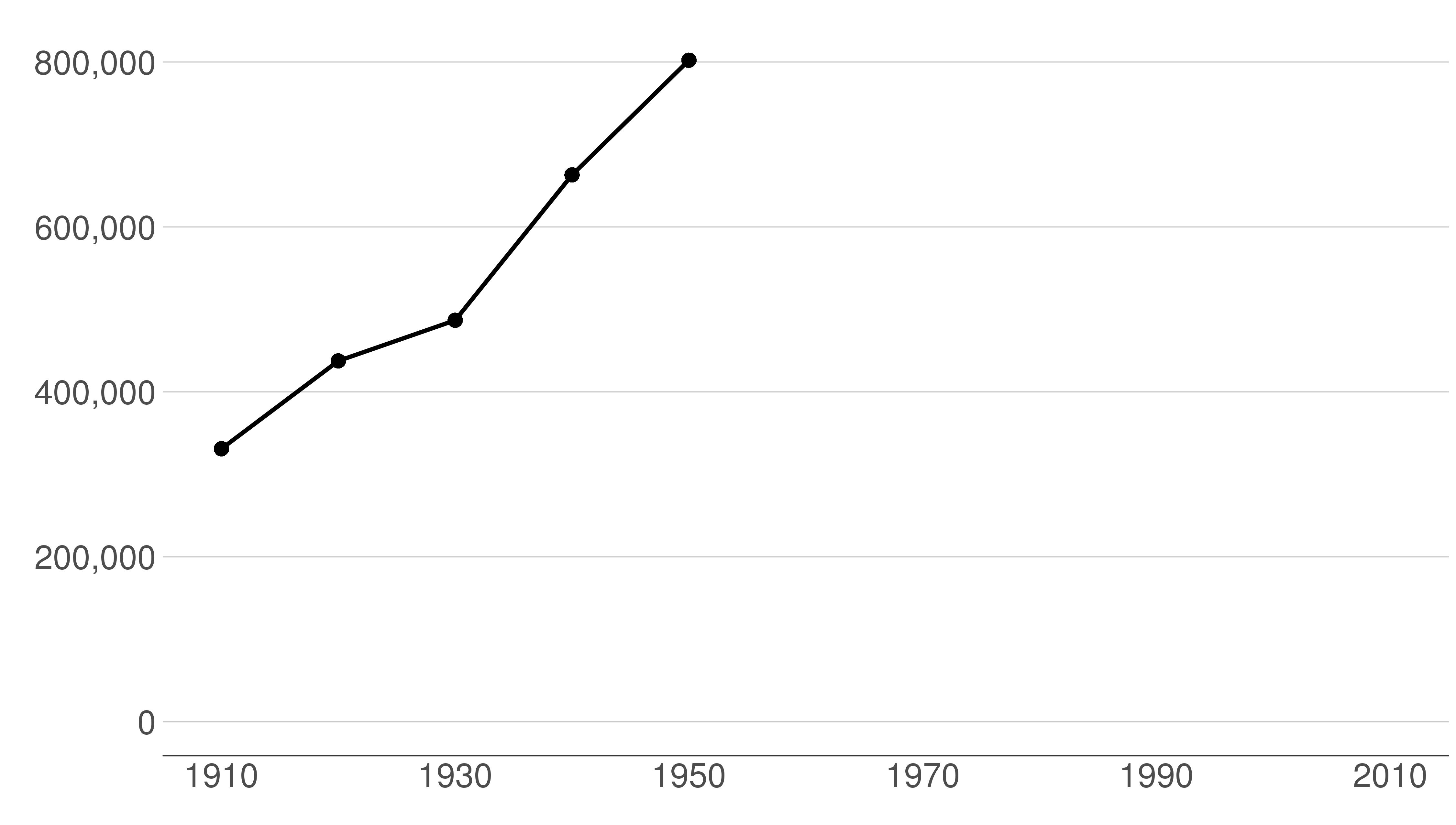
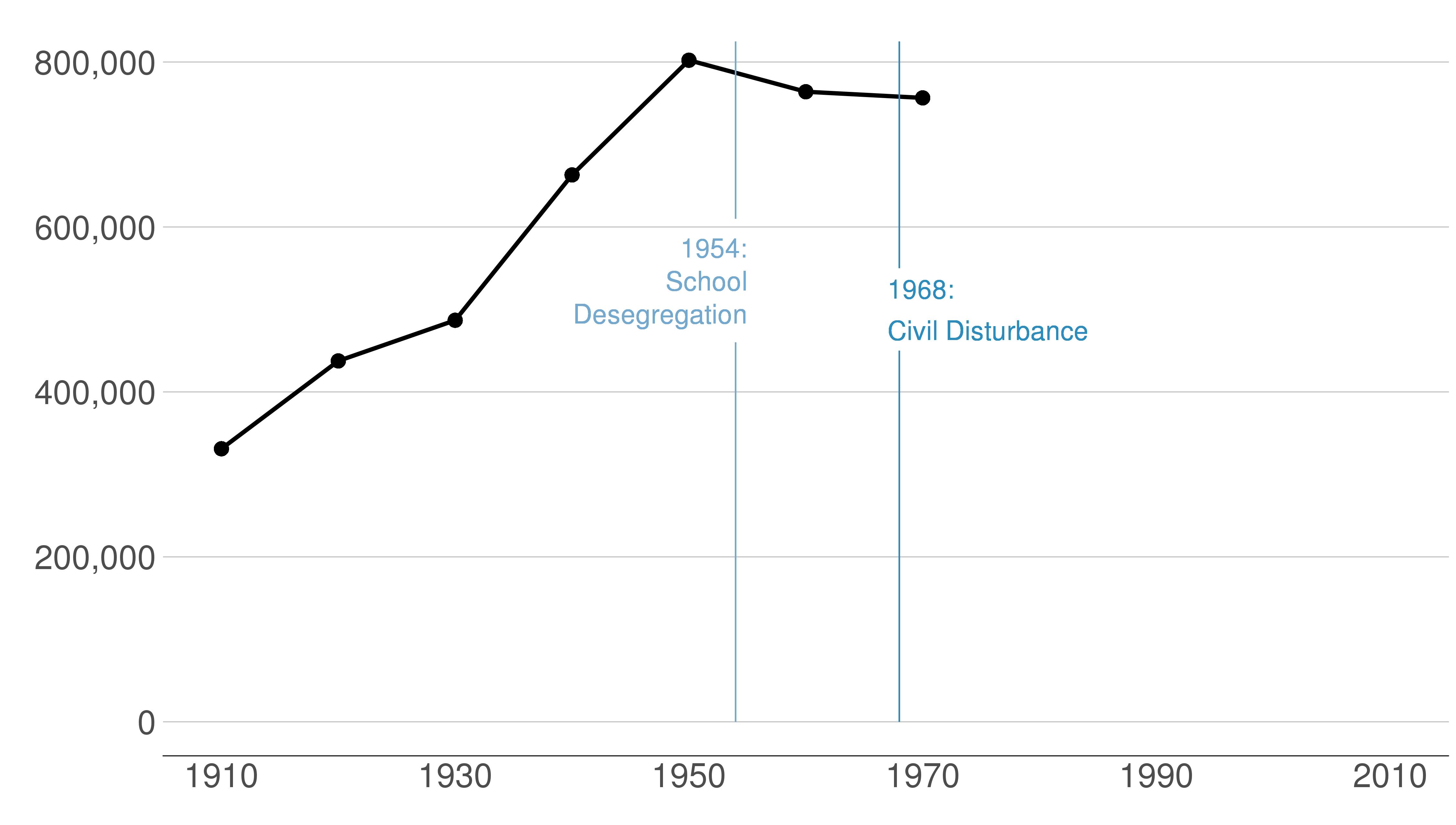
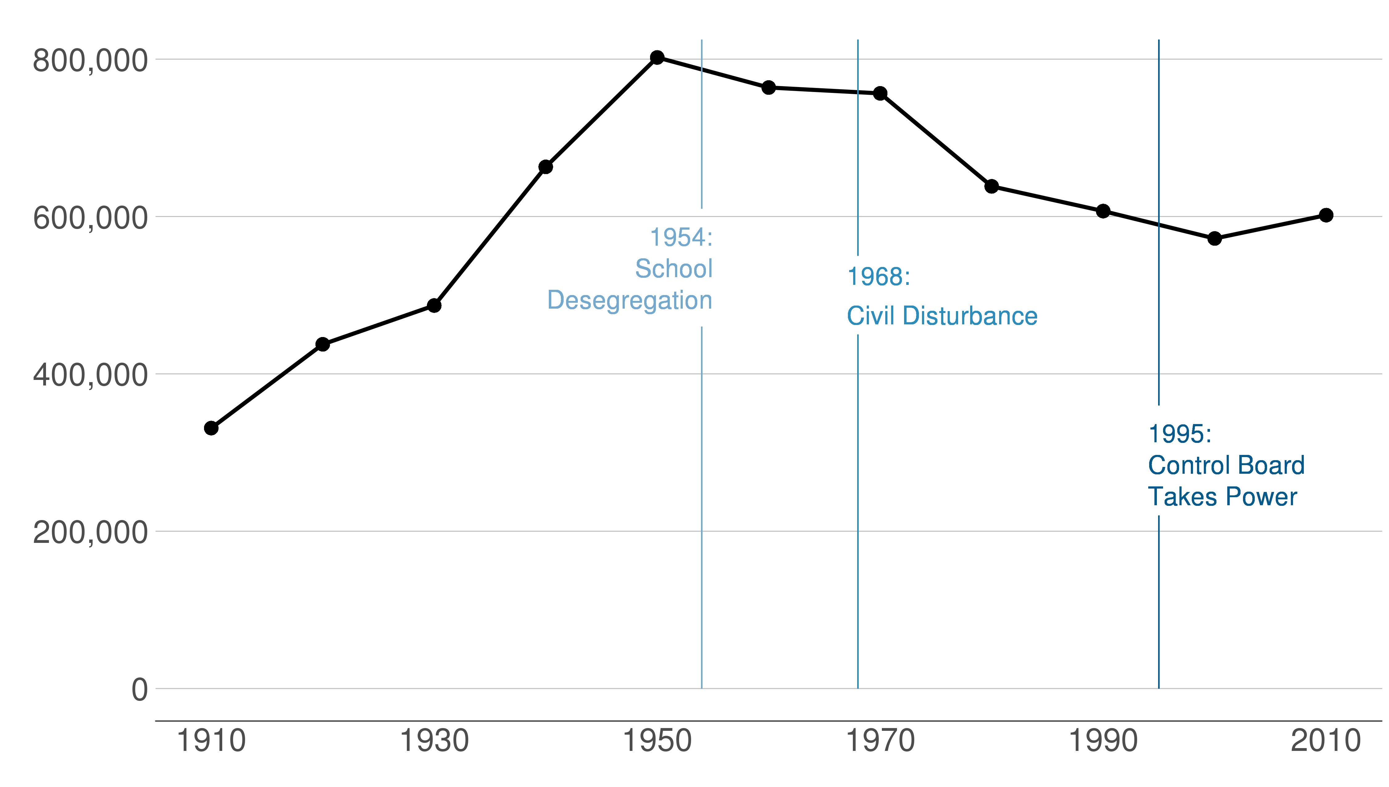
B.1. Look at the final product
Here are the sequential slides that I used in my presentation of this graph. I want the audience to know when DC’s population declined, when it rebounded and to have sense of the magnitude of the decline.
B.2 Load and prepare data
Now we’ll go through some code to build up to this chart.
Begin by downloading data from here. These are county-level data on population 1910 to 2010 (among other variables). I created these data for a research project from Decennial Census data.
Use read.csv to grab these data as we’ve done before.
# load data
counties <- read.csv("h:/pppa_data_viz/2019/tutorial_data/lecture08/counties_1910to2010_20180116.csv")
Now just limit the data to DC. You could do this in the ggplot call itself. However, in this case when we are only planning to use DC, this gives us a smaller dataset to work with and that speeds processing. This will also make the coding easier, since we won’t have to subset in each graph.
Take a look at the data after we subset to DC. Does it have the right number of observations?
# get just dc
dct <- counties[which(counties$statefips == 11),]
dim(dct)
[1] 11 68dct[,c("year","statefips","countyfips","cv1")] year statefips countyfips cv1
285 1910 11 1 331069
3244 1920 11 1 437571
6314 1930 11 1 486869
9418 1940 11 1 663091
12520 1950 11 1 802178
15626 1960 11 1 763956
18764 1970 11 1 756510
21899 1980 11 1 638333
25039 1990 11 1 606900
28182 2000 11 1 572059
31326 2010 11 1 601723We have only one state and one county in that state. We observe data from 1910 to 2010. This all looks good.
Alternatively, you can subset with filter() to get the same result
# get just dc
dct2 <- filter(.data = counties, statefips == 11)
dim(dct2)
[1] 11 68dct2 <- select(.data = dct2, c(year,statefips,countyfips,cv1))
dct2 year statefips countyfips cv1
1 1910 11 1 331069
2 1920 11 1 437571
3 1930 11 1 486869
4 1940 11 1 663091
5 1950 11 1 802178
6 1960 11 1 763956
7 1970 11 1 756510
8 1980 11 1 638333
9 1990 11 1 606900
10 2000 11 1 572059
11 2010 11 1 601723B.3. Make the simplest line graph
Now that you know many ggplot commands, it will not be a shock to hear that you make a line graph using geom_line(). As for all ggplot graphs, you should specify a dataframe and x and y variables. Below we make the simplest possible line graph.
b3 <- ggplot() +
  geom_line(data = dct,
            mapping = aes(x = year, y = cv1))
b3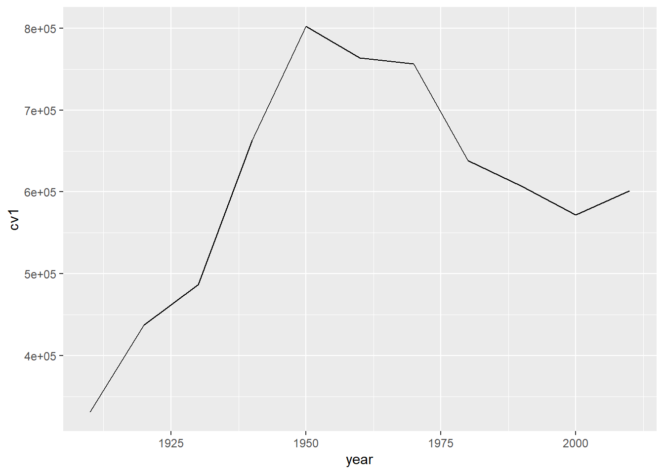
Note that line graphs do not default to a y-axis baseline of zero. This is ok, as we discussed in class.
B.4. Make some improvements
The line graph above is great for getting a sense of the data. It’s not so good for communicating. The x-axis labels don’t line up with the years in the data. The vertical axis labels are hard to read. And the grey background does not help tell the story.
We fix the horizontal axis to put 20-year labels with
scale_x_continuous(limits= c(1910, 2010), breaks = c(seq(1910,2010,20)))This tells R to start in 1910, and stop in 2010 (limits= c(1910, 2010)). It also tells R to make breaks on the axis at 1910 and every 20 years until 2010 (breaks = c(seq(1910,2010,20))).
We fix the vertical axis with
scale_y_continuous(labels = comma,
                   limits = c(0, 825000),
                   breaks = c(seq(0,800000,200000)))
This tells R to use commas in the numbers, to start at 0 and end at 825,000, and to make value labels every 200,000.
Generally, ggplot line graphs are easier to read when lines are thicker. We adjust the line width with the geom_line() option of size = 1.5. Note that this goes outside of the aes() command. Things inside the aes() describe how “variables in the data are mapped to visual properties (aesthetics) of geoms” (see cite). Things outside of the aes() command are for more general settings.
In addition, we modify the theme to do the following:
- omit major gridlines:
panel.grid.major = element_blank() - omit minor gridlines:
panel.grid.minor = element_blank() - (FYI: you can also omit both major and minor at once with
panel.grid = element_blank()) - omit panel background:
panel.background = element_blank() - add back in y-axis gridlines:
panel.grid.major.y = element_line(color="gray") - omit legend:
legend.position = "none" - make the x-axis line black:
axis.line.x = element_line(color = "black") - get rid of x- and y-axis ticks:
axis.ticks = element_blank() - change size of axis text:
axis.text = element_text(size = 10)
done <-
  ggplot() +
  geom_line(data = dct,
            mapping = aes(x=year, y=cv1), size=1.5) +
  scale_y_continuous(labels = comma,
                     limits = c(0, 825000),
                     breaks = c(seq(0,800000,200000))) +
  scale_x_continuous(limits= c(1910, 2010),
                     breaks = c(seq(1910,2010,20))) +
  labs(x="", y="") +
  theme(panel.grid.major = element_blank(),
        panel.grid.minor = element_blank(),
        panel.background = element_blank(),
        panel.grid.major.y = element_line(color="gray"),
        legend.position = "none",
        axis.line.x = element_line(color = "black"),
        axis.ticks = element_blank(),
        axis.text = element_text(size = 10))
done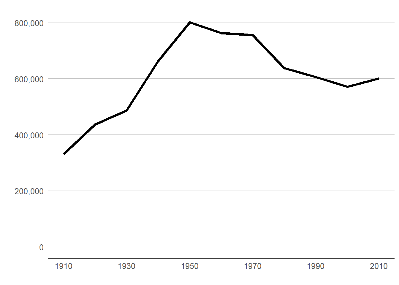
Beware that things can look different in the plot window and the final graphics output. To judge, save it in the proportions you’d like for a final product and then look at in with an image viewer. Here’s code to save this one.
fn <- "H:/pppa_data_viz/2020/tutorials/tutorial_08/b4_testerv1.jpg"
ggsave(plot = done,
       file = fn,
       dpi = 300,
       units = c("in"),
       width = 7,
       height = 3.5)
Then I pull in the final image:
Different! When doing final edits, work with the properly-sized graph.
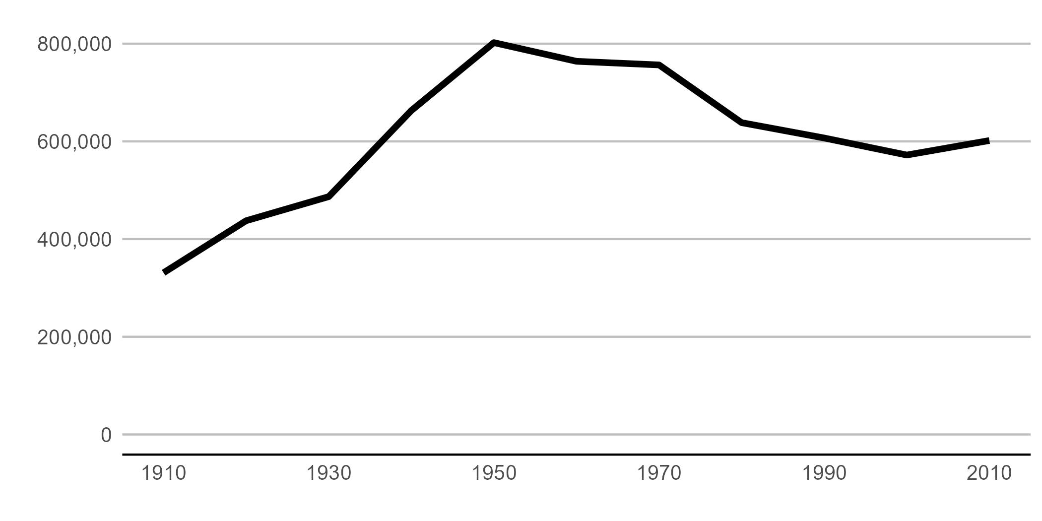
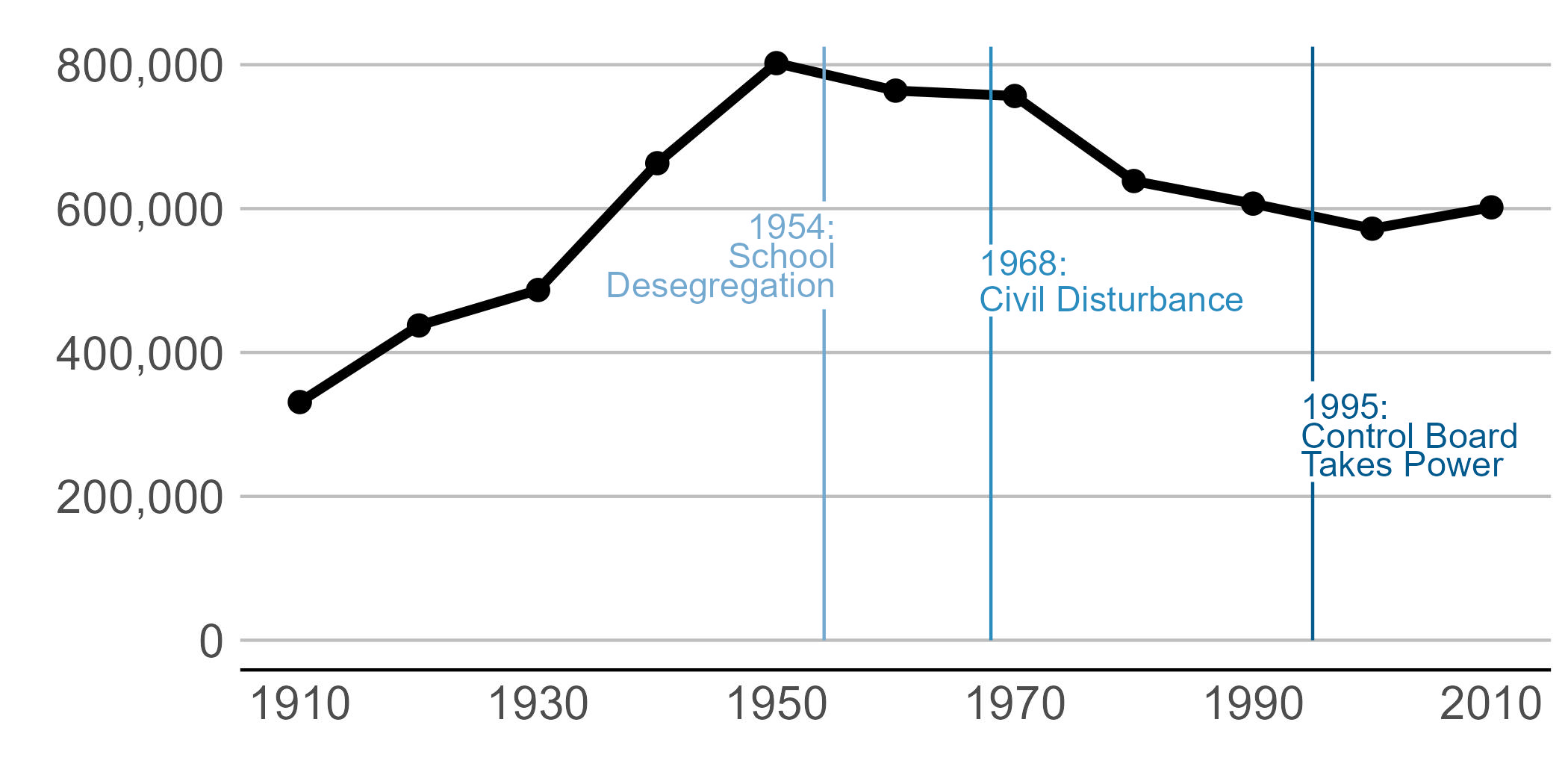
B.5 A few more improvements via annotations
I’d call the above plot functional, but the point of this graph is to point out specific historical moments that explain the shape of the plot. To do that we add text and lines to the plot.
We add data points on the line via geom_point(). This hints to readers that the data are only actually at the points. The line between the points is really just made up – or extrapolated if you’d like to be fancier.
To add “stuff” to your graph that is not data, use the annotate command. When I first learned R, I was under the incorrect impression that annotate(geom = "text")) and geom_text() did the same thing. I have learned that annotate() is much more efficient, as it draws just once. In contrast, geom_text() will draw as many times as you have data points – again and again in the same place.
The annotate() command has some basic options. The first is geom, which is what you want to show. Choices include, but are not limited to, “segment”, “rect”, or “text”. You specific the location with x and y for text, or, for rectangles and the like, xmin, xmax, ymin, and ymax (alternatively, x and xend, etc).
You can also adjust other options such as size (size=) or justification (hjust and vjust; see here). See how to implement these in the example below. We use both hjust = 0 (left align) and hjust = 1 (right align).
If you want to put text onto the graph, you put that text in the label= [text] part of the annotate command, as in the example below.
Note that I set the on-graph text size at the beginning in a variable (on.g.text.size). I use this for the size of the text that goes on the annotate command. That way if I don’t like it, I change it once, rather than eight times.
on.g.text.size <- 4
done2 <-
  ggplot(dct) +
  geom_line(dct, mapping = aes(x=year, y=cv1), size=1.5) +
  geom_point(dct, mapping = aes(x=year, y=cv1), size=3) +
  scale_y_continuous(labels = comma,
                     limits = c(0, 825000),
                     breaks = c(seq(0,800000,200000))) +
  scale_x_continuous(limits= c(1910, 2010),
                     breaks = c(seq(1910,2010,20))) +
  labs(x="", y="") +
  theme(panel.grid.major = element_blank(),
        panel.grid.minor = element_blank(),
        panel.background = element_blank(),
        panel.grid.major.y = element_line(color="gray"),
        legend.position = "none",
        axis.line.x = element_line(color = "black"),
        axis.ticks.x = element_blank(),
        axis.ticks.y = element_blank(),
        axis.text = element_text(size = 15)) +
  annotate(geom = "segment", x=1995, y=0, xend=1995, yend=220000, color="#045a8d") +
  annotate(geom = "segment", x=1995, y=360000, xend=1995, yend=825000, color="#045a8d") +
  annotate(geom = "segment", x=1968, y=0, xend=1968, yend=450000, color = "#2b8cbe") +
  annotate(geom = "segment", x=1968, y=550000, xend=1968, yend=825000, color = "#2b8cbe") +
  annotate(geom = "segment", x=1954, y=0, xend=1954, yend=460000, color = "#74a9cf") +
  annotate(geom = "segment", x=1954, y=610000, xend=1954, yend=825000, color = "#74a9cf") +
  annotate(geom = "text", x=1955, y=575000, label="1954:", color = "#74a9cf",
           size=on.g.text.size, hjust=1) +
  annotate(geom = "text", x=1955, y=535000, label="School", color = "#74a9cf",
           size=on.g.text.size, hjust=1) +
  annotate(geom = "text", x=1955, y=495000, label="Desegregation", color = "#74a9cf",
           size=on.g.text.size, hjust=1) +
  annotate(geom = "text", x=1967, y=525000, label="1968:", color = "#2b8cbe",
           size=on.g.text.size, hjust=0) +
  annotate(geom = "text", x=1967, y=475000, label="Civil Disturbance", color = "#2b8cbe",
           size=on.g.text.size, hjust=0) +
  annotate(geom = "text", x=1994, y=325000, label="1995:", color="#045a8d",
           size=on.g.text.size, hjust=0) +
  annotate(geom = "text", x=1994, y=285000, label="Control Board", color="#045a8d",
           size=on.g.text.size, hjust=0) +
  annotate(geom = "text", x=1994, y=245000, label="Takes Power", color="#045a8d",
           size=on.g.text.size, hjust=0)

## save it
fn2 <- "H:/pppa_data_viz/2020/tutorials/tutorial_08/b4_testerv2.jpg"
ggsave(plot = done2,
       file = fn2,
       dpi = 300,
       units = c("in"),
       width = 7,
       height = 3.5)
Pulling in the final image:
C. Themes
Now we take a detour from line graphs to discuss themes.
C.1. Modifying individual elements of themes
In the previous graph, we substantially changed the look of the graph by modifying elements in the theme() portion of the command. There are many, many different elements you can change in the ggplot theme, and you can find the complete list here.
C.2. Using ggplot’s built-in themes
In addition to modifying individual elements of a theme, you can use ggplot’s built-in themes to modify a graph. You can see the full list here, and we’ll do examples with theme_minimal() and theme_bw().
To make sure we understand what the themes are doing, let’s return to our original, somewhat ugly, graph of DC population over time.
b3 <- ggplot() +
  geom_line(data = dct,
            mapping = aes(x = year, y = cv1))
b3
First, we’ll apply the ggplot’s minimal theme. Notice that instead of retyping the graphing command, we just add the theme to the basic graph with a plus. You can see that many aspects of the graph’s look are changed.
c1 <- b3 + theme_minimal()
c1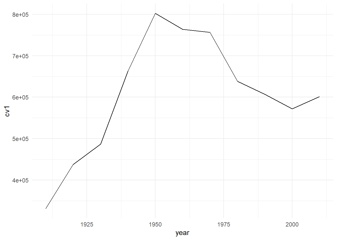
We can try a different built-in theme, theme_bw(), for black and white:
c2 <- b3 + theme_bw()
c2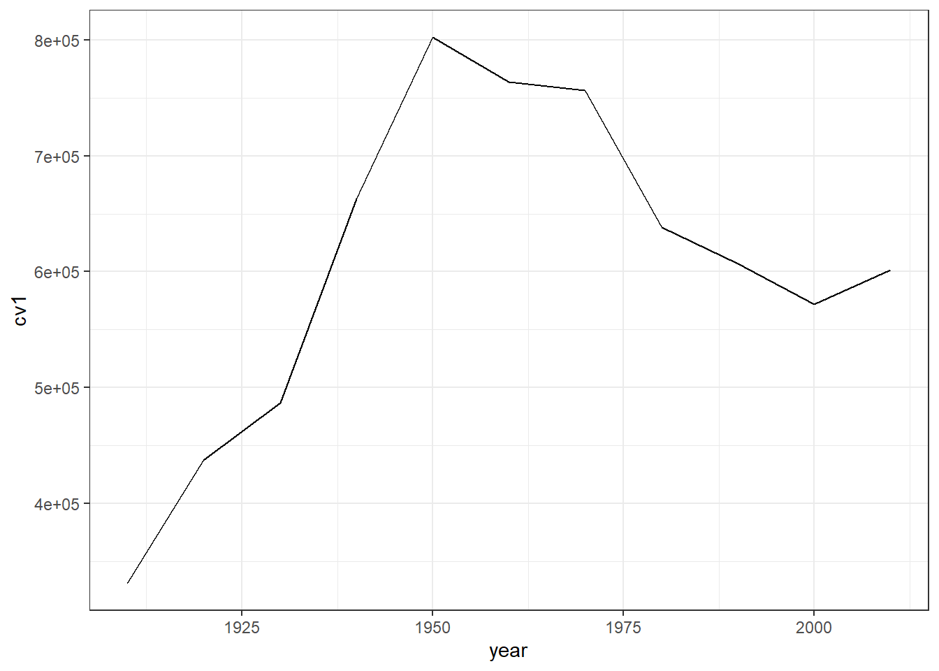
Finally, you can use a built-in theme and then also modify additional elements, as in
c3 <- b3 + theme_minimal() +
  theme(axis.line.x = element_line(color = "red"))
c3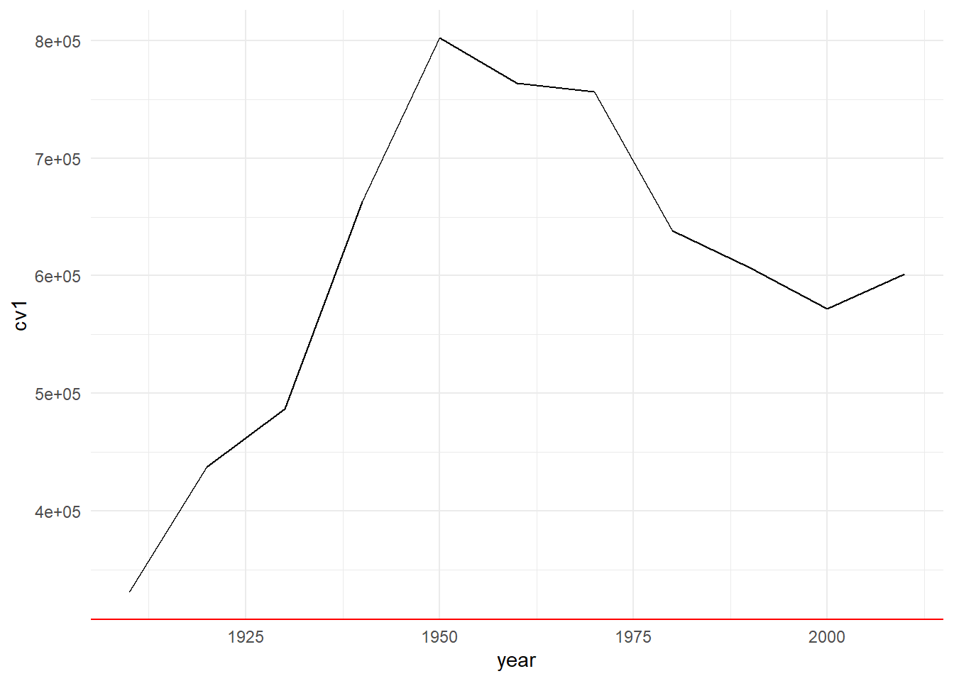
I don’t recommend this modifcation, but hopefully what it’s changing is clear.
C.3. Other peoples’ themes
Users have also created a variety of pre-packaged themes that you can use if you like. This webpage shows a variety of examples. To use these additional themes, you usually need to install a package.
C.4. Make your own theme
Finally, it can be quite helpful to create your own theme if you want to make a consistent look across many graphs.
Written as below, the theme modifies R’s default theme. We declare a function that has no inputs, but which creates the theme theme_me – you can call it theme_myself or whatever you’d like.
theme_me <- function(){
  theme(axis.line.x = element_line(color = "red"),
        axis.line.y = element_line(color = "blue"))
}
You could include one of R’s other themes below, too, if you’d prefer, as in
theme_me <- function(){
  theme_minimal() +
  theme(axis.line.x = element_line(color = "red"),
        axis.line.y = element_line(color = "blue"))
}
Then apply your theme to the line graph:
c4 <- b3 + theme_me()
c4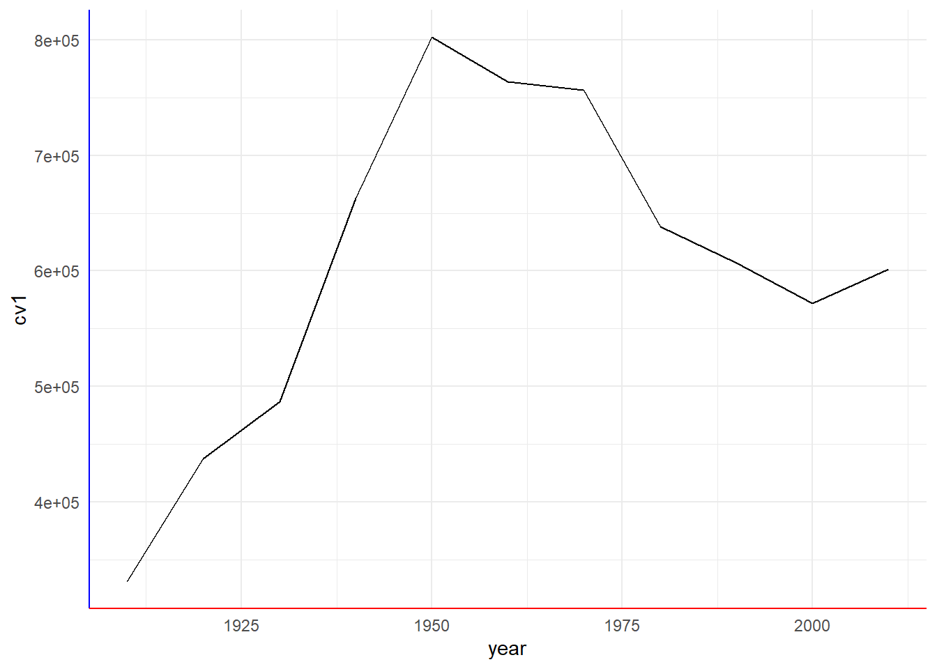
Bottom line: themes modify the look and feel of a graph. You need to alter them to make decent looking graphics. Making a custom theme can help create consistency across multiple graphics.
D. Grouped Line Graph: Multiple counties
The section above graphs just DC. In this section, we graph multiple counties and make them distinguishable.
D.1 Keep just a few counties
Here we subset the counties data to just keep DC (state 11), Maryland’s Montgomery and Prince George’s counties (state 24, counties 31 and 33), and Virginia’s Arlington, Alexandria and Fairfax jurisdictions (state 51, counties 13, 510 and 59).
We also make the year variable numeric for ease of plotting. And then to save space, we get rid of the counties dataframe with rm(counties). You can use rm() for any objects that you no longer want.
dcm <- counties[which(counties$statefips == 11 |
                      counties$statefips == 24 & counties$countyfips %in% c(31,33) |
                      counties$statefips == 51 & counties$countyfips %in% c(13,510,59)),]
dcm$nyear <- as.numeric(dcm$year)
rm(counties)
Finally, to identify a county in ggplot, it is much simpler if the state and county variables are combined into one. I use paste0 to concatenate the state and county variables. “Concatenate” means stick together. The paste0 command takes as many strings as you like and puts them together.
Here is a small example of what paste0 does. The first use of paste0 below just sticks strings s1 and s2 together. The next two examples, where we create p2 and p3, use different separators.
ex.df <- data.frame(s1 = c("fred","ted","pj"),
                    s2 = c("dog","cat","pig"))
ex.df$p1 <- paste0(ex.df$s1,ex.df$s2)
ex.df$p2 <- paste0(ex.df$s1,ex.df$s2, sep = "XX")
ex.df$p3 <- paste0(ex.df$s1,ex.df$s2, sep = " is a ")
ex.df
s1 s2 p1 p2 p3
1 fred dog freddog freddogXX freddog is a
2 ted cat tedcat tedcatXX tedcat is a
3 pj pig pjpig pjpigXX pjpig is a And here we use this paste0 command to stick the state and county identifiers together:
# make a state+county variable
dcm$stc <- paste0(dcm$statefips,dcm$countyfips)
D.2. Plot all counties
To plot multiple counties at one time, we use the group() command and tell R that the groups are by the stc variable. This is very similar to Note that the group = goes inside the aes() because it is telling R to do something based on the data. For legibility, I add commas in the y-axis values.
# all counties
ac <- ggplot() +
  geom_line(data = dcm, aes(x=year, y=cv1, group = stc)) +
  scale_y_continuous(labels = comma)
ac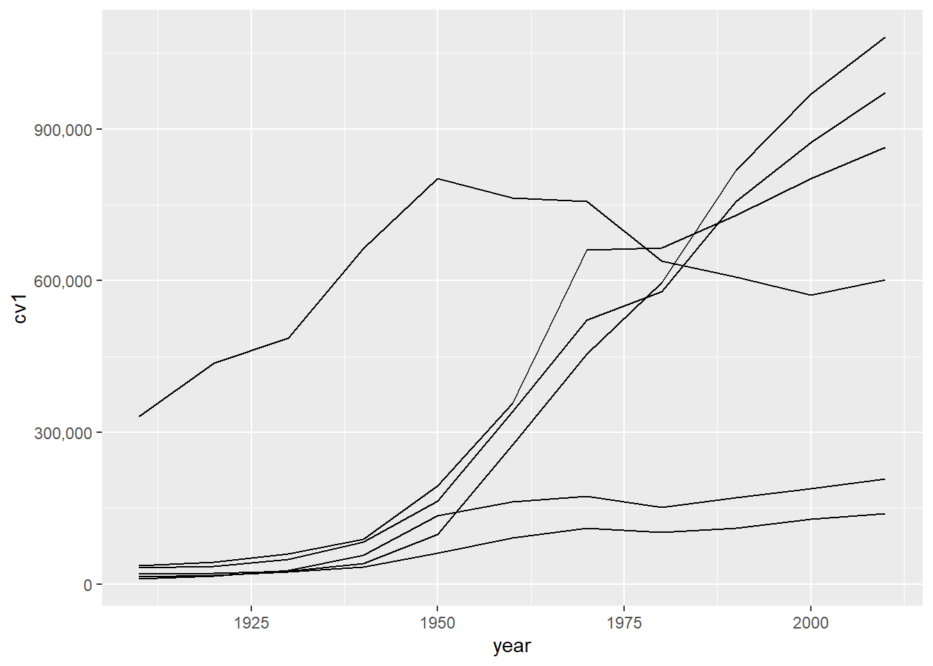
Of course, without a legend or identifying features, this graph is very hard to interpret. We add color = stc, again inside aes(), so that we can see which counties are which on the graph.
# color by state
ac <- ggplot() +
  geom_line(data = dcm, aes(x=year, y=cv1,
                            group = stc,
                            color = stc)) +
  scale_y_continuous(labels = comma)
ac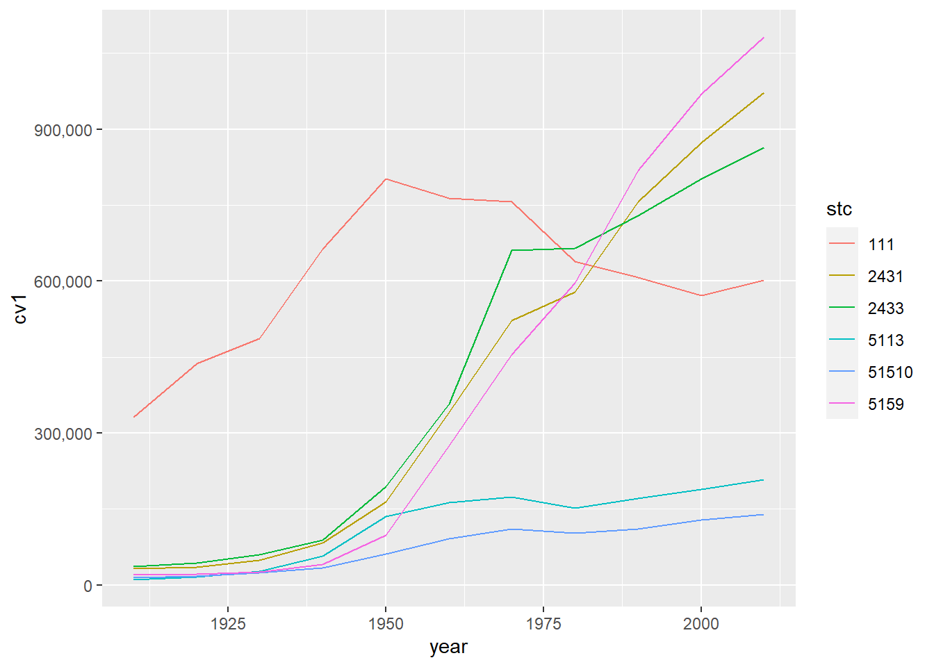
This graph is an improvement, but in previous years (not this one!) it had the very unfortunate feature of presenting the county code as if it were a continuous variable. To fix this, I used as.factor() around the county variable to let R know it is categorical.
# color by state, itemized legend
ac <- ggplot() +
  geom_line(data = dcm, aes(x=year, y=cv1,
                            group = as.factor(stc),
                            color = as.factor(stc))) +
  scale_y_continuous(labels = comma)
ac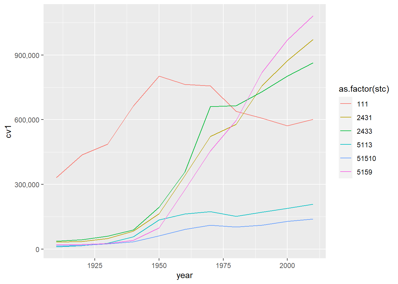
There are still many improvements we could make to this graph. For basic legibility, we should made the county codes names rather than numbers. We can do this by making stc a factor variable and assigning names to its levels. (We have done this is in a previous tutorial.) Even better, and depending on the point of the graph, omit the legend and put the jurisdiction names directly on the graph using annotate().
E. Preparing Data for Line Graphs
E.3. Use date variables for duration calculation
Now that we have two date variables, we can make our own measure of duration and check the bikeshare’s measure.
# my duration calculation
cabi.201901$my.duration <- cabi.201901$time.stop - cabi.201901$time.start

# comparing my results to built-in results
summary(cabi.201901$my.duration)
Length Class Mode
158130 difftime numeric Wait – this variable is not returning a normal summary output. We need to tell R that is is a numeric variable in the summary() command.
summary(as.numeric(cabi.201901$my.duration)) Min. 1st Qu. Median Mean 3rd Qu. Max.
1.000 5.817 9.633 14.939 15.967 1435.000 summary(as.numeric(cabi.201901$Duration)) Min. 1st Qu. Median Mean 3rd Qu. Max.
60.0 349.0 577.0 895.9 957.0 86100.0 This looks similar, but our calculated duration measure is in minutes and the bikeshare’s measure is in seconds. I could divide cabi$Duration by 60 to see if they are the same. I can also look at the correlation between the two measures using cor(). Here is the correlation method:
# look at the correlation -- looks like 1
cor(x = as.numeric(cabi.201901$my.duration),
    y = as.numeric(cabi.201901$Duration),
    method = c("pearson"))
[1] 1I find that the correlation between the two measures is 1. This makes we suspect that the bikeshare people calculated the duration in the exact way we did.
Now I do the other check: divide our measure by 60.
cabi.201901$Duration.minutes <- cabi.201901$Duration / 60
summary(cabi.201901$Duration.minutes)
Min. 1st Qu. Median Mean 3rd Qu. Max.
1.000 5.817 9.617 14.931 15.950 1435.000 OK – it’s the same.
E.4. Make hour level summary statistics
The trick to successfully plotting these data is to reduce their dimensionality. “Dimensionality” means size, or the number of observations by the number of variables. Our dataframe has about 150,000 observations – way too many to show on any plot.
One way to shrink what we show is to show data by hour, rather than by ride. Therefore, for each hour, we will find the average number of rides and the average duration of rides.
To do this, we first need a variable that tells us the hour of the trip. We extract the hour component from the date variable using the date notation. We can use the format() function because we already created a date variable called time.start. We write format(df$varname, "%H") to get the hour from the time variable. (This is the benefit of the time variable!) We then check the output using both summary() and table().
# get the hour out of the date variable
cabi.201901$start.hour <- as.numeric(format(cabi.201901$time.start, "%H"))
summary(cabi.201901$start.hour)
Min. 1st Qu. Median Mean 3rd Qu. Max.
0.00 9.00 14.00 13.63 17.00 23.00 table(cabi.201901$start.hour)
    0     1     2     3     4     5     6     7     8     9    10    11    12
  949   539   383   162   284  1369  3931  9314 15908  9409  6123  6818  8025
   13    14    15    16    17    18    19    20    21    22    23
 8304  8311  9728 12994 18785 13846  8570  5713  4082  2904  1679
From the summary command, we see that mean start hour is about 1:30 (13.6 hours). That seems fine, as does the max start hour of 11 pm (23 hours) and the min start hour of 0 (midnight).
Looking at the table output, the hour with the single largest number of rides is 17 – or 5 pm. This also seems reasonable.
Now that we are reassured the times are ok, we use group_by() and summarize() to find hourly traveling information. We calculate both the number of rides (no_rides) and the average duration of those rides (mean_dur).
# summarize to hourly data
cabi.201901 <- group_by(cabi.201901, start.hour)
cabisum <- summarize(.data = cabi.201901, no_rides = n(), mean_dur = mean(Duration))
dim(cabisum)
[1] 24 3E.5. Plot of number of rides and mean duration
Now we’ll plot the results, which is another reasonability check on the data. To plot both variables the same way, it is a good idea to make a function. However, the first rule of writing functions is to get the code working outside of a function first.
Following this commandment, we plot the number of rides by hour.
# get it to work outside of a function
c3 <- ggplot() +
  geom_line(data = cabisum, mapping = aes(x = start.hour, y = no_rides)) +
  labs(title = "Total number of rides by hour")
c3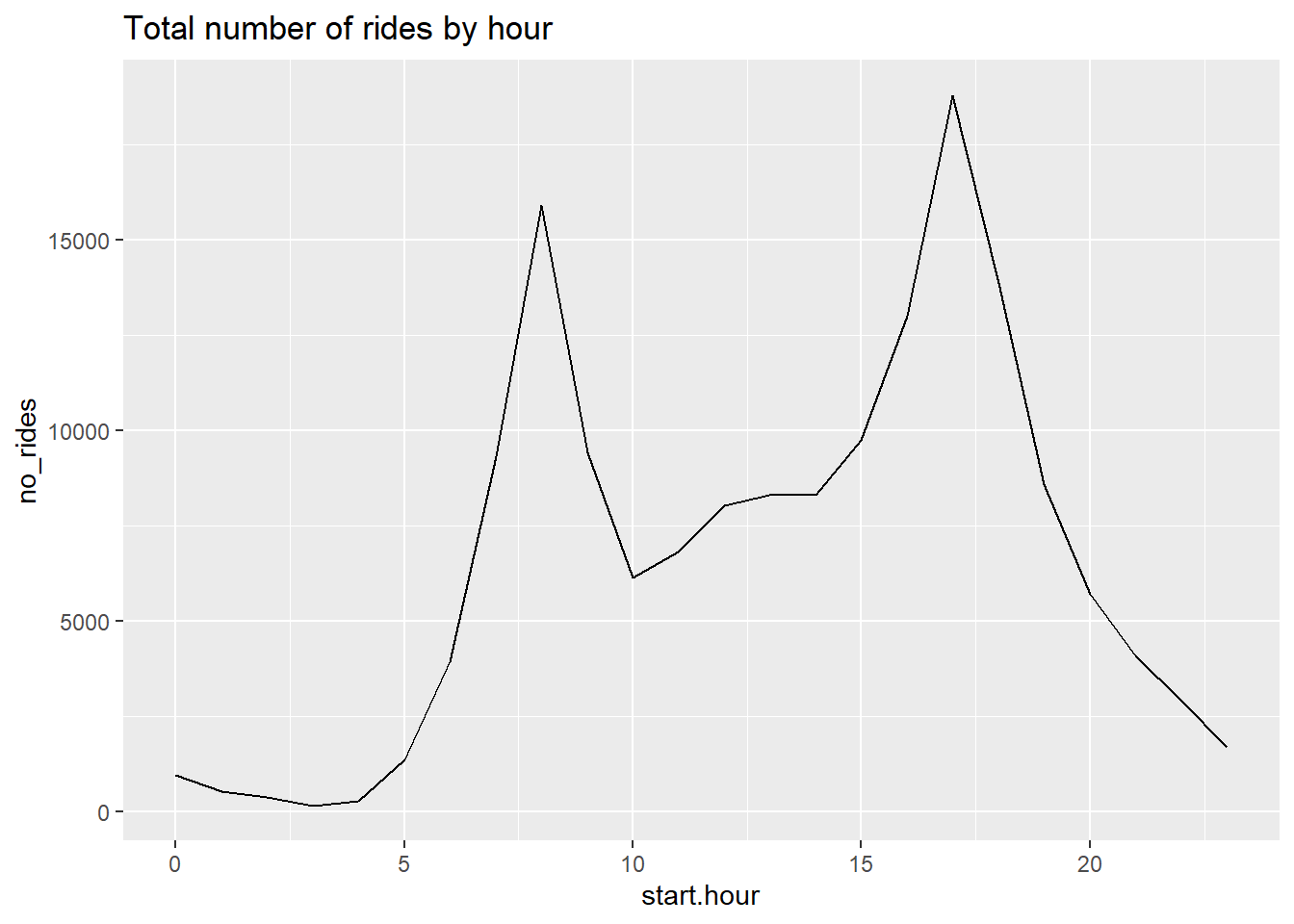
This seems to have gone smoothly. We see morning and afternoon peaks, which seems entirely reasonable.
For making multiple graphs, we’d prefer not to copy and paste this code for reasons we discussed in class. Instead, make a function. The below shows you how to iterate through ggplot with a function. This document explains the why this is not as straightforward as you might think.
Importantly, ggplot() uses non-standard evaluation, so it takes in text in a different way than base R commands. Thus, to replace text in a ggplot command, you need to surround it with {{}} to get R to read it as a variable name.
# write a simple function for two variables
# see examples here
# https://dplyr.tidyverse.org/articles/programming.html
c3func <- function(varin,vardescp){
  c3 <- ggplot() +
    geom_line(data = cabisum, mapping = aes(x = start.hour, y = {{varin}})) +
    labs(title = vardescp)
  print(c3)
}

c3a <- c3func(varin = no_rides,
              vardescp = "Total number of rides by hour of the day")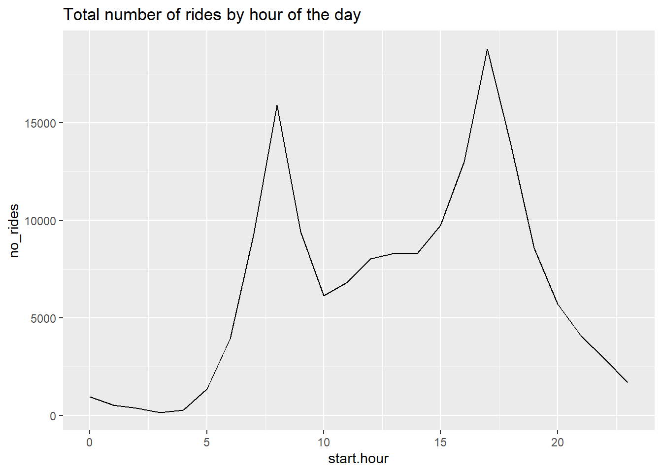
c3a <- c3func(varin = mean_dur,
              vardescp = "Average duration of ride by hour of the day")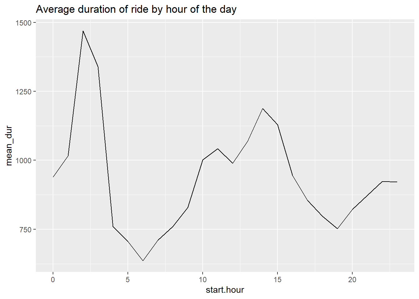
F. Stacked lines, useful for money
The final type of line graph we’re trying today is a stacked line chart, which can sometimes be very helpful to convey change over time along with the relative importance of categories.
F.1. Load data
Since this is a policy class, it seems fitting to graph at least some budget data. We are introducing a new dataset: US federal budget statistics. You can find the data from the Office of Management and Budget here. Download the zip file from the top of the page and unzip it.
I am not prepping these data for you, since I want to make sure you learn how to put raw data into R. You will find that there are many small issues that cause trouble. This is not atypical, so it is helpful to show how to handle them.
Unzip the file you downloaded, and you’ll see a bunch of files in this new folder. They follow the naming convention on the page from which you downloaded. Open up Tables 1.3 (hist01z3.xls; for homework) and 2.3 (hist02z3.xls; for now) in Excel.
From Table 2.3, we want the year and columns B, C, D, G, H and I. Create a new excel document with just this information, and make one row at top with names that you’ll understand. Keep just through 2022, and make sure that you don’t have any junk at the bottom of the table. Save this file as csv (file, save as, choose “csv” option for file type). Make sure the extension is also “.csv”. If there are numeric variables that take the value *, make them “.”, which is code for missing.
Load the csv file you just created into R.
### makeup of receipts ####
hist02z3 <- read.csv("H:/pppa_data_viz/2023/tutorials/data/tutorial_08/hist_fy2024/hist02z3.csv")
str(hist02z3)
'data.frame': 90 obs. of 7 variables:
$ year : chr "1934" "1935" "1936" "1937" ...
$ income.taxes : num 0.7 0.7 0.8 1.2 1.4 1.1 0.9 1.1 2.2 3.5 ...
$ corp.taxes : num 0.6 0.8 0.9 1.2 1.4 1.2 1.2 1.8 3.2 5.2 ...
$ social.sec.income: chr "." "." "0.1" "0.7" ...
$ excise.taxes : num 2.2 2 2 2.1 2.1 2.1 2 2.2 2.3 2.2 ...
$ other.rev : num 1.3 1.5 1.1 0.9 0.9 0.7 0.7 0.7 0.5 0.4 ...
$ total.receipts : num 4.8 5.1 4.9 6.1 7.5 7 6.7 7.5 9.9 13 ...Begin by making sure that what you’ve imported into R is what you expect. We run through the problems I encountered – your problems may differ! The goal here is to give you enough tools that you know how to look for problems and how to fix them once you find them.
We’ll start with the year variable, using tables() to look at the values and then table(is.na(hist02$z3)) to look at whether there are missing values.
# make sure year is always ok
table(hist02z3$year)
1934 1935 1936 1937 1938 1939 1940 1941 1942 1943 1944 1945 1946 1947 1948 1949
   1    1    1    1    1    1    1    1    1    1    1    1    1    1    1    1
1950 1951 1952 1953 1954 1955 1956 1957 1958 1959 1960 1961 1962 1963 1964 1965
   1    1    1    1    1    1    1    1    1    1    1    1    1    1    1    1
1966 1967 1968 1969 1970 1971 1972 1973 1974 1975 1976 1977 1978 1979 1980 1981
   1    1    1    1    1    1    1    1    1    1    1    1    1    1    1    1
1982 1983 1984 1985 1986 1987 1988 1989 1990 1991 1992 1993 1994 1995 1996 1997
   1    1    1    1    1    1    1    1    1    1    1    1    1    1    1    1
1998 1999 2000 2001 2002 2003 2004 2005 2006 2007 2008 2009 2010 2011 2012 2013
   1    1    1    1    1    1    1    1    1    1    1    1    1    1    1    1
2014 2015 2016 2017 2018 2019 2020 2021 2022   TQ
1 1 1 1 1 1 1 1 1 1 table(is.na(hist02z3$year))
FALSE
   90
Here are some problems I had this year (the first one) or prior years (the second one) – which you may or may not have this year.
To get rid of the observation where year is “TQ”, I keep only observations where the year is not “TQ”.
hist02z3 <- hist02z3[which(hist02z3$year != "TQ"),]One year (not this one), I had a few observations with no year at all. To fix this, I subset the data to get rid of the strange years.
hist02z3 <- hist02z3[which(hist02z3$year != ""),]In a different year, hist02z3$year loaded as a factor variable. When it did, I used this code to make it numeric – code I am not using this year:
hist02z3$nyear <- as.numeric(levels(hist02z3$year))[hist02z3$year]
summary(hist02z3$nyear)
This year, hist02z3$year loaded as a character variable. So make a numeric year and check the values, I use as.numeric:
hist02z3$nyear <- as.numeric(hist02z3$year)
summary(hist02z3$nyear)
Min. 1st Qu. Median Mean 3rd Qu. Max.
1934 1956 1978 1978 2000 2022 Good – the year variable now seems to have just numeric years and the values are non-crazy.
F.2. Make data long
To make a stacked line (or really, any multiple line), the data need to be long, not wide. As a refresher, wide data look like this, with one observation per unit:
wide <- data.frame(state = c("6","36","48"),
                   female_pop = c("10","12","14"),
                   male_pop = c("11","13","12"))
wide
state female_pop male_pop
1 6 10 11
2 36 12 13
3 48 14 12Long data look like this, with one observation per unit and type:
long <- data.frame(state = c("6","36","48","6","36","48"),
                   pop = c("10","12","14","11","13","12"),
                   sex = c("female","female","female","male","male","male"))
long
state pop sex
1 6 10 female
2 36 12 female
3 48 14 female
4 6 11 male
5 36 13 male
6 48 12 maleNote how this dataset requires a variable that tells you which type of population the row contains.
Neither data format is “right.” If you were doing a regression and wanted to control for male and female population, you’d need the wide format. However, to make a line graph with multiple lines in R, you need a long dataset.
To make the data long, first I tried the code below
## make this wide dataset long
head(hist02z3)
names(hist02z3)
r.long <- pivot_longer(data = hist02z3,
                       cols = c("income.taxes","corp.taxes","social.sec.income","excise.taxes","other.rev","total.receipts"),
                       names_to = "revenue_type",
                       values_to = "revenue")
r.long[1:15,]
This code delivers this error message:
Error in `pivot_longer_spec()`:
! Can't combine `income.taxes` <double> and `social.sec.income` <character>.
This error message is telling us that not all our income variables are the same type. Check this:
str(hist02z3)'data.frame': 89 obs. of 8 variables:
$ year : chr "1934" "1935" "1936" "1937" ...
$ income.taxes : num 0.7 0.7 0.8 1.2 1.4 1.1 0.9 1.1 2.2 3.5 ...
$ corp.taxes : num 0.6 0.8 0.9 1.2 1.4 1.2 1.2 1.8 3.2 5.2 ...
$ social.sec.income: chr "." "." "0.1" "0.7" ...
$ excise.taxes : num 2.2 2 2 2.1 2.1 2.1 2 2.2 2.3 2.2 ...
$ other.rev : num 1.3 1.5 1.1 0.9 0.9 0.7 0.7 0.7 0.5 0.4 ...
$ total.receipts : num 4.8 5.1 4.9 6.1 7.5 7 6.7 7.5 9.9 13 ...
$ nyear : num 1934 1935 1936 1937 1938 ...Sadly, it seems that social.sec.income is a character variable – all other taxes are numeric. So let’s fix this.
We fix social.sec.income by doing
hist02z3$social.sec.income <- as.numeric(hist02z3$social.sec.income)Warning: NAs introduced by coercionstr(hist02z3$social.sec.income) num [1:89] NA NA 0.1 0.7 1.7 1.8 1.8 1.7 1.7 1.6 ...R warns us that is has introduced NAs by coercion. This means that for all non-numeric values in the character variable, it created an NA. For our purposes, that’s perfectly good, since we want only true numbers.
Testing the output, the new structure says social.sec.income is now a numeric variable.
Now try the pivot_longer() command again:
## make this wide dataset long
r.long <- pivot_longer(data = hist02z3,
                       cols = c("income.taxes","corp.taxes","social.sec.income","excise.taxes","other.rev","total.receipts"),
                       names_to = "revenue_type",
                       values_to = "revenue")
r.long[1:15,]
# A tibble: 15 × 4
year nyear revenue_type revenue
<chr> <dbl> <chr> <dbl>
1 1934 1934 income.taxes 0.7
2 1934 1934 corp.taxes 0.6
3 1934 1934 social.sec.income NA
4 1934 1934 excise.taxes 2.2
5 1934 1934 other.rev 1.3
6 1934 1934 total.receipts 4.8
7 1935 1935 income.taxes 0.7
8 1935 1935 corp.taxes 0.8
9 1935 1935 social.sec.income NA
10 1935 1935 excise.taxes 2
11 1935 1935 other.rev 1.5
12 1935 1935 total.receipts 5.1
13 1936 1936 income.taxes 0.8
14 1936 1936 corp.taxes 0.9
15 1936 1936 social.sec.income 0.1This looks like what we want. Notice that there are NA values for social insurance spending in the 1930s. If you go back to your original download, you can see that this isn’t a mistake. In 1935, there was no social insurance spending.
F.3. Graphs
Let’s start with total tax revenue over time. As in the previous section, we need to note group=1, and recall that total is r.long$rtype == 6.
#### line chart of total receipts
g4.1 <-
  ggplot() +
  geom_line(data = r.long[which(r.long$revenue_type=="total.receipts"),],
            mapping = aes(x=nyear, y=revenue, group=1))
g4.1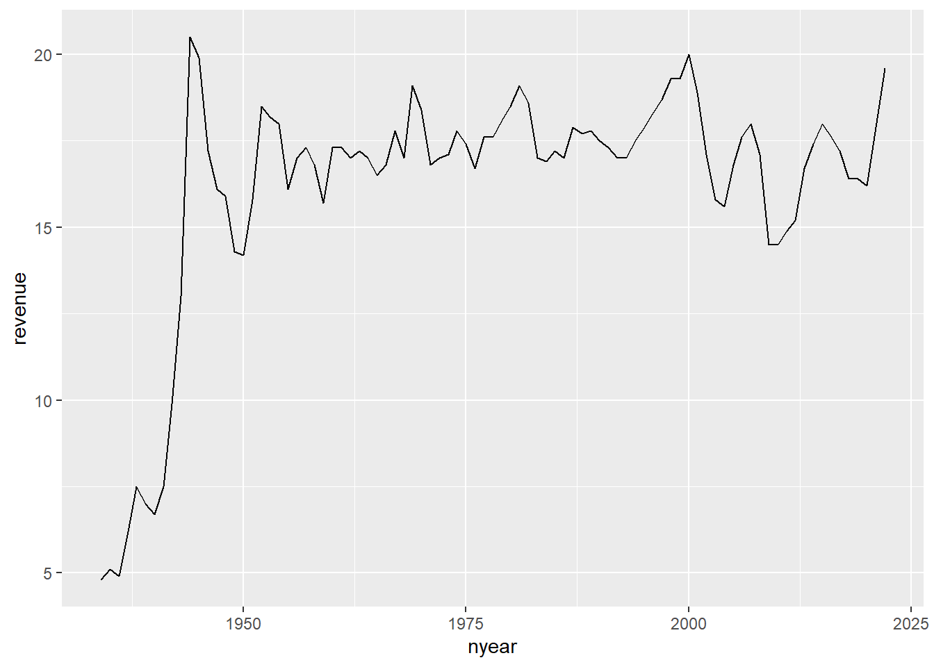
Now we’ll modify the chart to have all the categories but the total. I do this by subsetting r.long into all record types that are not total revenue. In addition, I tell R that the group by which we want to make the graph is a variable called revenue_type, which R should treat as a factor. We also tell r to color the lines by revenue_type, taken as a factor.
#### line chart of total receipts by type ###
g4.2 <-
  ggplot() +
  geom_line(data = r.long[which(r.long$revenue_type != "total"),],
            mapping = aes(x=nyear, y=revenue,
                          group=as.factor(revenue_type),
                          color=as.factor(revenue_type)))
g4.2
Warning: Removed 2 row(s) containing missing values (geom_path).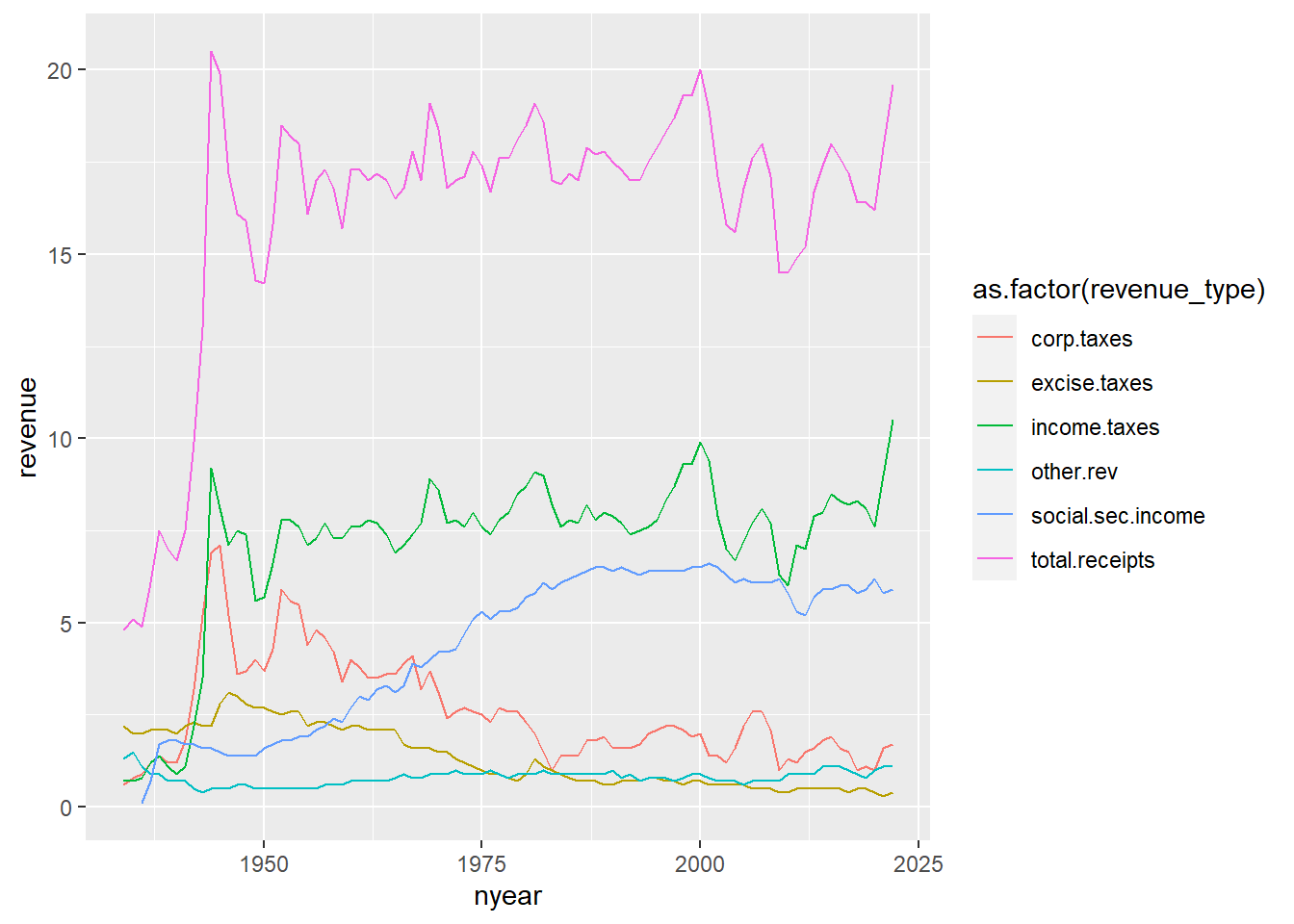
This graph is very hard to read. There are too many lines, and we don’t get a sense of the total, which may be a key point. An alternative is a stacked line. Stacked lines highlight the total amount, and give readers some sense of the relative share of different categories.
We do not include the total category in this graph, since the total is already visually present in the stacked lines. Including the total category
#### stacked chart of total receipts by type ###
## without factor() this doesnt work
g4.3 <- ggplot() +
  geom_area(data = r.long[which(r.long$revenue_type != "total.receipts"),],
            mapping = aes(x=nyear, y=revenue,
                          group=factor(revenue_type),
                          fill=factor(revenue_type)),
            position="stack") +
  labs(x="", y="share of GDP")
g4.3
Warning: Removed 2 rows containing missing values (position_stack).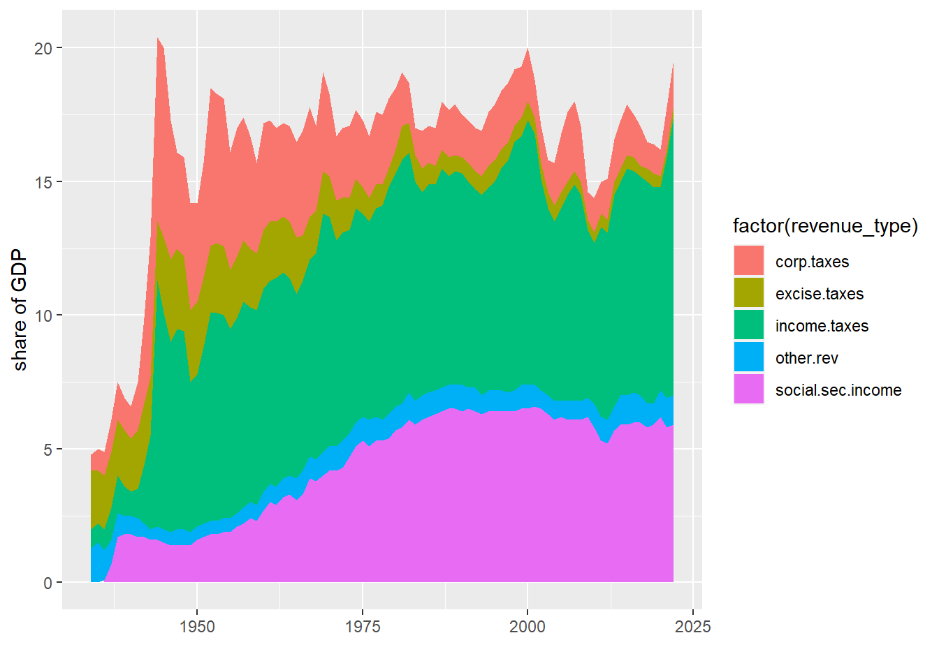
If you do this, it is freqently wise to put labels on the area portions of the graph and omit the legend. If the areas are too small to label, consider whether you need then individually.
These charts have the same downsides of stacked bars: the numbers for only the bottom category are directly legible from the graph.
G. Homework
In my example of DC population over time in section B.1., I present the graph of three steps. Modify your code to make these same three steps.
Using the bikeshare data,
- Re-do one of the by-hour pictures as a minute-by-minute picture showing total ridership
- Use one of the y variables we used or an alternative one. Add some annotations to your graph to point out salient features.
- More stacked areas
Now you try to load your own budget data!
Use Table 1.3 (his01z3.xls), from which we want the year and columns E, F, G and columns I, J and K. Create a new excel document with just this information, and make one row at top with names that you’ll understand. Keep just through 2017, and make sure that you don’t have any junk at the bottom of the table. Save this file as csv (file, save as, choose “csv” option for file type).
Load it into R and make a stacked area graph of receipts, outlays and deficits over time.
Having done this myself, here are a few suggestions
- make long data, as we did above
- make year numeric, as we did for the social insurance revenue above
- get rid of commas in the data. My command to do this, for one variable, is
hist02z3$b1 <- as.numeric(gsub(",", "", hist02z3$cd.receipts, fixed = TRUE))