Welcome back to maps! Today is the second of two mapping tutorials. We learn how to make
choropleth maps
legends for those maps
dot density maps
We also learn some useful R programming, including
pivot_wider(): a command to make long data wide
how to annotate a chart in R
A. Load Packages and Data
A.1. Packages
We are using a set of packages that you should have already used in the past. Here I am loading them with require() which installs the package if you do not already have it.
We will do all geographic analysis for today’s tutorial at the block group level, so load the block group map you used in Section E.1 of Tutorial 5.
# load block group map for dc onlybg2010 <-st_read("H:/pppa_data_viz/2019/tutorial_data/lecture05/Census_Block_Groups__2010/Census_Block_Groups__2010.shp")
Reading layer `Census_Block_Groups__2010' from data source
  `H:\pppa_data_viz\2019\tutorial_data\lecture05\Census_Block_Groups__2010\Census_Block_Groups__2010.shp'
  using driver `ESRI Shapefile'
Simple feature collection with 450 features and 54 fields
Geometry type: POLYGON
Dimension:     XY
Bounding box:  xmin: -77.11976 ymin: 38.79165 xmax: -76.9094 ymax: 38.99581
Geodetic CRS:  WGS 84
B. Create a block-group level shapefile with crime data
To make block group maps of crime, we need a block group level simple feature with crime information. What we have now is a block group level simple feature (bg2010) and a crime dataset that is at the level of the individual crime (vc2018). To get one spatial dataframe with crime information, we need to (i) modify the crime dataset to make it block group level and then (ii) add these aggregated crime data to the simple feature.
Note that this is different than what we did in Tutorial 5. In Tutorial 5, we found the block group in which each crime point was located, and our final product was a crime level dataframe. In contrast, our goal today is a block group level spatial dataframe (a simple feature).
B.1. Figure out the block group in which crime occurs
We begin by figuring out the block group in which each crime occurs. In the interests of full disclosure, this information is actually already in vc2018, but we are doing this so you know how to do it when you don’t already have this helpful information in hand. We did something very similar in the previous map class, so these steps should be somewhat of a review.
To make sure that all we are adding to the crime data is block group identification numbers, we create a subset of the full block group map file and call this new dataframe bg2010.small. This dataframe has just the tract and block group ids (recall, a block group id is the tract id plus the block group id – 7 digits in total; if these data spanned counties, we would also need the state and county IDs). We then intersect the crime data with this block group simple feature. This tells us, for each observation in vc2018, in which block group it lies.
# find which crimes are in which block groups# vc2010 actually already has the block group, but i want to be sure you can do this yourselfbg2010.small <- bg2010[,c("TRACT","BLKGRP")]cbg <-st_intersection(vc2018,bg2010.small)
Warning: attribute variables are assumed to be spatially constant throughout all
geometries
head(cbg)
Simple feature collection with 6 features and 25 fields
Geometry type: POINT
Dimension:     XY
Bounding box:  xmin: -77.0734 ymin: 38.90259 xmax: -77.05759 ymax: 38.91258
Geodetic CRS:  WGS 84
           CCN               REPORT_DAT    SHIFT METHOD  OFFENSE
1826  18064713 2018-04-23T13:04:28.000Z      DAY OTHERS BURGLARY
11452 18134729 2018-08-14T03:10:42.000Z MIDNIGHT OTHERS BURGLARY
26674 18042061 2018-03-15T16:09:21.000Z  EVENING OTHERS BURGLARY
30745 18026424 2018-02-16T14:31:32.000Z      DAY OTHERS BURGLARY
30750 18026435 2018-02-16T15:42:03.000Z  EVENING OTHERS BURGLARY
23472 18136654 2018-08-17T04:38:28.000Z MIDNIGHT OTHERS BURGLARY
                                            BLOCK XBLOCK YBLOCK WARD ANC
1826             3100 - 3199 BLOCK OF K STREET NW 394626 137194    2  2E
11452            3036 - 3099 BLOCK OF M STREET NW 394737 137483    2  2E
26674            3000 - 3099 BLOCK OF N STREET NW 394778 137665    2  2E
30745 2800 - 2899 BLOCK OF PENNSYLVANIA AVENUE NW 395005 137471    2  2E
30750 2800 - 2899 BLOCK OF PENNSYLVANIA AVENUE NW 395005 137471    2  2E
23472      3700 - 3799 BLOCK OF RESERVOIR ROAD NW 393634 138304    2  2E
      DISTRICT PSA NEIGHBORHO BLOCK_GROU CENSUS_TRA VOTING_PRE LATITUDE
1826         2 206  Cluster 4   000100 4     000100 Precinct 5 38.90258
11452        2 206  Cluster 4   000100 4     000100 Precinct 5 38.90519
26674        2 206  Cluster 4   000100 4     000100 Precinct 5 38.90683
30745        2 206  Cluster 4   000100 4     000100 Precinct 5 38.90508
30750        2 206  Cluster 4   000100 4     000100 Precinct 5 38.90508
23472        2 206  Cluster 4   000201 1     000201 Precinct 6 38.91258
      LONGITUDE        BID               START_DATE                 END_DATE
1826  -77.06195 GEORGETOWN 2018-04-23T10:56:35.000Z                     <NA>
11452 -77.06068 GEORGETOWN 2018-08-13T22:52:11.000Z 2018-08-14T00:19:42.000Z
26674 -77.06021       <NA> 2018-03-14T03:48:45.000Z 2018-03-14T03:49:12.000Z
30745 -77.05759 GEORGETOWN 2018-02-16T01:25:28.000Z 2018-02-16T02:30:15.000Z
30750 -77.05759 GEORGETOWN 2018-02-15T17:30:53.000Z 2018-02-16T08:15:53.000Z
23472 -77.07340       <NA> 2018-08-17T03:36:29.000Z 2018-08-17T03:46:04.000Z
       OBJECTID  OCTO_RECOR  TRACT BLKGRP                   geometry
1826  259183436 18064713-01 000100      4 POINT (-77.06196 38.90259)
11452 259193062 18134729-01 000100      4  POINT (-77.06068 38.9052)
26674 259240847 18042061-01 000100      4 POINT (-77.06021 38.90684)
30745 259245997 18026424-01 000100      4 POINT (-77.05759 38.90509)
30750 259246002 18026435-01 000100      4 POINT (-77.05759 38.90509)
23472 259224604 18136654-01 000201      1  POINT (-77.0734 38.91258)
Now we have a crime incident level simple feature (cbg) with block group information (TRACT,BLKGRP).
dim(cbg)
[1] 1567 26
Note that this file has many more observations than the block group file with which we started. This is because this file is at the crime incident level, not the block group level.
B.2. Create block group level crime dataframe
Now we are at the second step: create a block group level dataframe. First, we make the simple feature into a dataframe by getting rid of all geometry information. Recall that since this is a incident-level dataframe, the geometry is at the level of the incident, not the block group. We want the block group geometry, not the point locations of crimes.
st_geometry(cbg) <-NULL
Next, we want to add up the crime-level dataframe to the block group level (this is one example of the type of aggregation I’m asking you to do in your policy brief). We return to the pair of functions – group_by() and summarize() – that we learned in previous classes. Refer back to the previous tutorials for explanations of these. We check the number of observations after we summarize the data. It should have no more obsevations than the number of block groups times two, since each block group and offense gets its own row. There may be fewer observations than the number of block groups, since some block groups have no crime.
`summarise()` has grouped output by 'TRACT', 'BLKGRP'. You can override using
the `.groups` argument.
dim(cbg3)
[1] 478 4
If you look at this this dataframe, it has the following variables
names(cbg3)
[1] "TRACT" "BLKGRP" "OFFENSE" "tot_crimes"
This is a “long” dataframe, where each observation is a block group and an incident type. Note that the variable OFFENSE indicates the incident type and takes the value of either buglary or homicide. The variable tot_crimes reports the number of incidents.
For the purposes of today’s tutorial, it is more useful to have a wide dataframe than a long one. A wide dataframe will have one row per block group, and will have two variables for crimes – one for homicides and one for burglaries.
For most ggplot purposes, a long dataframe is preferable. It is particularly useful if you want to show different categories within one chart, such as categories within a histogram, or categories on a map.
B.3. Aside on wide and long data and how to go in between
As an aside, here is a little example of the same data, wide versus long. The dataframe printed below is a wide dataframe. The unit of observation here is the year, and we observe multiple variables for that unit – both baked goods: muffins and sugar cookies.
The kable() command below is just a way of printing the dataframe that makes it a little easier to read. You don’t need to use this (it only works in R markdown), and you can substitute by just typing the dataframe name to see what is going on.
data.wide <-data.frame(year =c(2001,2002,2003),muffins =c(50,49,36),sugar_cookies =c(100,200,300))print("here are the wide data")
[1] "here are the wide data"
kable(x = data.wide, format ="html")
year
muffins
sugar_cookies
2001
50
100
2002
49
200
2003
36
300
What if we want to make these wide data long? Use pivot_longer(). Tell R which data you want to use (data.wide), which variables you want to make long (cols = c("muffins","sugar_cookies")), what you want the column that names the types to be called (names_to = "baked_goods_type") and what you want the column that describes the values to be called (values_to = "num_baked_goods").
data.long <-pivot_longer(data = data.wide,cols =c("muffins","sugar_cookies"),names_to ="baked_goods_type",values_to ="num_baked_goods")print("here are the long data")
[1] "here are the long data"
kable(x = data.long, format ="html")
year
baked_goods_type
num_baked_goods
2001
muffins
50
2001
sugar_cookies
100
2002
muffins
49
2002
sugar_cookies
200
2003
muffins
36
2003
sugar_cookies
300
You can then go backwards with pivot_wider():
data.wide.again <-pivot_wider(data = data.long,id_cols =c("year"),names_from ="baked_goods_type",values_from ="num_baked_goods")print("back to wide data")
[1] "back to wide data"
kable(x = data.wide.again, format ="html")
year
muffins
sugar_cookies
2001
50
100
2002
49
200
2003
36
300
Same data, different representations. Usually we prefer long data when using ggplot – just not today.
B.4. Make long crime data wide
To transform our crime long dataframe into a wide one, we use a command called pivot_wider(). The basic syntax of this command is
new.wide.df <-pivot_wider(data = long.dataframe,id_cols = set of columns that uniquely id obs,names_from = column from which new variable name comes,values_from = which column(s) to get values from)
In our case, tract + block group + offense uniquely identify observations in cbg3. We would like R to take the values to make wide from the variable OFFENSE. Before starting, we know that the final dataframe should have no more than the number of block groups in our data, which we know from above is 450 (look at the output when you first loaded bg2010).
# A tibble: 6 × 4
# Groups:   TRACT, BLKGRP [6]
  TRACT  BLKGRP BURGLARY HOMICIDE
  <chr>  <chr>     <int>    <int>
1 000100 2             1       NA
2 000100 3             1       NA
3 000100 4             5       NA
4 000201 1             3       NA
5 000202 1             2       NA
6 000202 2             2       NA
dim(cbg4)
[1] 387 4
This new dataframe now has one column that reports the number of homicides, and one column that reports the number of burglaries.
The dataframe has 387 rows – fewer than the 450 block groups that we know exist in DC. Fewer rows means that there are block groups without crimes, and this is ok. (We’ll have to do some fixes later, but this is logically ok.) If there were more than 450 rows, you would immediately know that something is wrong, since we should never exceed the true number of block groups in the city.
Now we have in hand a non-spatial block group file with information on crime levels. It is non-spatial because, although it has plenty of information about each block group, it contains no spatially encoded information. Put differently, it has no coordinates for points or polygons or lines. To map things, we therefore need to add the block group geography. We do this by merging the data we just created (cbg4) with our nearly-original block group shape file(bg2010.small). We can do with with the basic merge command that we have used before.
B.5. Merge map and data
Before you conduct a merge, you should always know – or at least have a ballpark sense – of what the number of observations in the final file should be. What is that number here?
Now check the final file. Does it have the expected number of observations? If no, something has gone wrong.
# merge each back into the block groups file so we have all block groups with shapesbg2010.c2 <-merge(x = bg2010.small, y = cbg4, by =c("TRACT","BLKGRP"), all =TRUE)dim(bg2010.c2)
[1] 450 5
We find that this file has 450 observations. This is the original number of block groups we started with and is good news.
C. Make quartiles for the map
Now that we have these data together, we need to think about how to display them on a map. Recall that people have a hard time remembering more than four colors. This limitation strongly suggests that maps should show things like quartiles and terciles of a distribution (and not deciles!).
While we have the full distribution of crime incidents, we don’t know to which quartile of incidents each block group belong. We need to know this so we can tell R to plot the quartile. This is important – we don’t give R the number of burglaries, for example. Instead, we tell R the quartiles directly.
To find quartiles, we use a R dplyr function called ntile(), which asks you for the input dataframe and variable, and then the number of groups into which you’d like to divide the data in roughly equal numbers.
Specifically, this function has the following syntax
df$new.variable <-ntile(x = df$continuous.var,n = number of categories to make)
While we are finding quartiles (n = 4), you can use this function to find any grouping you’d like – deciles (1/10, or n = 10), centiles (1/100, or n = 100), and beyond.
We implement this function for the burglary variable:
bg2010.c2$burg.quartile <-ntile(x = bg2010.c2$BURGLARY, n =4)
As always, check the output. A first test that this function is behaving properly uses the table() command. All observations should be in a quartile and each quartile should have roughly the same number of observations.
table(bg2010.c2$burg.quartile)
 1  2  3  4
96 95 95 95
Each quartile has roughly the same number of observations. However, 95*3 + 96 < 400 – this is a hint that something is wrong, since we don’t have a quartile for each block group (remember, about 450 block groups). You’ll see how this problem plays out in the steps ahead.
D. Choropleth maps
We now have all the data in hand to make a choropleth map: geographic areas and a variable with quartiles to plot. As we did the last mapping tutorial, we will use geom_sf(). This class we’ll also add the fill= option to plot our variable of interest.
D.1. Burglaries
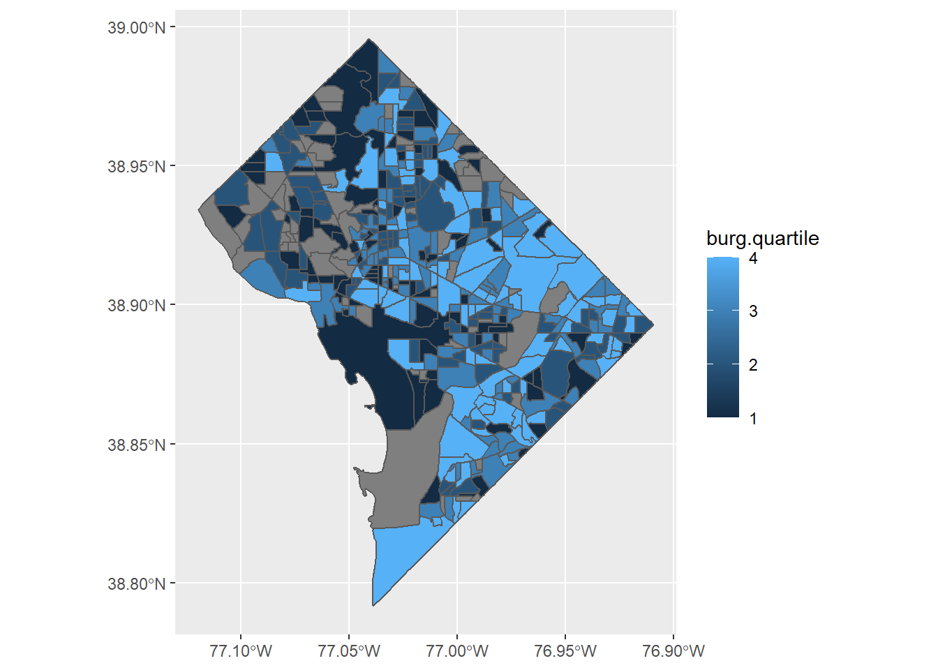
We begin by plotting quartiles of burglaries (burg.quartile).
burg <-ggplot() +geom_sf(data = bg2010.c2, mapping =aes(fill = burg.quartile))burg
This is a good first step. But this is far from the last step, because there are a number of things we should quite dislike about it
some block groups have no crime information and are in grey
the legend has a graduated color scale, but the data are categorical
low numbers are darker than high ones – attention should be directed to the darkest color, or the higher crime areas
the plot background is useless and distracting
Let’s fix these and see how things look. First, consider what a block group with a NA value for burglaries means. In this case a NA block group is a block group with no burglaries. Because of this, we make block groups with NA values zero. Changing NA values to zero is ok in this case. It is not, however, generally the case that you can set NA values to zero. In many cases NA means that we don’t know what the value is. However, in this particular case, we know that block groups with NA don’t have reported homicides or burglaries, and that their true number of reported burglaries is really zero.
Below, we use ifelse() to re-assign NA values to zero. We then check our work using table() to see if all observations now have a value.
# lets fix# make NA values zero# test beforedim(bg2010.c2)
Note how the second table() output is different from the first – it has a column of zeros at the far left of the table. (You may also note a problem lurking; we will address it in due course).
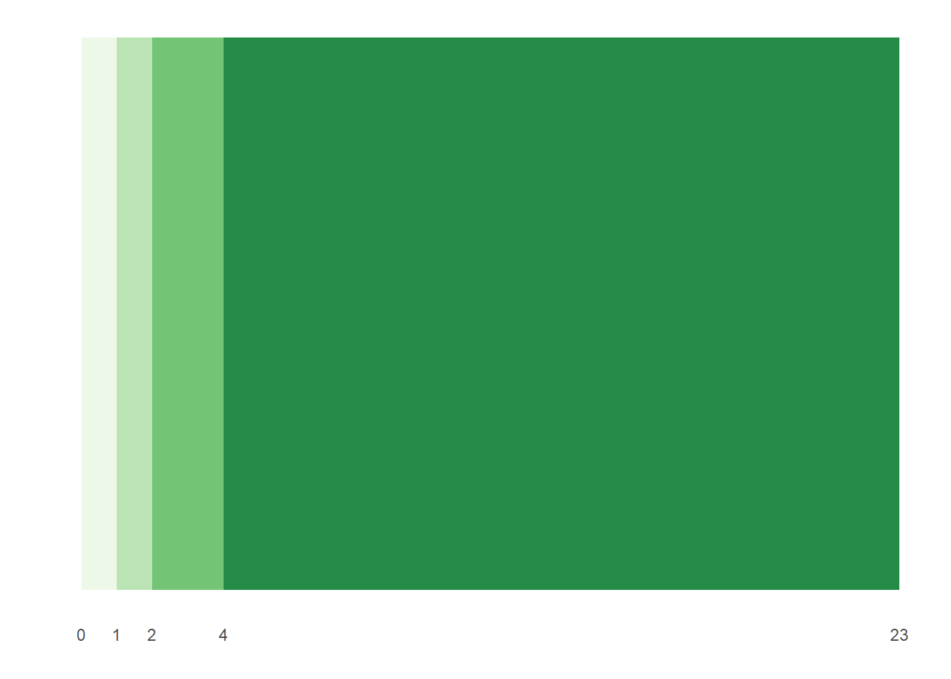
The table() output after we convert NAs to zeros shows that all one-burglary block groups are in the first quartile, along with a few two-burglary block groups. Two- and three-burglary block groups are in the second quartile, and the top quartile contains block groups with 5 to 23 burglaries.
To address the problem of the graduated color legend, let’s create a color scale. I got these hex colors from www.colorbrewer2.org; we discuss this website in greater detail in the lecture. I create a vector (a list of values) that I can later use in the chart. Recall the c() notation for making a column (or vector).
# make color ramp# see four.colors <-c("#edf8e9","#bae4b3","#74c476","#238b45")
To put these colors in the graph, we use the scale_fill_manual() command, which will put in the colors in the order we have specified in four.colors. If you don’t like the order that you get, you can either change the factor levels, or change the order of the colors.
Finally, we tell R that we want a discrete set of colors (e.g., 1, 2, 3, 4), rather than a continuous legend (e.g, 1 to 4 with all numbers in between). We do this by make the quartiles variable a factor. We can do this by creating a new variable (using as.factor()), or by just writing as.factor() around the variable in the geom_sf() command.
Now we try to make a graph with all of these fixes: without the NA values, without the plot background, and with better colors for discrete categories. Note that we set both the panel and the plot background to be transparent.
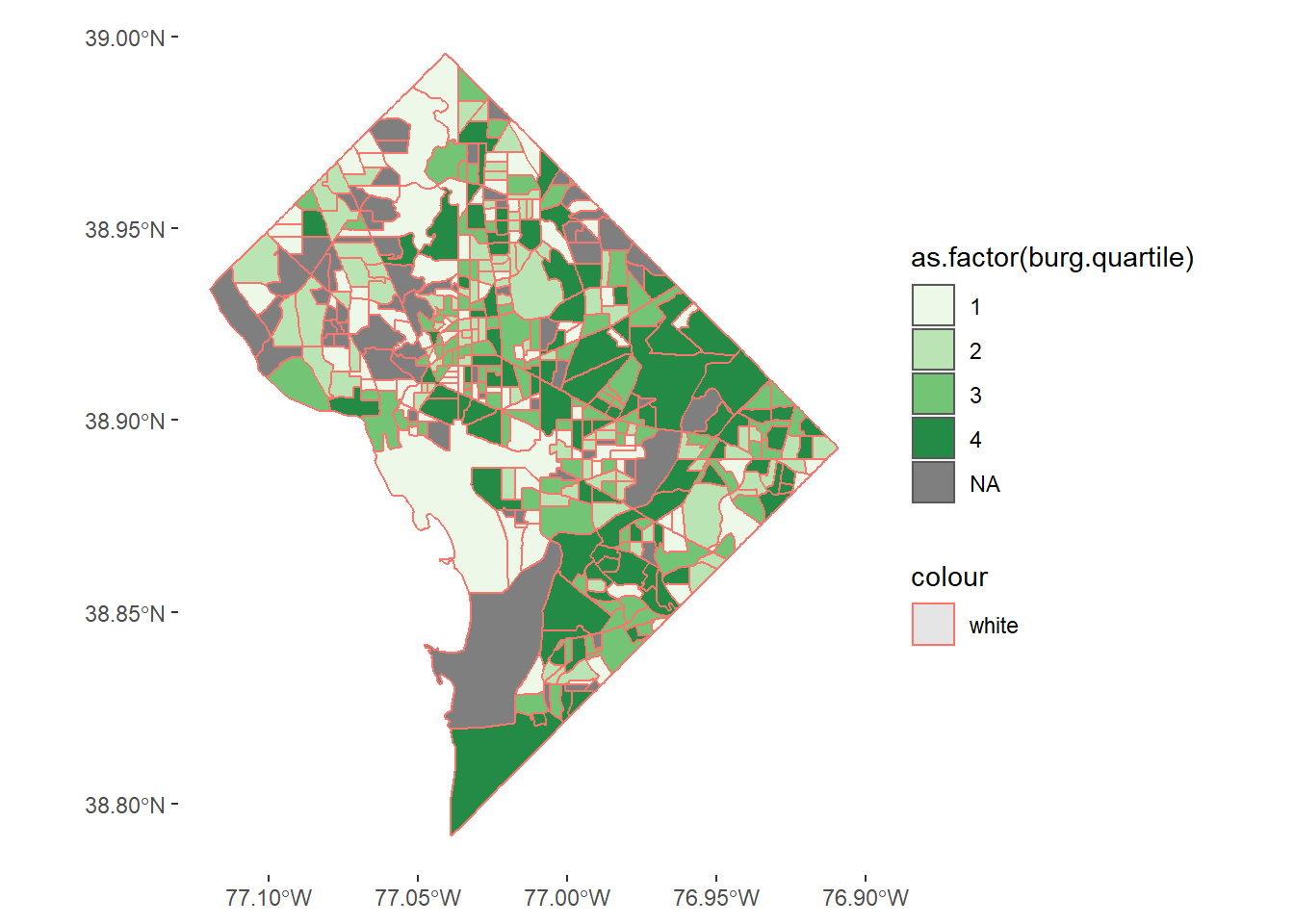
# make graph with categorical legend## still need to get rid of NAs and make borders whiteburg <-ggplot() +geom_sf(data = bg2010.c2, mapping =aes(fill =as.factor(burg.quartile), color ="white")) +scale_fill_manual(values = four.colors) +theme(panel.background =element_rect(fill ="transparent",colour =NA),plot.background =element_rect(fill ="transparent",colour =NA))burg
Some things are fixed in this revision, but we still have NAs. Why? Recall that we defined the quartiles before we set the NAs to zero – and the above graph is plotting those original quartiles. Mistake!
We fix this mistake by re-defining the quartiles with the variable where NAs are coded to zero. We do this below:
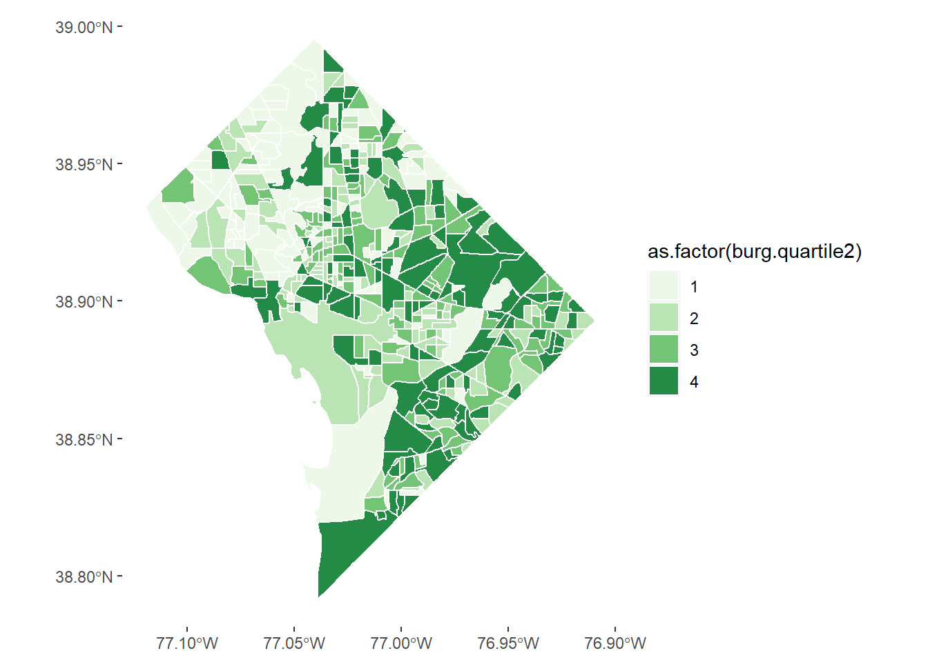
## for first problem: b/c quartiles were defined before we fixed the NAs to zeros## lets try a second round of making quartilesbg2010.c2$burg.quartile2 <-ntile(bg2010.c2$BURGLARY, 4)table(bg2010.c2$burg.quartile2)
  1   2   3   4
113 113 112 112
Note that this number of observations should look different than before.
We also have an odd red border around the blockgroups. Looking carefully, this is because the color= command was inside the aes() command – where it should not have been. Fixing both of these issues, we get
# another attempt# the -white- was inside the aes call, which it should not have been# using the new quartiles solves the previous problemburg2 <-ggplot() +geom_sf(data = bg2010.c2, mapping =aes(fill =as.factor(burg.quartile2)), color ="white") +scale_fill_manual(values = four.colors) +theme(panel.background =element_rect(fill ="transparent",colour =NA),plot.background =element_rect(fill ="transparent",colour =NA))burg2
This is not perfect, but it is good enough for now.
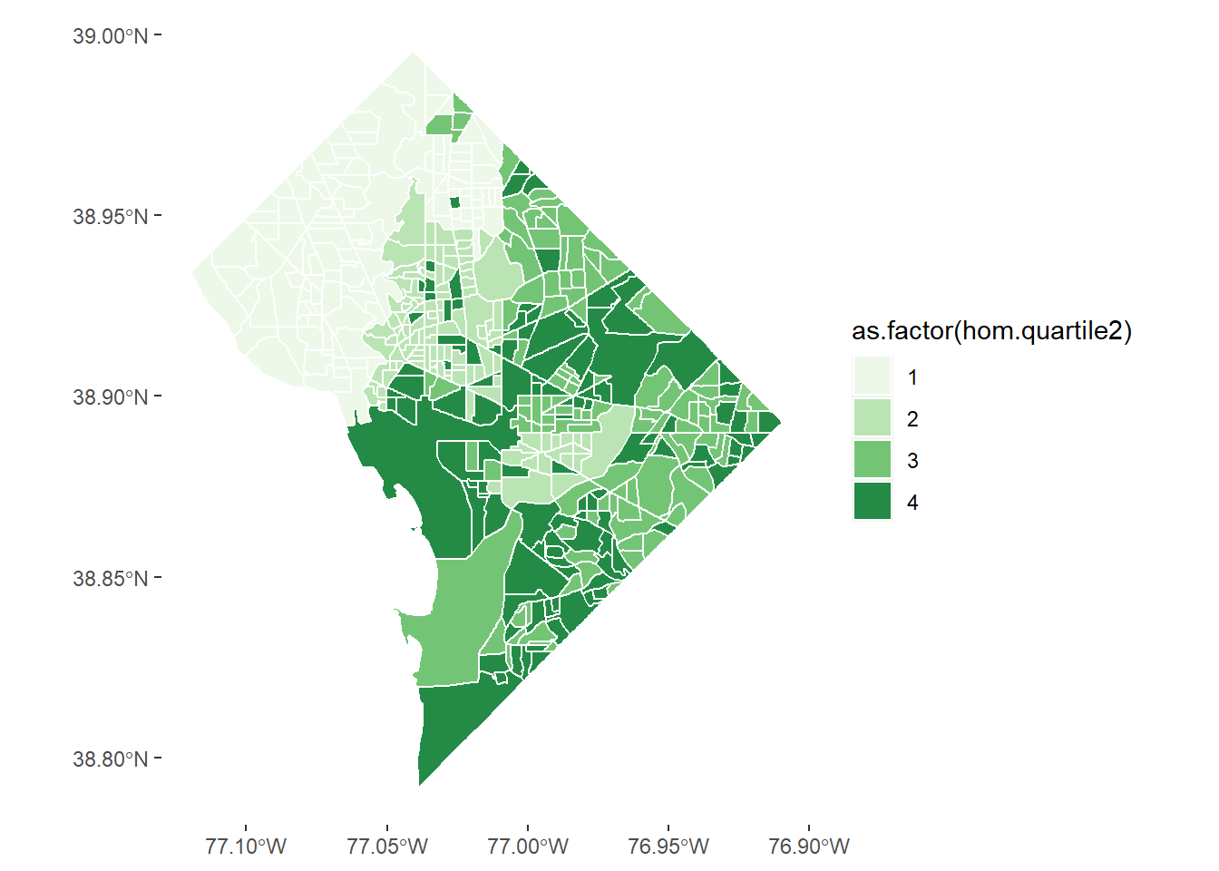
D.2. Homicides
Let’s repeat this exercise for homicides, of which there are (thankfully) many fewer than burglaries. First we set NAs equal to zero and then calculate quartiles (skipping the previous mistake!).
The legend on this graph is very misleading. Take a look at the number of homicides by quartile. The homework asks you to explain why it is so misleading and to make another graph that is not as misleading.
E. Legends that Show Distribution
I have come to believe that, when possible, all choropleth maps should be accompanied by a histogram legend. This is because, as we discuss in lecture, the histogram legend ameliorates part of the worst aspects of a choropleth map, namely the unconscious equation of size and value. It also helps us see the full distribution of the variable in a way that the map cannot.
This is a great example of a choropleth map with a histogram legend:
Choropleth Map with Histogram Legend
And a zoom in on the legend:
This example comes from Matthew Kiang who explains exactly how to do it in the linked blog post. We will try to do exactly what this author does, but it will not work out exactly because our the quartiles in our data don’t break neatly by category. We will then show a modified bar alternative.
E.1. Histogram Legend
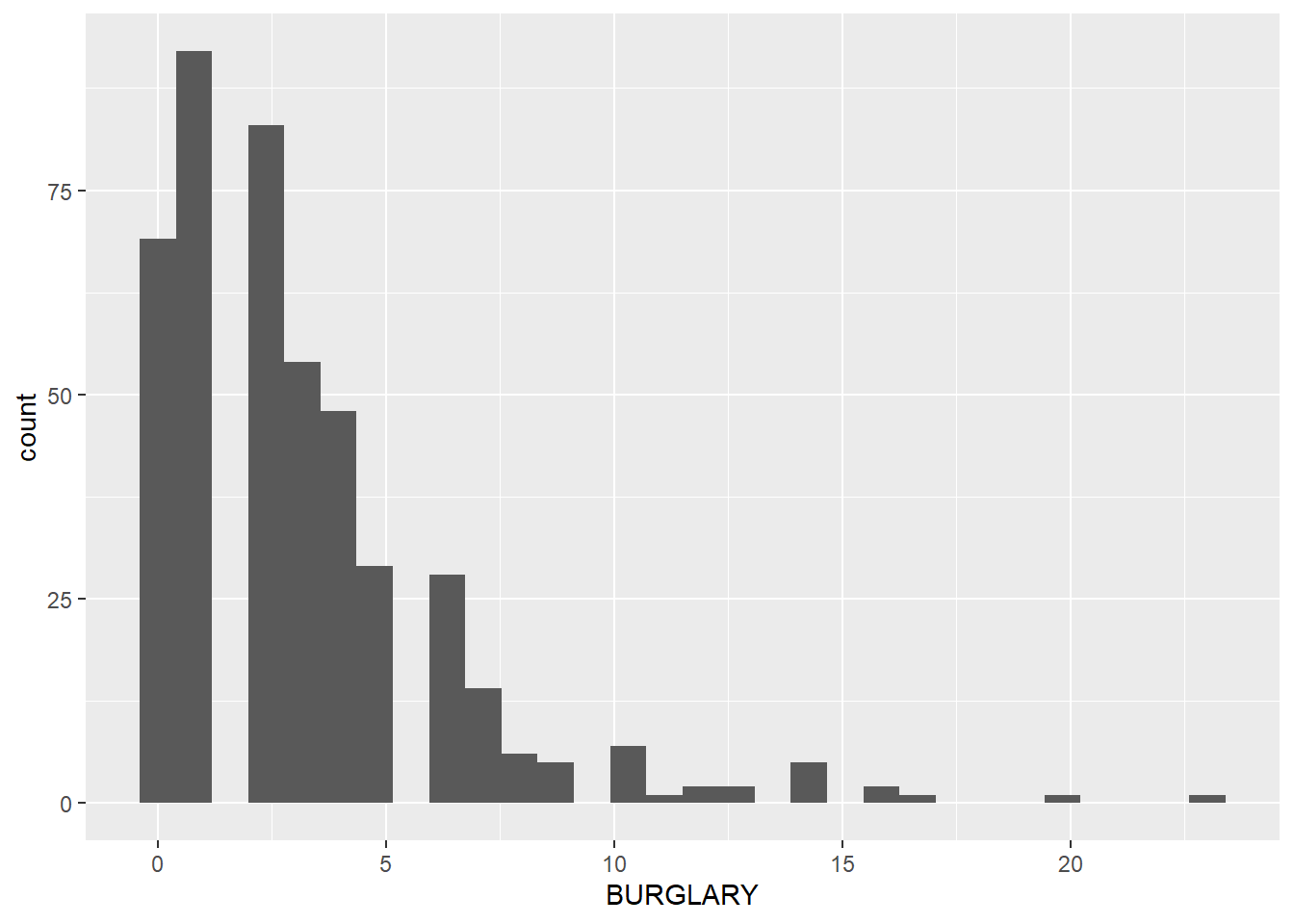
Below, we make a histogram showing the distribution of the number of burglaries, where the bars are colored the quartile in which the observation falls.
`stat_bin()` using `bins = 30`. Pick better value with `binwidth`.
But all the bars are grey! This is because we tried to fill with a numeric variable. Let’s try again with a factor. Let’s also add axis labels, get rid of the background and get rid of the legend.
# note that this wont work with the fill as a numeric thinglego <-ggplot() +geom_histogram(data = bg2010.c2, mapping =aes(x = BURGLARY, fill =as.factor(burg.quartile2))) +theme(legend.position ="none",axis.line.x =element_line(color="black"),axis.line.y =element_line(color="black"),panel.background =element_rect(fill ="transparent",colour =NA),plot.background =element_rect(fill ="transparent",colour =NA)) +labs(title ="", subtitle ="", x ="number of burglaries", y ="number of block groups")lego
`stat_bin()` using `bins = 30`. Pick better value with `binwidth`.
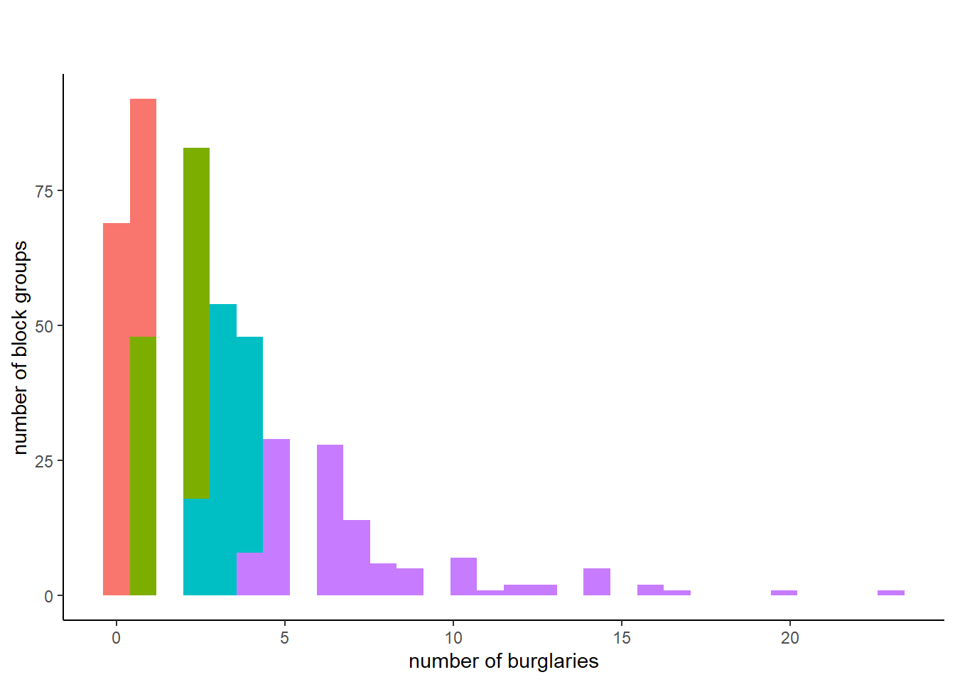
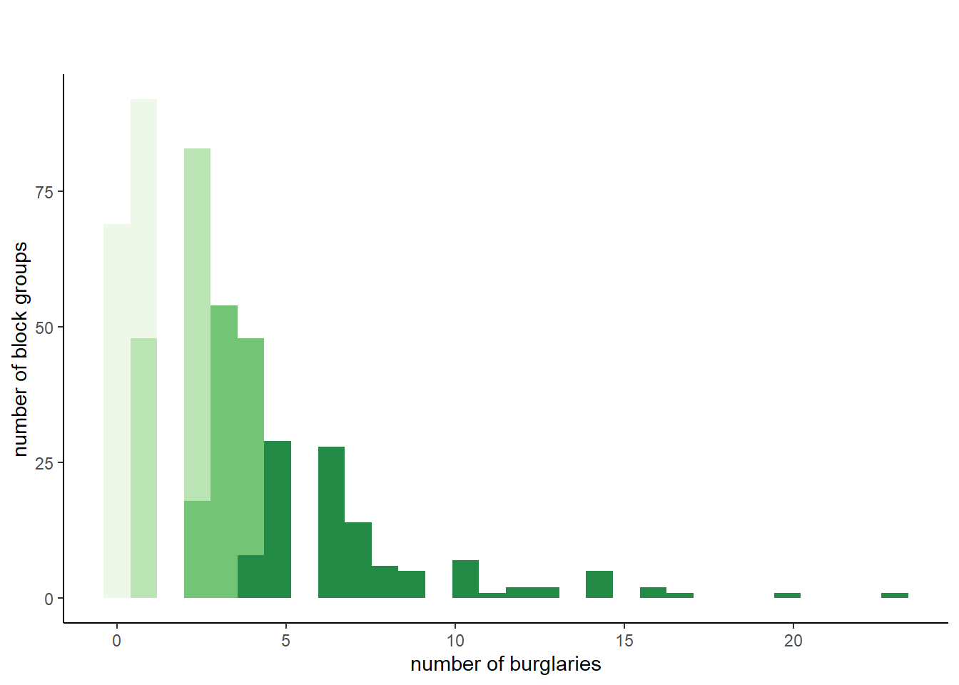
Now we have colors. But these aren’t very helpful because they are not the same colors in the map. The legend only works if we use the same colors as the choropleth. I do this below by adding the same scale_fill_manual() command from the choropleth maps.
# note that this wont work with the fill as a numeric thinglego <-ggplot() +geom_histogram(data = bg2010.c2, mapping =aes(x = BURGLARY, fill =as.factor(burg.quartile2))) +scale_fill_manual(values = four.colors) +theme(legend.position ="none",axis.line.x =element_line(color="black"),axis.line.y =element_line(color="black"),panel.background =element_rect(fill ="transparent",colour =NA),plot.background =element_rect(fill ="transparent",colour =NA)) +labs(title ="", subtitle ="", x ="number of burglaries", y ="number of block groups")lego
`stat_bin()` using `bins = 30`. Pick better value with `binwidth`.
This is sort of successful. The graph is on its way to being ok, but the output reveals a glaring problem for this type of representation. Some block groups with just one burglary are assigned to the first quartile. Other block groups with just one burgalry are assigned to the second quartile. This makes the legend too confusing.
What can you do? You can re-define your cut-offs, so that you create things that are not quartiles, but are interesting categories. This would allow clean cut-offs at integers that you could graph. This may sometimes be preferable.
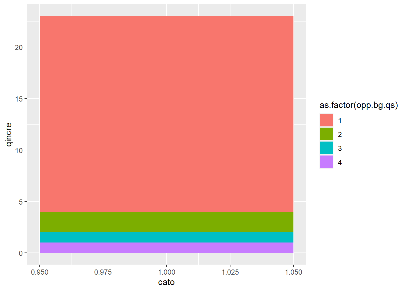
E.2. Distribution Bar
Another alternative to the histogram legend is a bar legend. If we are using quartiles, we know that each color has the same number of observations – but not the same range of values. A distribution bar legend can help readers understand this.
The first step to doing this is to get the cut-offs for the quartiles into a variable. To do this, I return to group_by() and summarize(). We group by the quartile created above and find the max and min value for each quartile with summarize().
The final command below re-orders the quartiles. We need to do this for the legend below, given how R plots the quartiles.
Sadly, this isn’t quite enough to make an appropriate bar graph. We also need a variable that tells us how much more each quartile gains above the previous. Basically, when we go to make a bar chart, R interprets the number of the y axis as the number of things in this category, not the absolute number. So we need a number that is parallel to “the number of things in this category” to trick R into making a bar chart that looks right.1
To this end, we use the tidyversemutate command to add a new variable that measures the increase in qmax from quartile to quartile. From each value of qmax, we subtract the value in the previous row (lag(qmax, n= 1)). As you can see, this gives nothing for the first observation, since it has no previous value. We set it equal to qmax, which is, appropriately, the number of things in this category.
# create the incremented valuedqcuts <-mutate(.data = qcuts,qincre = qmax -lag(qmax, n =1))qcuts
# assign the first quartile a value of 1 (its increment from zero)qcuts$qincre <-ifelse(test = qcuts$burg.quartile2 ==1,yes = qcuts$qmax,no = qcuts$qincre)qcuts
Now we are finally ready to make a one-bar graph with this. To do this we trick R into having a category for the bar (there will only be one, but that’s ok). We’ll call it cato and set it equal to 1.
qcuts$cato <-1
Now can we plot this?
### plot itp2 <-ggplot() +geom_bar(data = qcuts,mapping =aes(x = cato, fill =as.factor(opp.bg.qs), y = qincre),position ="stack",stat ="identity",width =0.1) p2
This is ok, but let’s do some fixes to make it look sort-of decent. Just like we made the quartile numbers backwards, we also have to make the colors backwards order to match:
Now readers can see that the first quartile of burglaries is very few burglaries, as is the second quartile. However, some block groups in the fourth quartile have over 20 burglaries per year.
Let’s do one more fix to this graphic, by adding the cut-offs as labels.
making the bar way less tall – this you can fix in ggsave() depending on how you save the data
maybe putting the quartile labels directly on the bars (e.g., “Q1”, “Q2”, etc.)
F. Dot Density Map
Our final task for this tutorial is to make a dot density map. A dot density map is an alternative way of showing spatial patterns on a map. Here is an example of something very similar to what we’re doing.
For this section, I needed to install a new package: lwgeom. that new packages should be installed by typing code directly into the console, not by putting this in your R script.
install.packages("lwgeom", dependencies =TRUE)
F.1. Housing Density
We begin with a density plot for housing units, showing how the density of housing units varies across space.
To start, let’s get a sense of what the housing unit variable looks like by block group, using summary and dim.
summary(bg2010$H0010001)
   Min. 1st Qu.  Median    Mean 3rd Qu.    Max.
    2.0   413.2   583.5   659.4   843.8  3134.0
dim(bg2010)
[1] 450 55
We learn that there are 450 block groups in DC, and the median block group has 583 housing units. We probably cannot make one dot per housing unit, since everything would look like a big black mass (but you can check if you want!).
So let’s rescale, so that we observe in units of 10 houses. We’ll round up if there are any houses at all. Alternatively, you could round based on 5, or really any number of your preference; the representation becomes more divergent from reality the more you need to round up. And, of course, we check the output.
# let's make each dot 10 houses, and then round up to 10 if < 10bg2010$hby10 <- bg2010$H0010001/10bg2010$hby10 <-ifelse(test = bg2010$hby10 <10, yes =1, no = bg2010$hby10)summary(bg2010$hby10)
   Min. 1st Qu.  Median    Mean 3rd Qu.    Max.
   1.00   41.33   58.35   65.94   84.38  313.40
# make an integer value for the next stepbg2010$hby10.int <-as.integer(bg2010$hby10)bg2010[1:10,c("hby10","hby10.int")]
The next step is to create a dataframe of points to put on the map. We’ll go through this code step by step.
The first line in the code below using st_sample() creates a matrix (hdots) of points from the simple feature file bg2010. It makes one row, corresponding to a point, for each value of the variable equal to size (here the number of housing units divided by 10), and points are allocated randomly within a block group (or whatever polygon you’ve told R in x=).
In other words, if the variable hby10.int is equal to 10, the command generates 10 rows in the matrix hdots. Each row in the matrix has a unique x, y coordinate randomly sampled from within the block group.
This command generates a lot of error messages. I have suppressed them so they don’t drive us crazy. Basically, they are saying that you are taking geographic coordinates and assuming the earth is flat for purposes of this sampling. Because our area is so small, that is perfectly fine.
But R does not yet know that the things in hdots are points, so we use st_cast() to “cast” them into points (to = "POINT"). Because we want to plot these points as a dataframe, not a simple feature (I’m not entirely sure why this is preferred, but it is what this author does, and I’m sure there must be a good reason!) we use st_coordinates() to put the information from hdots into a matrix that also has the randomly assigned x,y coordinates.
But ggplot can’t plot matrices, so we still need to create a dataframe using as.data.frame(), and then give names to the columns (with setNames).
# get the points to plothdots <-st_sample(x = bg2010, size = bg2010$hby10.int, type ="random")hdots <-st_cast(x = hdots, to ="POINT")hdots.mat <-st_coordinates(hdots)hdats.df <-as.data.frame(hdots.mat)hdats.df <-setNames(object = hdats.df, nm =c("lon","lat"))
This step will generate many repeated warning that “although coordinates are longitude/latitude, st_intersects assumes that they are planar.” This basically means that R is putting spherical coordinates on a flat plane. For an area as small as DC, this is not at all worrying.
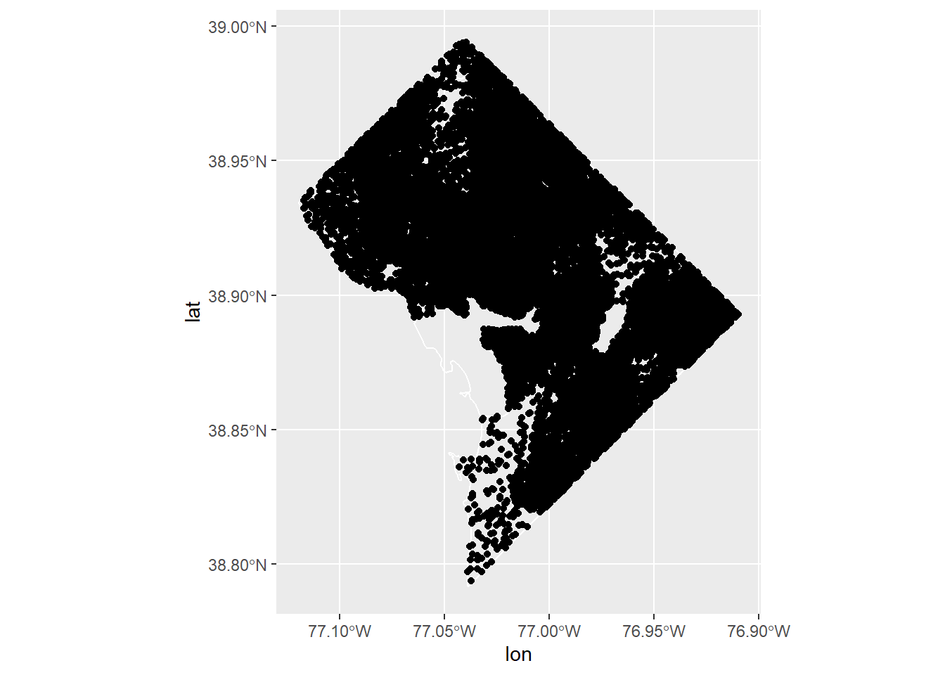
Now that we’ve put all these points together, let’s plot, using our old tool of geom_sf() for the block group map and geom_point() for the points.
# now plot it with the DC bg map behind ith.map <-ggplot() +geom_sf(data = bg2010, fill ="transparent", color ="white") +geom_point(data = hdats.df, mapping =aes(x=lon, y = lat))h.map
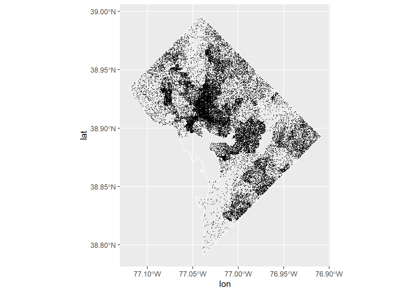
You can make this map bigger on your screen and see if it looks more legible. Alternatively, you can make small points using shape = ".".
h.map <-ggplot() +geom_sf(data = bg2010, fill ="transparent", color ="white") +geom_point(data = hdats.df, mapping =aes(x=lon, y = lat), shape =".")h.map
F.2. Dot density with two categories of things
This is just fine for one value, but I think the benefit of this method is when we want to show more than one value. In the previous graph, we could have equally well used a choropleth to make categoies of housing units density (housing units divided by land area).
So now we’ll make a map that shows occupied and vacant housing units. We’ll also use the function skills we learned last class. To make this new map, we need to make another density dataframe just as we did above.
Rather than copying and pasting, we’ll make a function to create these new dataframes. Our function has three inputs: the variable we want to make into points (hvar), the scaling we want to use (by 5 units? 10 units? here it is by scaler), and the name of the variable (namer; this was useful for de-bugging, as well as for creating a ID variable).
This code is very similar to the previous, with two exceptions. Instead of scaling by 10, I’m using the function to scale by 5. You can try alternatives – which is easy, once you’ve built this into the function.
The second exception is that I add a column to the hdats.df dataframe with the name of the type of unit: occupied or vacant. So I use this function twice, once for occupied units and once for vacant ones, each time returning a dataframe.
hfunc <-function(hvar,scaler,namer){# check distributionprint(summary(hvar))# let's make each dot 5 houses, and then round up if < 5 bg2010$hbyn <- hvar/scaler bg2010$hbyn <-ifelse(test = bg2010$hbyn < scaler, yes =1, no = bg2010$hbyn) bg2010$hbyn.int <-as.integer(bg2010$hbyn)# get the points to plot hdots <-st_sample(x = bg2010, size = bg2010$hbyn.int, type ="random") hdots <-st_cast(x = hdots, to ="POINT") hdots.mat <-st_coordinates(hdots) hdats.df <-as.data.frame(hdots.mat) hdats.df <-setNames(object = hdats.df, nm =c("lon","lat")) hdats.df <-data.frame(hdats.df, htype = namer)# get the dataframe outreturn(hdats.df)}## call the function # occupied unitsohdats.df <-hfunc(hvar = bg2010$H0010002,scaler =5, namer ="occupied housing")
   Min. 1st Qu.  Median    Mean 3rd Qu.    Max.
    2.0   373.2   533.0   592.7   749.5  2736.0
   Min. 1st Qu.  Median    Mean 3rd Qu.    Max.
   0.00   30.00   50.00   66.69   86.75  451.00
The last thing to do before we map is to stack our two dataframes into one and randomize the order for plotting. If we didn’t randomize, either all the occupied units or all the vacant units would be on top. First we stack the dataframes using rbind() (row bind, basically putting one dataframe on top of another).
We then use slice() which selects rows from a dataframe by position. We tell R we want the dataframe hhats.df, and we want the order to be sample(1:n()), which is a random number. So the new dataframe is the old one, but in a random order.
## stack these dataframeshhdats.df <-rbind(ohdats.df,vhdats.df)## randomize the order of the pointshhdats.df <-slice(.data = hhdats.df, sample(1:n()))
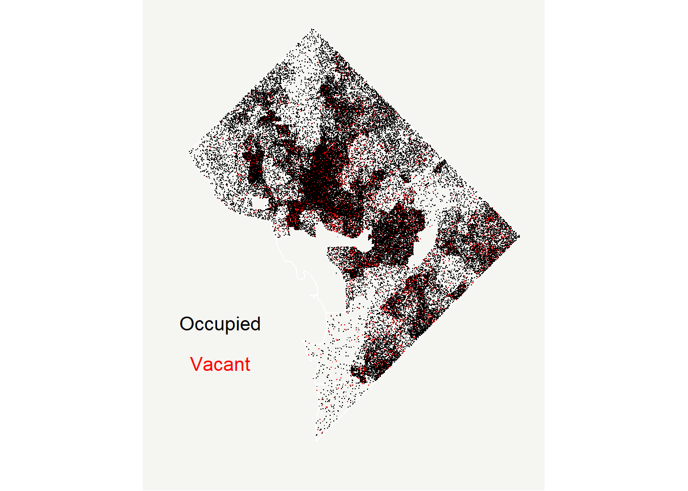
Finally, we plot it! Now we just plot the points using geom_point() (you could put the block groups behind, or wards, or whatever you think would be helpful). We tell R what colors we want with scale_color_manual() (not -fill- as before, since these are colors, not fills).
We use shape = "." to get very small points; you could use a different point or shape.
And finally, we use annotate() to put the relevant legend info straight onto the map. This is much easier to understand than the legend that R auto-generates (get rid of legend.position = "none" to see for yourself).
# now plot it with the DC bg map behind itoh.map <-ggplot() +geom_sf(data = bg2010, fill ="transparent", color ="white") +geom_point(data = hhdats.df, mapping =aes(x=lon, y=lat, color = htype), shape =".") +scale_color_manual(values =c("black","red")) +labs(x="",y="") +theme(plot.background =element_rect(fill ="#f5f5f2", color =NA), panel.background =element_rect(fill ="#f5f5f2", color =NA), panel.grid =element_blank(),legend.background =element_rect(fill ="#f5f5f2", color =NA),legend.position ="none",axis.ticks =element_blank(),axis.text =element_blank()) +annotate(geom ="text", label ="Occupied", x =-77.1, y =38.85, color ="black", size =5) +annotate(geom ="text", x =-77.1, y =38.83, label ="Vacant", color ="red", size =5) oh.map
G. Homework
Why is the homicide choropleth misleading? Fix it! (There are many ways to fix it – do anything you think is appropriate.)
Make choropleths for both homicides and burglaries in rates (per residential population). Recall that population is in bg2010 when you load it.
Pull in other geographic data (the data we used earlier this semester is fine, as is any other of your choice) and make a choropleth map with a histogram legend.
Make a dot density map with the data of your choice and at least two groups.
If you’re curious, you can do everything below where the y variable is qmax and see what you get.↩︎