In today’s tutorial, we learn how to make histograms. Histograms show the distribution of a single variable. They are very useful when you want to show details of a variable beyond the mean. For example, if you’re interested in showing income inequality, a histogram is very useful. Alternatively, you can calculate summary statistics that give measures of inequality; these are more limited descriptions of what you see in a histogram.
Histograms are also very useful as legends or context for other charts. I frequently recommend that the categorical label for a map be in the form of a bar-type histogram.
In this tutorial, we first use a small annual dataset of hurricanes by year since 1851 to get started. After establishing how histograms work, we then turn to a larger dataset of all neighborhoods in the Washington region, and work on further variations of histograms.
Along the way, we begin to introduce elements of ggplot’s theme() command for changing the chart background. You also learn how to save graphs via the command line, and how to create a sequence of numbers.
A. Load Packages and Small Data
As you did last week, create an R script for this class. Write all your commands in the R script (recall, a file with R commands ending in .R). You can run all of the program at once (code -> run region -> run all), or just selected lines.
At the end of this tutorial you should be able to run your entire R script once and it should run without errors. If this doesn’t work, there is a logical error in the order of your arguments, or some other problem.
A.1. Load packages
Start by loading the tidyverse set of packages so you can access ggplot2 and dplyr packages. You should also load the scales package. It is good practice to load all packages at the start of the program.
The following object is masked from 'package:purrr':

    discard
The following object is masked from 'package:readr':

    col_factor
A.2. Load and explore data
Now you should download this week’s data on hurricanes, and load them into R using read.csv(). These data come from this webpage; look at this page for complete variable definitions. I copied the online table into Excel and saved as a csv file in order to load into R.
Take a quick look at these data. What variables (columns) does it have? What do the first five observations look like (head)? And what types of variables does it have (str)?
'data.frame':   168 obs. of  4 variables:
 $ year        : int  1851 1852 1853 1854 1855 1856 1857 1858 1859 1860 ...
 $ Named.Storms: int  6 5 8 5 5 6 4 6 8 7 ...
 $ Hurricanes  : int  3 5 4 3 4 4 3 6 7 6 ...
 $ Major       : int  1 1 2 1 1 2 0 0 1 1 ...
B. Make a simple histogram
B.1. Check on data
Our first goal is to make a histogram of the number of hurricanes by year. How frequent are years with many hurricanes? Before making a histogram, let’s start by making a table that shows the data we’ll use in the histogram. We do this to check on data quality and to make sure that we are graphing something that can be graphed with a histogram.
We use the command table that we’ve used in the last tutorial.
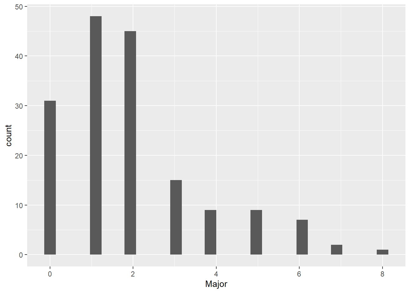
# make sure we know what data will tell ustable(hurr$Major)
 0  1  2  3  4  5  6  7  8
31 48 45 15  9  9  7  2  1
So far so good. This looks like it could be the number of hurricanes in a year. Read the table as saying that there are 38 years with zero hurricanes, 48 years with 1 hurricane, …, and one year with eight hurricanes.
B.2. Basic histograms
As a reminder, the three things R needs to make a graph are (i) the dataframe, (ii) the variable(s) you want to graph and (iii) the type of graph you’d like to make.
Note that I am creating the chart as an object c1, and I can refer to c1 elsewhere in the program if I like. I can add to it, as we’ll see later, and I can output it.
A small programming note: R will fail if you put the + on the second line (by this I mean on a separate line before the geom_whatever command). So make sure that you never start a continuing line of ggplot with a plus. See here for details.
# how many hurricanes by year?c1 <-ggplot() +geom_histogram(data = hurr,mapping =aes(x = Major)) c1
`stat_bin()` using `bins = 30`. Pick better value with `binwidth`.
This chart looks a bit odd. But before we get to the oddness of the chart, pay attention to the red error message in your console (Some students never get this message! If you don’t get it, just read through this section so you know what to do if you encounter a similar problem):
This message translates in English to “there is one observation from your dataframe that was intended for this chart that has a missing value.” What is this one missing? And why didn’t we see it in the table command above? We didn’t see it in the table() function because table() reports only for non-missing values by default.
B.3. Finding the missing value
When you have missing values, you should know why. Sometimes a value is missing because the observation (row) has no data when you got it. Alternatively, and sadly, frequently, missing data is a result of mistakes in programming.
We’ll now investigate why there is a missing value here. First, we want to check that there really is a missing value, given that the table command above didn’t report one. We use the summary() command to look at the distribution of a variable:
# fix data problemsummary(hurr$Major)
   Min. 1st Qu.  Median    Mean 3rd Qu.    Max.    NA's
  0.000   1.000   2.000   1.964   3.000   8.000       1
The summary output tells me that the mean number of hurricanes per year is almost 2 – and that there is one missing value.
Alternatively, you can use the table() function with the option `useNA = “always”):
# look at data problemtable(hurr$Major, useNA ="always")
   0    1    2    3    4    5    6    7    8 <NA>
  31   48   45   15    9    9    7    2    1    1
Either way, there is a missing value. Let’s look at this problematic observation, by just printing just a subset of the dataframe hurr where the variable Major takes on a value of missing.
# fix data problemhurr[which(is.na(hurr$Major) ==TRUE),]
    year Named.Storms Hurricanes Major
168   NA           NA         NA    NA
Notice that this error occurs in a row 168, which is also without a value for the variable year. Putting this together, I conclude that this is an extra row that R imported by mistake.
How do we get rid of this extra row? Use dim() to see how many rows the dataframe has
dim(hurr)
[1] 168 4
and we find that it is 168. That means this problematic observation is the last observation. This is also consistent with a data import problem.
Let’s get rid of this observation. Below I replace dataframe hurr with a new dataframe hurr with only observations where hurr$Major is not missing (see the first class’s tutorial if you don’t remember this syntax). We
# get rid of the obs with missing valueshurr <- hurr[which(is.na(hurr$Major) ==FALSE),]# check the size of the new dataframedim(hurr)
[1] 167 4
Once you’ve figured out where the problem is and what’s causing it there are alternative ways to get to this same outcome. For example, you could do
hurr <-filter(.data = hurr, is.na(Major) ==FALSE)
Here we replace dataframe hurr with a revised data from where the variable Major is not missing (is.na() == FALSE).
B.4. Basic histogram, again
Now let’s try the graph again. You should have no error message about non-finite values.
# how many hurricanes by year?c1 <-ggplot() +geom_histogram(data = hurr,mapping =aes(x = Major)) c1
`stat_bin()` using `bins = 30`. Pick better value with `binwidth`.
The other warning message is about the number of bins. R is putting the data into 30 bins, I think by default. This is odd, given that our measure of hurricaines per year is an integer that takes values 0 through 8. In other words, R is creating 30 bins from the range from 0 to 8. This makes a set of 30 bins like this: [0-8/30, 8/30-16/30, 16/30-24/30, … , 232/30-240/30], or in decimals [0 - 0.26, 0.26 - 0.53, 0.53 - 0.8, …, 7.73 - 8].
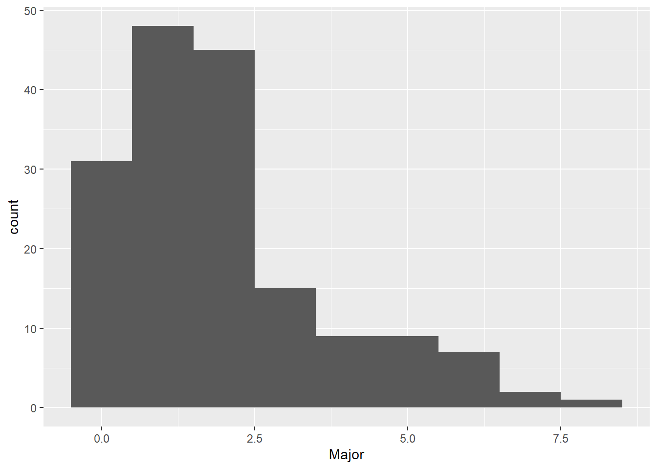
This is crazy! We have only 9 bins (zero through 8), so we need to tell R this explicitly, using the bins option inside geom_histogram. Note that this option is inside the geom call, since it is specific to this type of graph. However, the bins option is outside the aes() portion of the command, since it is not assigning data to location on the chart.
# we know there are only 9 bins. fix to reflectc1 <-ggplot() +geom_histogram(data = hurr,mapping =aes(x = Major),bins =9) c1
This graph could still use some work. For one, the axis labels in the above are entirely unhelpful. We now do two things to make the axes more legible. First, we modify axis labels by using the labs command to add in x and y axis labels. You can also use this command to get rid of labels.
Second, to change the numeric labeling on the x axis, I use the scale_x_continuous(breaks = seq(from = 0,to = 8,by = 1)) to tell R to use numbers 0 to 8 as the labeled breakpoints on the horizontal axis. The command seq(from = 0,to = 8,by = 1) means “create a sequence starting at 0, going to 8, by 1.” Alternatively, I could have written scale_x_continuous(breaks = c(0,1,2,3,4,5,6,7,8)), but the first one is shorter, cleaner and easier to modify if you want to later make changes.
The sequence framework is easily modifiable. For example, seq(from = 0, to = 1,by = 0.25) means “create a sequence starting at 0, going to 1, by 1/4.” Try it and see:
my.seq <-seq(from =0,to =1,by =0.25)my.seq
[1] 0.00 0.25 0.50 0.75 1.00
Does the sequence look as you expected?
And now for the new graph with both additions:
# with improved labelsc1 <-ggplot() +geom_histogram(data = hurr,mapping =aes(x = Major),bins =9) +scale_x_continuous(breaks =seq(0,8,1)) +labs(x ="number of hurricanes in a year",y ="number of years")c1
The background in the above chart is distracting and unhelpful. Like almost everything in ggplot, the background is also modifiable. The background and the types of axes, and many other things are parts of the “theme” of the graph, and you modify them with the theme() command. You can see the zillions of full options for modification here. Right now, we’ll just get rid of the grid and the background color. Here I use panel.grid, but you can adjust both the major and minor grids with panel.grid.major and panel.grid.minor. “Getting rid” means setting to element_blank(). I also set the axis lines black.
# get rid of crazy background that is confusingc1 <-ggplot() +geom_histogram(data = hurr,mapping =aes(x = Major),bins =9) +scale_x_continuous(breaks =seq(from =0,to =8,by =1)) +labs(x ="number of hurricanes in a year",y ="number of years") +theme(panel.grid =element_blank(), panel.background =element_blank(), axis.line =element_line(color ="black"))c1
C. Modifying the basic histogram
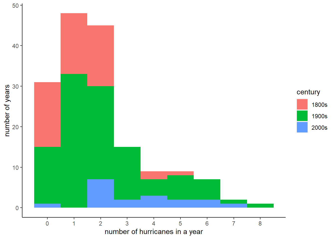
The histogram above is doing one job: telling us the overall distribution of number of major hurricaines by year. Suppose we want to convey some additional information – perhaps we’d like to show that the number of hurricaines by century is on the rise.
Below is an interesting but not-perfect technique for doing this. We color in the bars to reflect the number of observations that come from each century. This is visually clear, but somewhat misleading because each century does not have the same number of observations. In other words, saying that there were ten hurricaines in the 2000s (as yet incomplete) is more striking than saying there were ten hurricaines in all the 100 years of the 1900s. We are not going to deal with this concern in this section. However, later in the tutorial we return to ways to compare distributions.
To color the number of observations from each century in each bar, we first need a variable that marks century. Start by looking at the distribution of years with summary:
summary(hurr$year)
   Min. 1st Qu.  Median    Mean 3rd Qu.    Max.
   1851    1892    1934    1934    1976    2017
We see that there are years in the 1800s, 1900s and 2000s. Now assign the century marker using the ifelse command. Note that the command actually has two ifelses. First we ask whether year in dataframe hurr is less than 1900. If yes, assign the century variable the value of “1800s”. If not true, then we move to the second ifelse, which says if year is greater than or equal to 1900 and at the same time less than 2000, assign the century variable the value “1900s.” For all other values of year (which we know are only in the 2000s from looking above), assign the century variable the value “2000s”.
# color sections of bars?hurr$century <-ifelse(test = hurr$year <1900,yes ="1800s",no =ifelse(test = hurr$year >=1900& hurr$year <2000,yes ="1900s",no ="2000s"))
We then check our work with a table() command, making sure that we have roughly the number of observations for each century that we think we should. We also see what type of variable R created – century is character variable.
To add color to the graph, we add to the “aesthetics” command for the graph. We put the color in the aesthetics portion of the command because the color derives from the data. (If we wanted to color all the bars the same color, we would use color = [] inside the geom_histogram command, but outside of the aes().) Specifically, we tell R to fill in the bars by the century, using fill = century. Note that century is a character variable; you don’t need a factor variable for the fill (but you do need a categorical variable!).
# color bars by centuryc1 <-ggplot() +geom_histogram(data = hurr,mapping =aes(x = Major, fill = century),bins =9) +scale_x_continuous(breaks =seq(from =0, to =8, by =1)) +labs(x ="number of hurricanes in a year",y ="number of years") +theme(panel.grid.major =element_blank(), panel.grid.minor =element_blank(),panel.background =element_blank(), axis.line =element_line(colour ="black"))c1
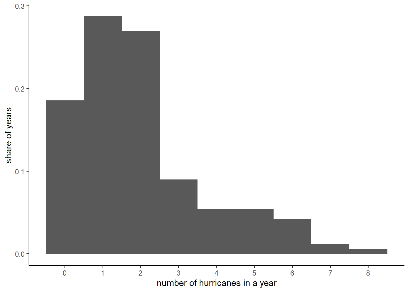
All the graphs we’ve made till now use the number of observations on the vertical axis. Sometimes it is more useful to show shares rather than numbers. You can do this easily by telling R that the y axis should be a share: y = ..density... This will change the numbering on the y axis, but not the height of the bars (your homework asks why).
# show as percentage, rather than numberc1 <-ggplot() +geom_histogram(data = hurr,mapping =aes(x = Major, y = ..density..),bins =9) +scale_x_continuous(breaks =seq(0,8,1)) +labs(x ="number of hurricanes in a year",y ="share of years") +theme(panel.grid.major =element_blank(), panel.grid.minor =element_blank(),panel.background =element_blank(), axis.line =element_line(colour ="black"))c1
I wanted to also show you how you could make this plot with dots instead of bars, sort of like the example below. However, this requires using a new geom command, so we’ll save it for later in the semester.
Dot Plot
D. Load and examine a new dataset
Now we are going to do more histogram examples with a larger dataset where you cannot get a good sense of the entire data by browing on the data viewer. We do this to work on your skills with larger datasets and to have enough data to make interesting histogram comparisons.
Specifically, we are using data on neighborhoods called block groups. A block group is an area of typically between 600 to 3,000 people. You can find examples of block groups by looking here. Both Montgomery and Prince George’s County neighbor DC, so I encourage you to look at one of those. We will use block group data multiple times this semester, so I encourage you to follow the links and get an understanding of how these data are set up.
For each block group, we observe data on people and housing. These data come from the Census Bureau’s American Community Survey and reports an average for years 2015-2019.
Use this Census provided dictionary to understand variables. For example, variable B01001_001E is the total of sex by age, which is a longhand way of saying the total population. The data you are getting does not have all the variables listed in this linked table – as you can see, there are thousands of them.
This linked file can be somewhat opaque. If you prefer a slightly less opaque documentation, see this Excel file created by the Census. Our variable B010001_001E is the variable in row four; this name has the table ID plus the line number (001), plus a “E” to represent estimate.
For further information, consult American Community Survey documentation.
A block group is uniquely identified by the variables state + county + tract + blkgrp.
This file contains just data from the 24 jurisdictions that make up the Washington, DC metropolitan area from VA, MD, WV and DC so as to be of a manageable size. If you desperately want additional variables, please let me know.
Download the data from here. When you download, note that these data have a “.rds” extension, meaning that they are in R format.
Since these data are in R format, you can’t use read.csv to open them. Instead, use readRDS(), for read R dataset.
# load the data# data are created in # /groups/brooksgrp/pppa_dataviz/r_programs/2021/acsinv03.Rblock.groups <-readRDS("h:/pppa_data_viz/2021/tutorial_data/tutorial_04/acs5_bg_dmv_2019_20210202.rds")# How big is it?dim(block.groups)
[1] 3570 33
# What variables does it have?str(block.groups)
'data.frame':   3570 obs. of  33 variables:
 $ NAME       : chr  "Block Group 2, Census Tract 88.02, District of Columbia, District of Columbia" "Block Group 3, Census Tract 88.02, District of Columbia, District of Columbia" "Block Group 3, Census Tract 96.03, District of Columbia, District of Columbia" "Block Group 1, Census Tract 96.03, District of Columbia, District of Columbia" ...
 $ B01001_001E: int  1368 1211 1077 2048 844 2196 1063 1640 1132 864 ...
 $ B17017_001E: int  554 514 529 840 323 845 457 629 679 328 ...
 $ B17017_002E: int  170 32 109 224 22 274 203 192 24 12 ...
 $ B19013_001E: int  32250 72750 35731 43929 72413 22589 19306 96152 133625 250001 ...
 $ B19057_001E: int  554 514 529 840 323 845 457 629 679 328 ...
 $ B19057_002E: int  14 31 8 54 17 85 26 13 0 0 ...
 $ B25003_001E: int  554 514 529 840 323 845 457 629 679 328 ...
 $ B25003_002E: int  259 245 68 173 265 158 138 192 358 242 ...
 $ B11007_001E: int  554 514 529 840 323 845 457 629 679 328 ...
 $ B11007_003E: int  129 36 96 133 31 166 55 103 56 59 ...
 $ B25057_001E: int  322 891 733 -666666666 648 99 950 -666666666 1777 1636 ...
 $ B25058_001E: int  675 1038 928 1042 -666666666 716 1163 962 2110 1772 ...
 $ B25059_001E: int  1314 -666666666 1216 1188 1681 1139 1395 1870 2514 1908 ...
 $ B25076_001E: int  383000 468800 184200 164500 231700 198900 158800 240000 454400 1080400 ...
 $ B25077_001E: int  558000 614100 206400 282400 354900 240600 276600 362800 627700 1916700 ...
 $ B25079_001E: int  137981000 142880000 NA NA 84225600 NA 34229000 NA 399515200 NA ...
 $ B25107_001E: logi  NA NA NA NA NA NA ...
 $ B25107_002E: logi  NA NA NA NA NA NA ...
 $ B25107_003E: logi  NA NA NA NA NA NA ...
 $ B25107_004E: logi  NA NA NA NA NA NA ...
 $ B25107_005E: logi  NA NA NA NA NA NA ...
 $ B25107_006E: logi  NA NA NA NA NA NA ...
 $ B25107_007E: logi  NA NA NA NA NA NA ...
 $ B25107_008E: logi  NA NA NA NA NA NA ...
 $ B25107_009E: logi  NA NA NA NA NA NA ...
 $ B25107_010E: logi  NA NA NA NA NA NA ...
 $ B25107_011E: logi  NA NA NA NA NA NA ...
 $ state      : int  11 11 11 11 11 11 11 11 11 11 ...
 $ county     : int  1 1 1 1 1 1 1 1 1 1 ...
 $ tract      : int  8802 8802 9603 9603 9603 9801 9802 2802 4100 4100 ...
 $ block.group: int  2 3 3 1 2 1 2 2 1 3 ...
 $ acs        : num  1 1 1 1 1 1 1 1 1 1 ...
E. Basic histograms, bigger data
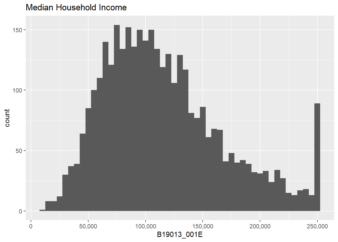
Let’s return to histograms and plot the distribution of median household income over the past 12 months, or B19013_001E.
Before making the histogram, let’s take a quick look at the data to make sure we understand it
summary(block.groups$B19013_001E)
      Min.    1st Qu.     Median       Mean    3rd Qu.       Max.
-666666666      75124     105495  -12398300     143655     250001
Watch out! A few block groups have a value of median income = -666666666 – obviously not a real income. This is a Census code for “this block group does not have data, please look at the data documentation as to why.” We will just set these values to missing:
block.groups$B19013_001E <-ifelse(test = block.groups$B19013_001E ==-666666666,yes =NA,no = block.groups$B19013_001E)# check if this workssummary(block.groups$B19013_001E)
   Min. 1st Qu.  Median    Mean 3rd Qu.    Max.    NA's
  11950   76364  106618  115540  144364  250001      67
Now let’s do a basic histogram:
## this makes a basic histograme1 <-ggplot() +geom_histogram(data = block.groups,mapping =aes(x=B19013_001E))e1
`stat_bin()` using `bins = 30`. Pick better value with `binwidth`.
The warning message tells us that there are 67 observations with no income data. This is a small share of the roughly 3,500 observations in the entire dataset. Likely, these are relatively unpopulated block groups. But we don’t have to assume! We can check if this is the case by looking at the average population (B01001_001E) when income is missing (is.na(B19013_001E)).
# overall populationprint("all block groups")
[1] "all block groups"
summary(block.groups$B01001_001E)
   Min. 1st Qu.  Median    Mean 3rd Qu.    Max.
      0    1107    1548    1732    2151    9133
# for block groups with missing incomeprint("block groups with missing income")
   Min. 1st Qu.  Median    Mean 3rd Qu.    Max.
      0      78     696     872    1251    4591
From this, we learn that block groups with no reported median income information have much lower than avearge population – this is comforting, since we are not missing income for well-populated ares.
Before we do anything else, let’s make the horizontal axis legible by using the scales package and the scale_x_continuous() option.
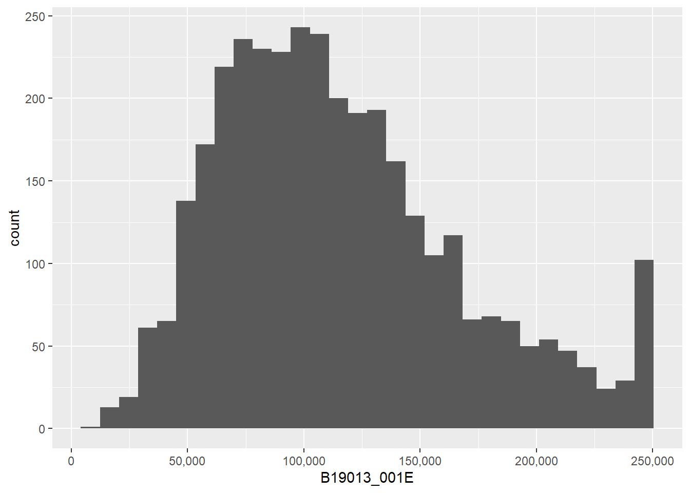
# fix axis to be legiblee11 <-ggplot() +geom_histogram(data = block.groups,mapping =aes(x=B19013_001E)) +scale_x_continuous(labels = comma)e11
`stat_bin()` using `bins = 30`. Pick better value with `binwidth`.
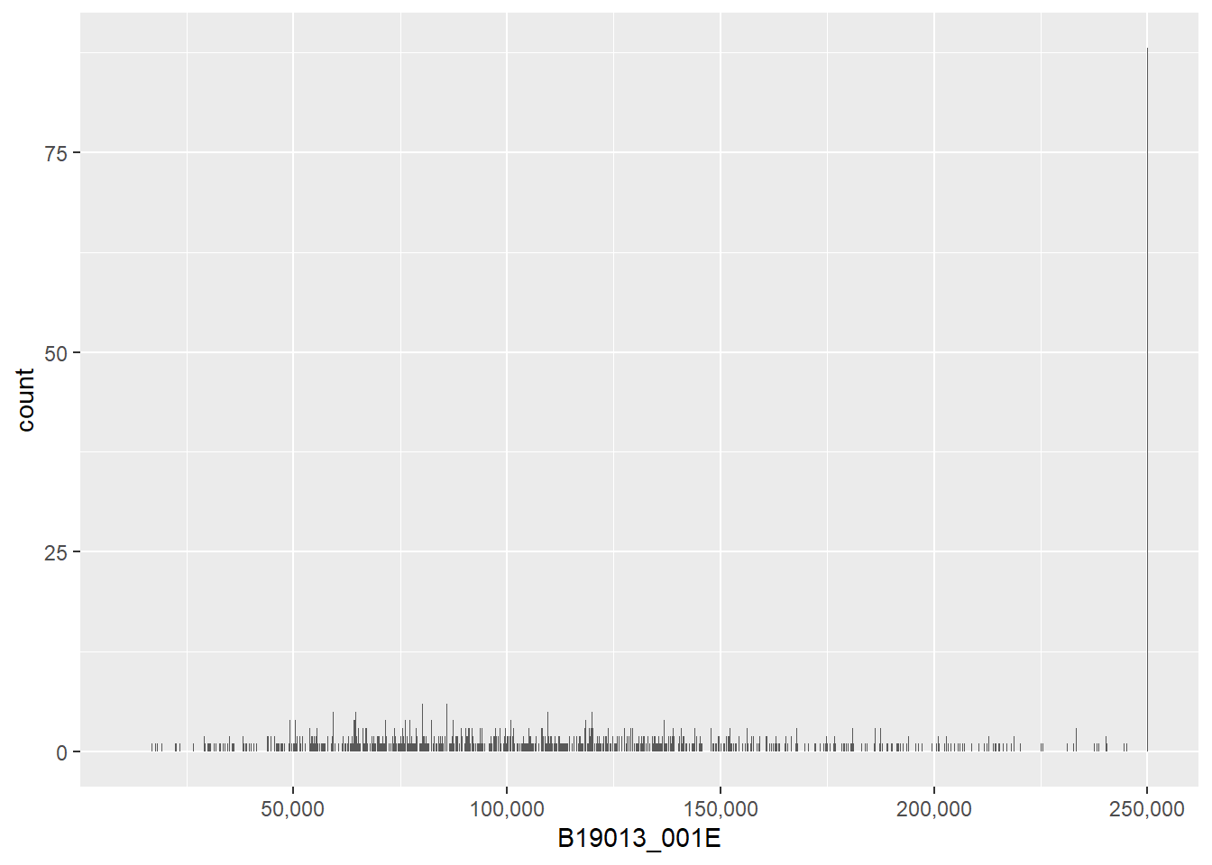
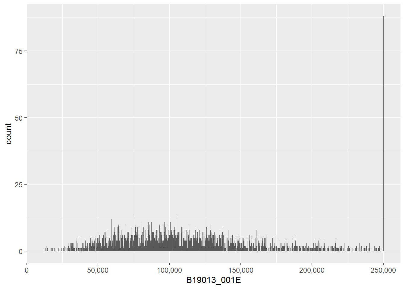
Now that we have a wealth of data, we can explore how changing the bin width (the width of the vertical bar, or how many values of income you group together) impacts the look of the graph. In the first, ggplot counts the number of block groups by $50 bin. In other words, the number of block groups where the median income is between 0 and $50, the number of block groups where the median income is between $50 and $100, etc.
## here we begin changing the width of the histogram binse2 <-ggplot() +geom_histogram(data = block.groups,mapping =aes(x=B19013_001E),binwidth =50) +scale_x_continuous(labels = comma)e2
Note that the choice of bin is very important to the final look of the graph. Also notice that very small bins make the top-coded final category (for all block groups with a median income greater than 250,000, the Census reports 250,000) look big.
Even with the small number of plots we just made, we can get lost without titles. (Though frequently I end up omitting the title in the very final product because I put the plot in a presentation slide and put the title on in the slide itself.) Here again we use labs for title and axis labels.
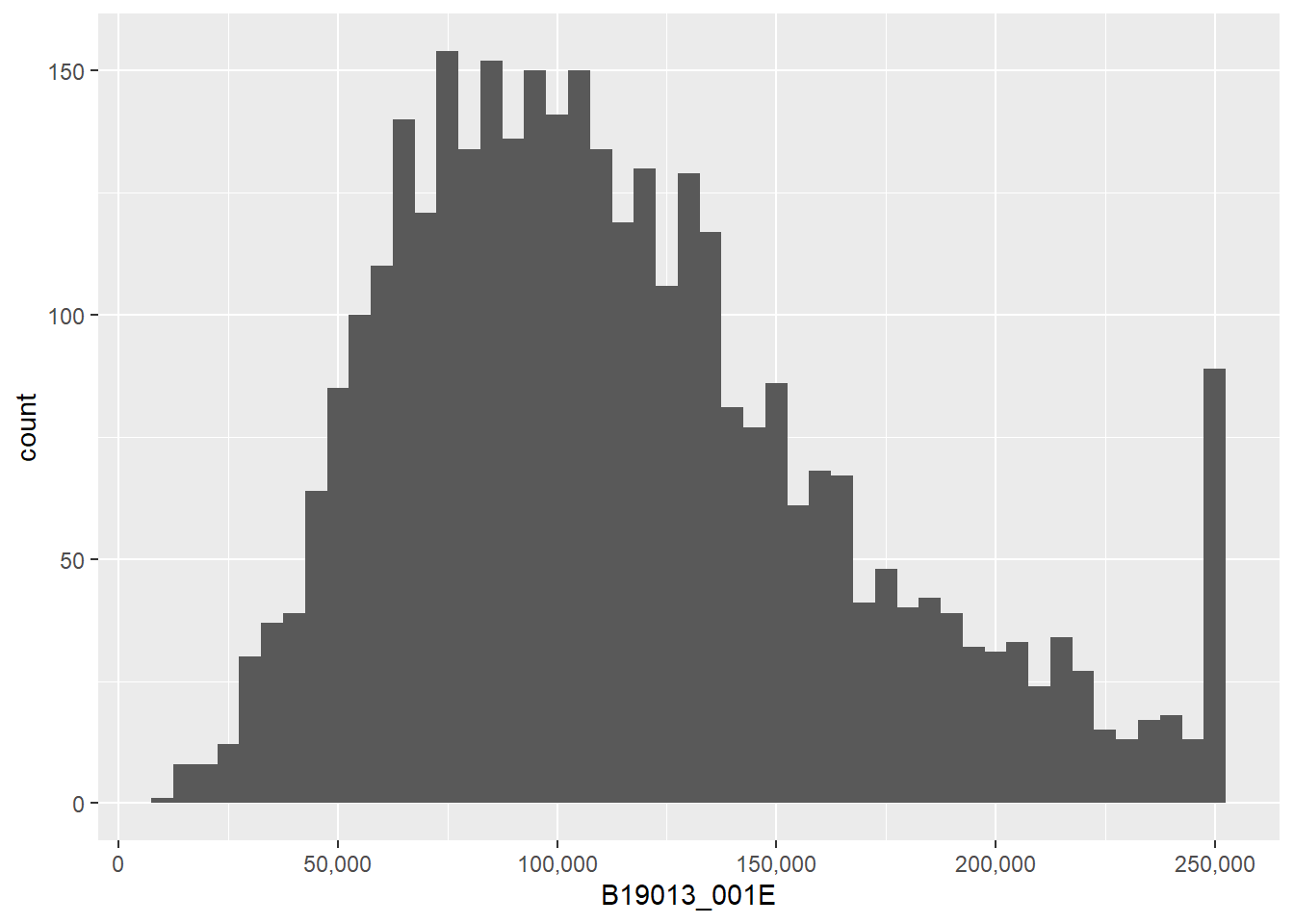
## make things legible: titles and axesf1 <-ggplot() +geom_histogram(data = block.groups,mapping =aes(x=B19013_001E),binwidth =5000) +labs(title ="Median Household Income") +scale_x_continuous(labels = comma)f1
We will talk more later about the power of titles and axis labels. You should consider them key to any decent final product.
F. Other ggplot options for types of histograms
Here we explore density curves and subsets.
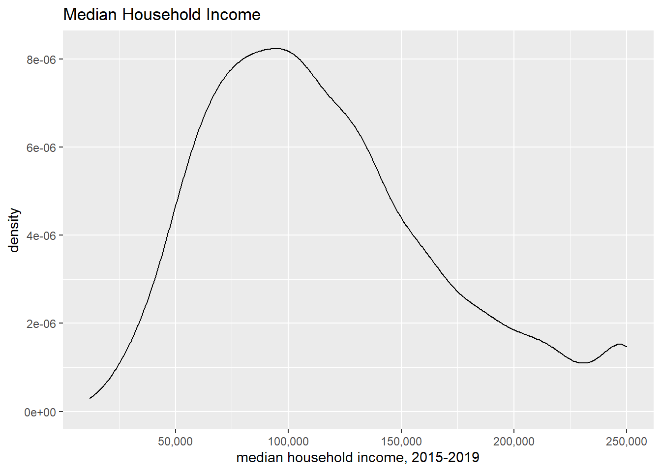
F.1. Density curves
We begin by using curves. To do so, use geom_density(), which makes a smoothed density curve (very close to a continuous histogram). Whether or not smoothing is appropriate depends on your data and goals.
This shows the same information as the histogram above, but displayed differently. The y axis is no longer the number of block groups. The values on the y axis are scaled so that if you drew tiny thin lines from the x axis to the curve, and you added the length of all of these lines, you would get to 1. (For those that know calculus, the area under the curve integrates to one.) Visually, this is quite similar to the histogram.
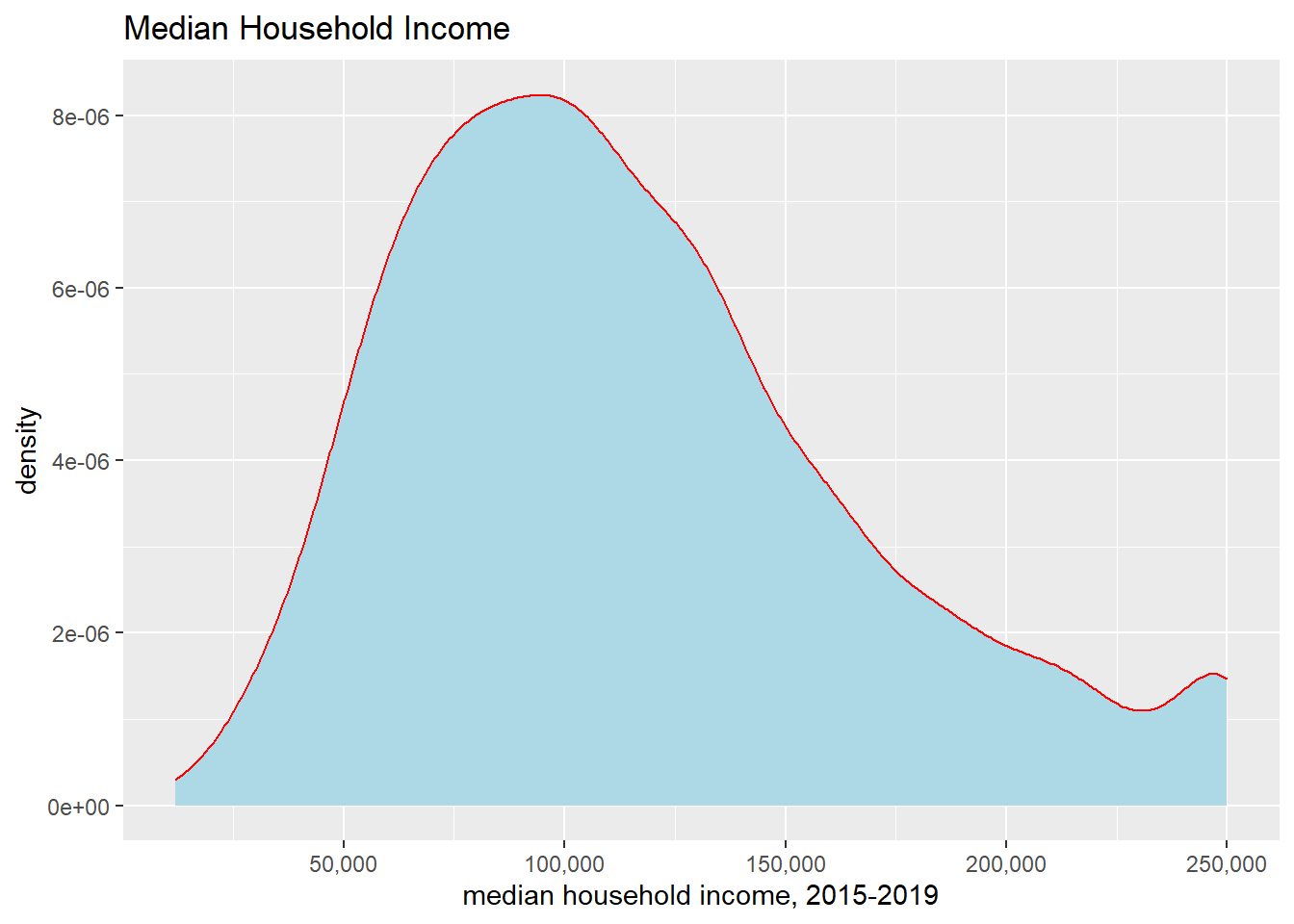
It is sometimes useful to color in the area under the line, which you can do by telling R a color to fill the plot. I’ve also changed the color of the line with the color = option. Please don’t take this as an endorsement of this graph! Merely an illustration of the possibilities.
I don’t view these as superior to the previous final histogram because to me they seem more difficult to understand without any other benefit.
F.2. Subgroups
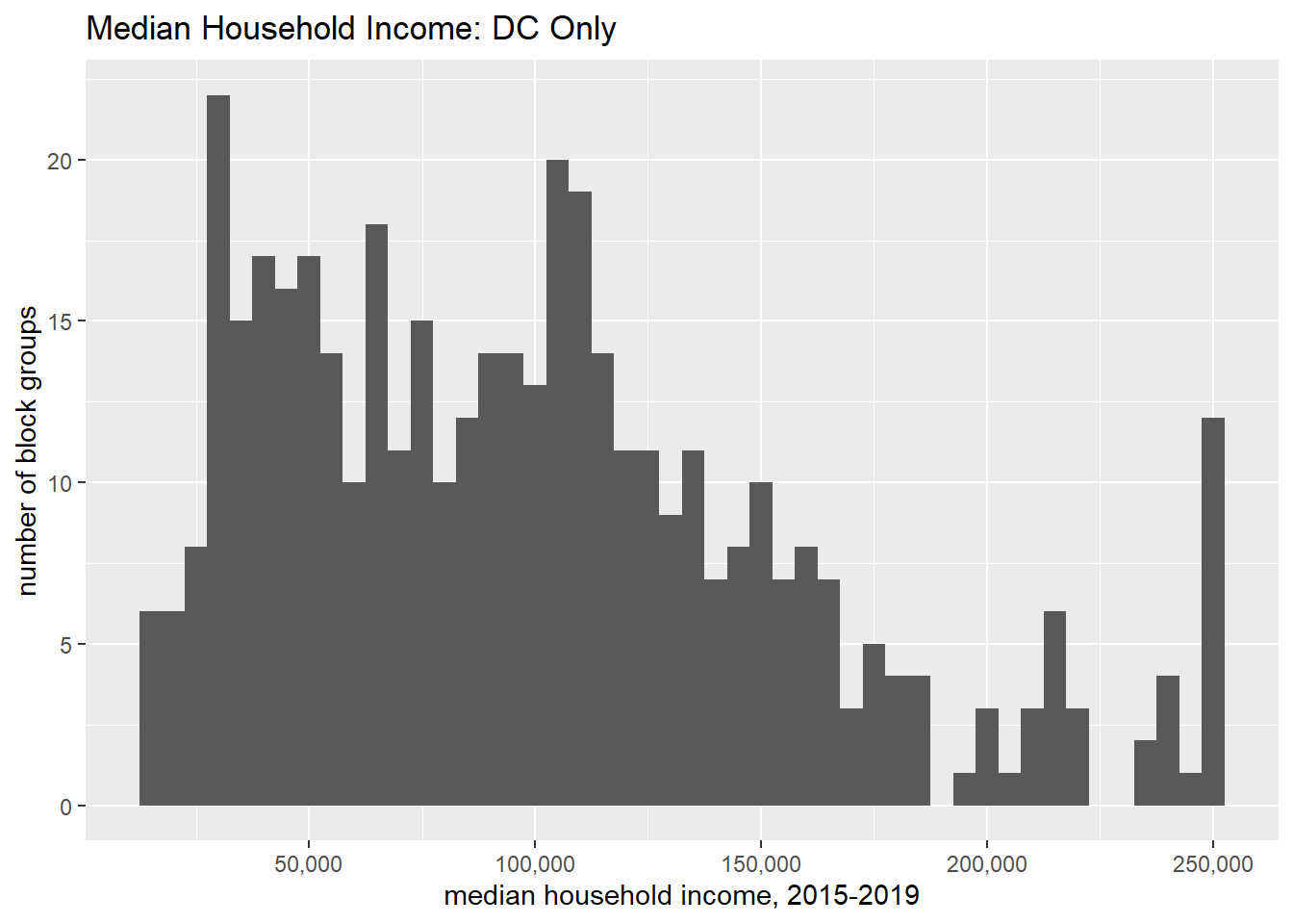
We can limit the analysis only to a subgroup – this can frequently be useful and enlightening. Note that we use the double equals sign for evaluating (here we are evaluating, not assigning). Below we limit to block groups in DC (block.groups$state == 11).
## subsetting to only certain data# one wayggplot() +geom_histogram(data = block.groups[which(block.groups$state ==11),],mapping =aes(x=B19013_001E),binwidth =5000) +stat_bin(geom ="area") +labs(title ="Median Household Income",x="median household income, 2015-2019",y="number of block groups") +scale_x_continuous(labels = comma)
Compare this distribution to the previous to see how DC’s relative distribution. Of course, looking across two graphs is not an ideal comparison method. We’ll work on this as we go along.
There are many ways to subset data in R. An alternative, that I show but do not run, is to use the filter command. The method above and the method below are entirely equivalent.
# alternative dc.only <-filter(.data = block.groups, state ==11)ggplot() +geom_histogram(dc.only,mapping =aes(x=B19013_001E, na.rm =TRUE),binwidth =5000) +stat_bin(geom ="area") +labs(title ="Median Household Income: DC Only",x="median household income, 2015-2019",y="number of block groups") +scale_x_continuous(labels = comma)
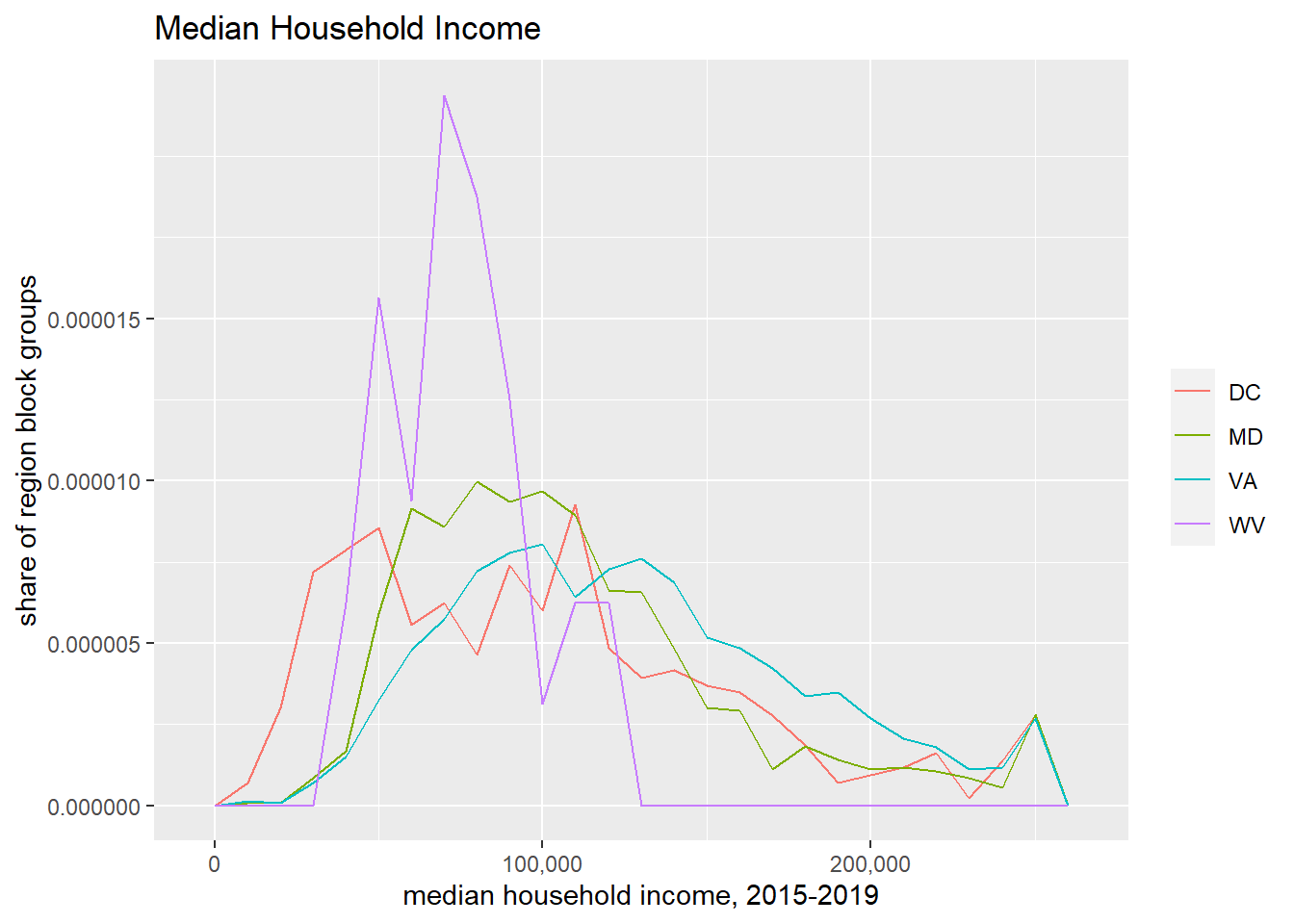
Now we want to show the block group income distribution in DC, MD and VA together on one chart.
G.1. Showing by group
If you have used other programming languages, you might think about using a loop. However, loops are not very R-like. Almost everything that a loop does is better done with a matrix or list in R. You sometimes have to do heroic coding to make a loop work like you’d like, and heroics are not needed.
Rather than a loop, use ggplot’s built-in tools to make graphs by group.
The important missing ingredient before we do this is to recall our discussion of R’s “factor” variables. In essence, a factor variable is a variable that takes on a limited number of values. This may also be known as a categorical variable.
We care about factors here because there are certain things you can do in graphs only with factor variables. If something is not already a factor variable, but it takes on a limited set of values, you can tell R to use it as a factor by putting as.factor() around it.
Here we use yet another potential command for creating histograms: geom_freqpoly(). This command also generates a density curve, but does not smooth like geom_density().
To tell R that we want one curve for each state, we add color = as.factor(state). This goes inside the aes() command, because it is telling ggplot how to use data to plot.
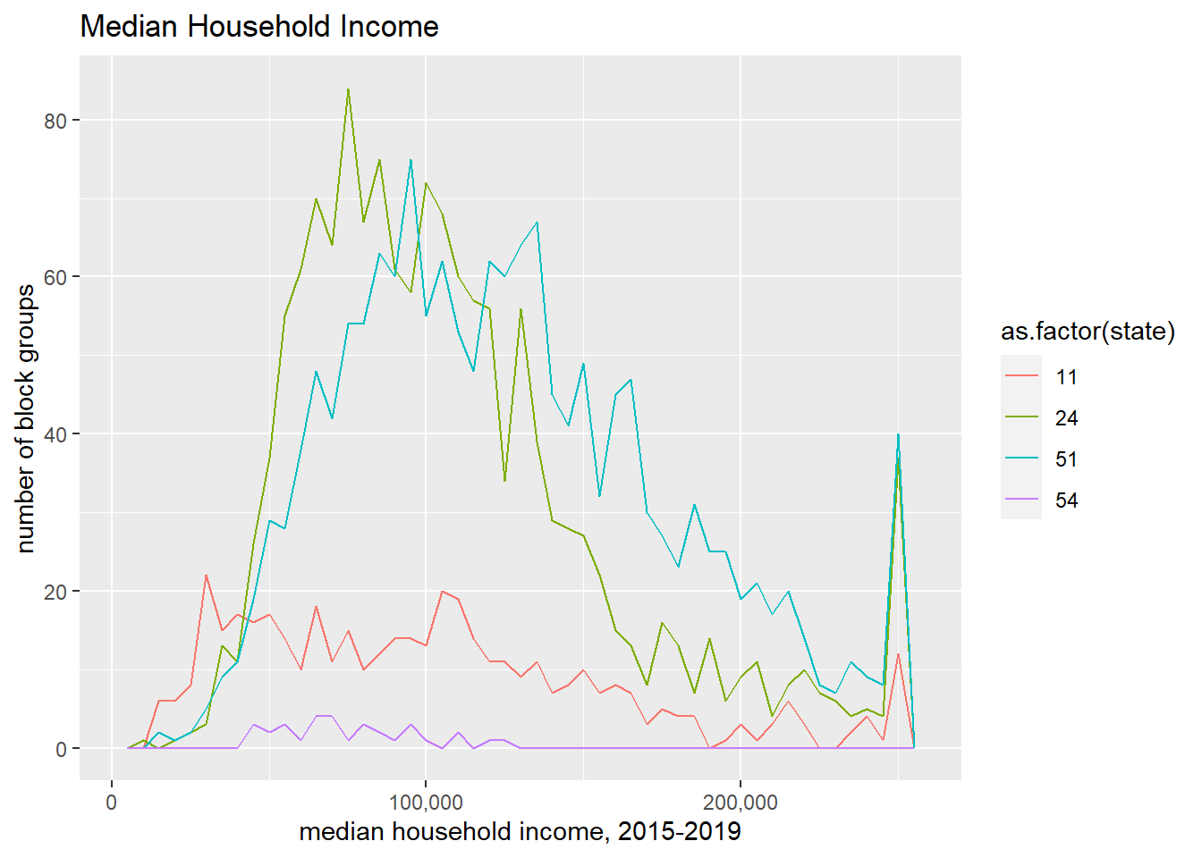
The code below shows the number of block groups by state for median income:
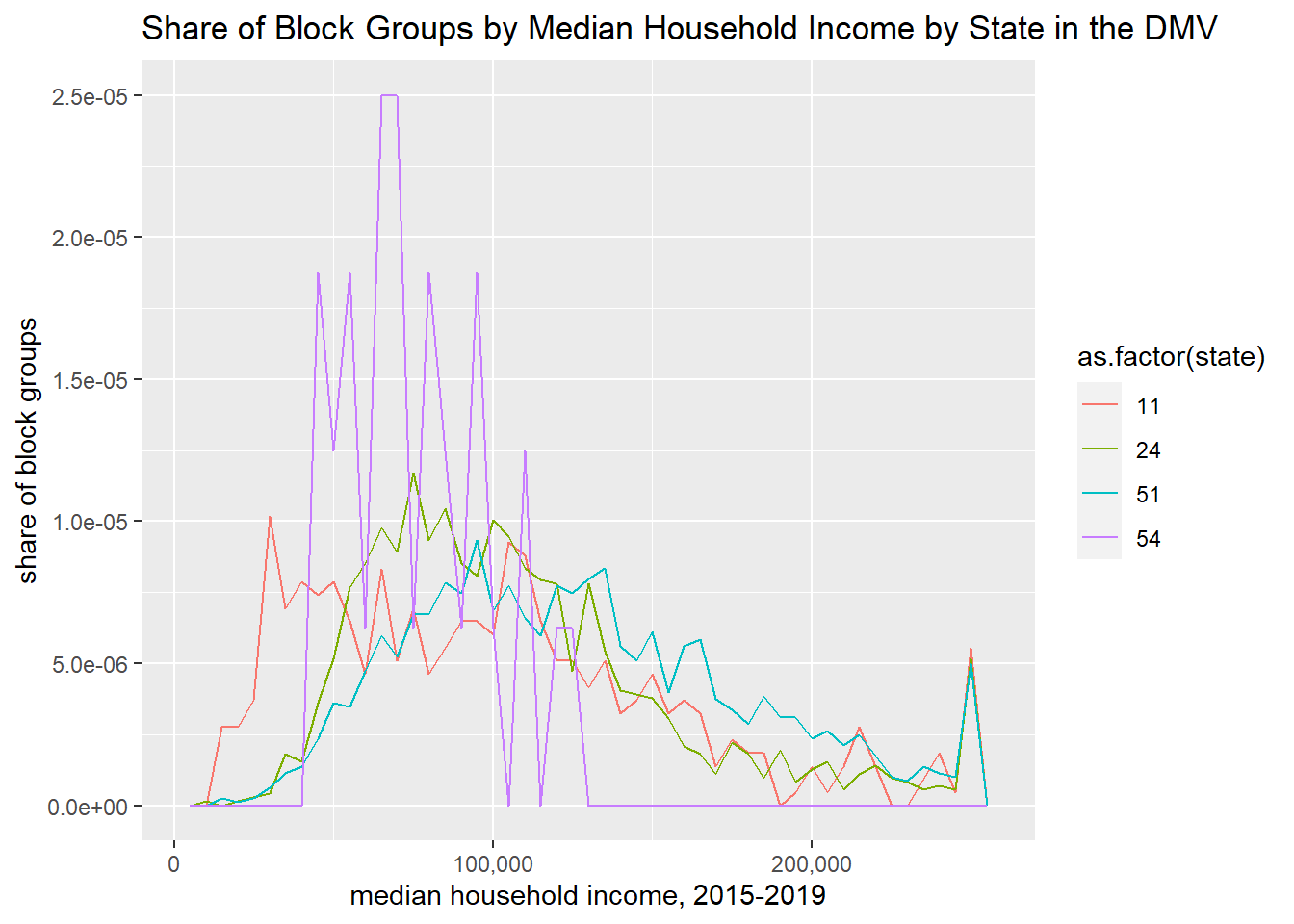
One might prefer to show the share of block groups, rather than the number when making this cross-state comparison. To do so, tell R that the y variable is ..density..
h1 <-ggplot() +geom_freqpoly(data = block.groups, mapping =aes(x = B19013_001E, y = ..density.., color =as.factor(state)), binwidth=5000) +labs(title ="Share of Block Groups by Median Household Income by State in the DMV",x="median household income, 2015-2019",y="share of block groups") +scale_x_continuous(labels = comma)h1
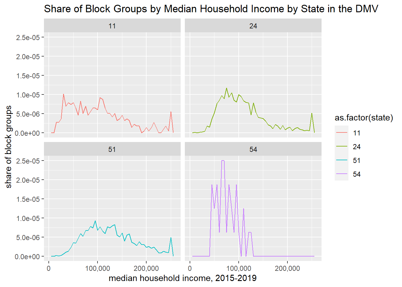
Alternatively, you can show multiple small versions of the same chart using facet_wrap():
h1 <-ggplot() +geom_freqpoly(data = block.groups, mapping =aes(x = B19013_001E, y = ..density.., color =as.factor(state)), binwidth=5000) +facet_wrap(block.groups$state) +labs(title ="Share of Block Groups by Median Household Income by State in the DMV",x="median household income, 2015-2019",y="share of block groups") +scale_x_continuous(labels = comma)h1
There are still plenty of unpleasant things about these graphs. In this list, I would include
probably bad smoothing making the DC line more jerky than the others
density in illegible units
hard to read legend
unhelpful color scheme
potentially useless grey background
poor axis labels
lines too jerky to convey desired idea
state ids should be abbreviations or names
We’ll now fix some of these issues and leave the remainder for future tutorials.
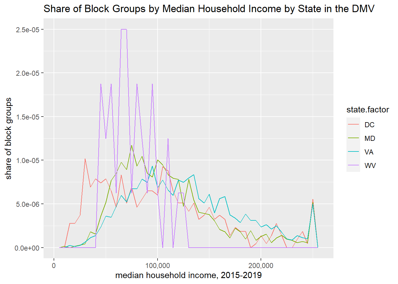
To make the states legible, we need to re-name the factor levels. Below we first make a factor state variable called state.factor using the as.factor() command. We then look at the levels of this factor, which are the fips state codes.
# fix state factor to have namesblock.groups$state.factor <-as.factor(block.groups$state)levels(block.groups$state.factor)
[1] "11" "24" "51" "54"
These are great for data processing and merging, but not good for conveying to people not deeply familiar with federal information processing codes. So we tell R to reassign the levels of the factor as below. We then check using levels() that we did what we thought we did – which is have abbreviations instead of numbers.
Now that we’ve fixed this, we re-do the chart with the new state.factor variable.
# with state as a named factorh1 <-ggplot() +geom_freqpoly(data = block.groups, mapping =aes(x = B19013_001E, y = ..density.., color = state.factor), binwidth=5000) +labs(title ="Share of Block Groups by Median Household Income by State in the DMV",x="median household income, 2015-2019",y="share of block groups") +scale_x_continuous(labels = comma)h1
Finally, you will sometimes need to save your graph, not just see it in the plot window. You can use the export button in the plot window.. but then you realize you’ve made a mistake in your graph and you export .. and you find another mistake…
Instead, write some code that automatically savs the graph each time you create it. We work through an example below using the function ggsave(). There are many many more options in the ggsave command that then ones we use here. See the full documentation as needed.
Below, inside ggsave() we tell R where to save the final product (filename =) and name the full path with the extension for the file type I want to use (“jpeg”). R supports a variety of file types if you prefer another one.
We tell R which plot to save using plot =. In the example below, this is plot f2 that we created above. We also need to tell R what kind of file we want using the driver= command. Also tell R how big you want the final product to be with width= and height= and the units that you’re using (“in”, “cm”, “mm”).
The final component below is the number of dots per inch, or dpi. Using 300 dpi is sufficient for digital display.
When we change from a histogram that reports the number of years by number of hurricanes to share of years by number of hurricanes, the numbering on the y axis changes, but the height of the bars is constant. Why?
Why does the income histogram look so odd when bins are very narrow? Explain in your own words.
We created the histogram with income distribution for all four states. In one of those we have the number of block groups on the vertical axis; in the other the share. Explain (a) what the share is of (number of block groups from what total number) and (b) why the share makes a more reasonable comparison than the levels.
Create a sequence of odd numbers from 1 to 11, inclusive. (Not a graph, just a list of numbers.) Report the code and output.
Choose a new variable in the block group dataframe with which to make a histogram from the block group data (not income!). Here I define histogram broadly, as any of the types of charts we’ve explored in this tutorial. Your chart should show the four states in the DC area, grouped or faceted as you please. (However, West Virginia has very few observations and can sometimes complicate things; you can drop it if you prefer.)
Make two histograms from a dataset (one dataset is sufficient) that we have not used in this class. A good place to start if you have no favorite data is Open Data DC here.