Today we get to graphs! We begin with an overall introduction to the graphing package we’ll use in R and then turn to bar graphs and lollipop graphs using a small dataset.
Bar graphs are intended for comparison of absolute numbers or shares across groups.
Along the way we introduce some elements of graph legibility such as titles and axis scaling. We also cover some new commands to deal with issues in the data.
We then use a much larger dataset to practice creating summary statistics from large data and create stacked and grouped bars with these data.
A. Load Packages and Small Data
A.1. ggplot2 package
If you installed the tidyverse package, you should already have the ggplot2 package (which I may sometimes refer to as the ggplot package, as that is what the command is called).
Let’s load the tidyverse package, and then for thoroughness we can check whether ggplot is also loaded.
Recall, library loads all the tidyverse packages. To access commands from these packages, you must put the library command in your R script.
You can check to see if you have the ggplot2 package installed by typing
tester <-require(ggplot2)tester
[1] TRUE
The require() function tells R to install the package. It returns TRUE if it can load the package and FALSE if otherwise. Here the value is TRUE, so we are good to go.
If, for some reason, you do not have ggplot installed, you must first do that by typing in the console, not in your program
install.packages("ggplot2", dependencies =TRUE)
Recall that install.packages is a command you need only do once – and not once per class or R use, but once. You should not have it in your R script. We’ve also used the dependencies = TRUE option, telling R that if this package depends on other packages, and you don’t have those packages, R should install them.
As you did last week, create an R script for this class. Write all your commands in the R script (recall, a file with R commands ending in .R). You can run all of the program at once (code -> run region \(\rightarrow\) run all), or just selected lines.
A.2. Download small data
Now please download the small dataset for today. We’re using population by contintent, which I took from Wikipedia (this is fine for a class example; policy briefs need data with citations from the source), and I’ve set up the data as a csv for you to use here.
Recall that we read .csv files using read.csv(), and we do this again here:
# load small datacont <-read.csv("H:/pppa_data_viz/2020/tutorial_data/tutorial03/2020-01-26_population_by_continent.csv")
It is always a good idea to look at your data after you’ve loaded it and get a quick sense of whether it looks reasonable. By “reasonable,” I mean things such as “do the values of data in the column make sense with the headers?”, or “are values that should be numeric actually numeric?”
Because this is a small dataset, you can print out the entire thing and see it in the console by typing the name of the data:
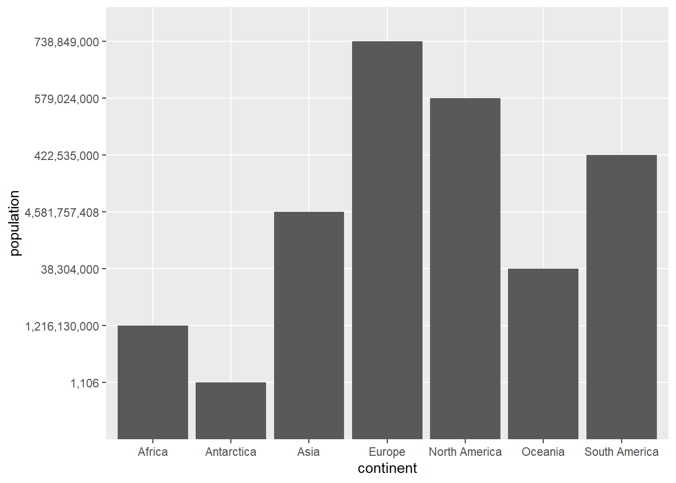
# load small datacont
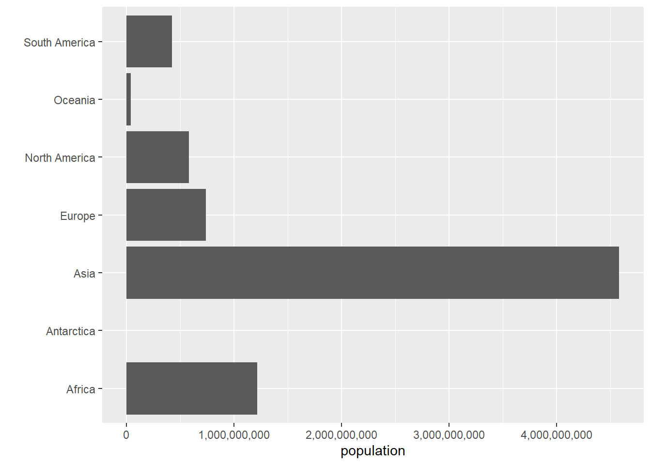
      continent    population
1          Asia 4,581,757,408
2        Africa 1,216,130,000
3        Europe   738,849,000
4 North America   579,024,000
5 South America   422,535,000
6       Oceania    38,304,000
7    Antarctica         1,106
Does anything look fishy? We will discover a few problems below.
B. First Bar Graphs
B.1. Introduction to ggplot
We’re now finally ready to make our first graph. The basic ggplot() syntax is as below
# load small datagraph.object <-ggplot() +geom_TYPEOFGEOMETRY(data = dataframename,mapping =aes(x = xvariable, y = yvariable))
The first line tells R that you want to make a ggplot object called graph.object. You can put data and variables in this first ggplot call. I usually do not. I’ll introduce without this, and then move to other formulations that are equivalent.
The second line – note that these lines are joined together with a + to indicate that this is one command – tells R what kind of graph you’d like to make. We’ll spend most of today’s class on bar graphs, which you can make with geom_bar or geom_col.
Inside the geom_TYPEOFGEOMETRY command, you tell R what data you’re using (data = dataframename) and how R should map the variables to the graph (mapping = aes(x = .., y = ...)).
To see the graph you’ve just created, type the graph name and it will pop up in the graph window. Next class we’ll learn how to program the graph to save in a particular location.
(Note: To simplify this introduction, I have omitted the fact that you can put many of the elements, including the data and mapping, from the geom portion of the command into the ggplot() portion of the command. Everything that is in the ggplot() portion of the command applies across all geom commands. One of the powerful things about making graphics in ggplot is that you can use multiple geom commands in the same graph. )
B.2. Create a graph
Given all that, let’s make a graph of population by continent. I follow the logic above and use geom_col() as below. The ggplot package also has a geom called geom_bar(). You use this when you want R to automatically calculate means (or some other statistic) from your data to chart. I avoid this, as I prefer to make my statistic directly (so I’m sure what’s going on) and then plot the statistic, which is what geom_col() does.
To use geom_col() to create a new graph, I plug in as needed into the ggplot command. We tell R we want to use the continents cont dataframe by the command data = cont. We tell R we want to continent names on the x axis and population on the y axis with mapping = aes(x = continent, y = population).1 Therefore, we write
# bars of levelscont.pop <-ggplot() +geom_col(data = cont, mapping =aes(x = continent, y = population))cont.pop
The first command here creates the graph. Writing the name of the graph causes the graph to display.
Look carefully at the resulting graph. It is strange. Can you figure out why?
The continent of Europe has the tallest bar, suggesting the largest population – which isn’t true. Looking more carefully, Asia has 4.5 billion people, and its bar is not the tallest. In addition, the numbers on the y axis don’t go from small to large.
The problem is due to R interpreting the numbers not as numbers but as categorical variables. Why is this? Look at the structure of the dataframe to figure it out, using the str() function we learned before:
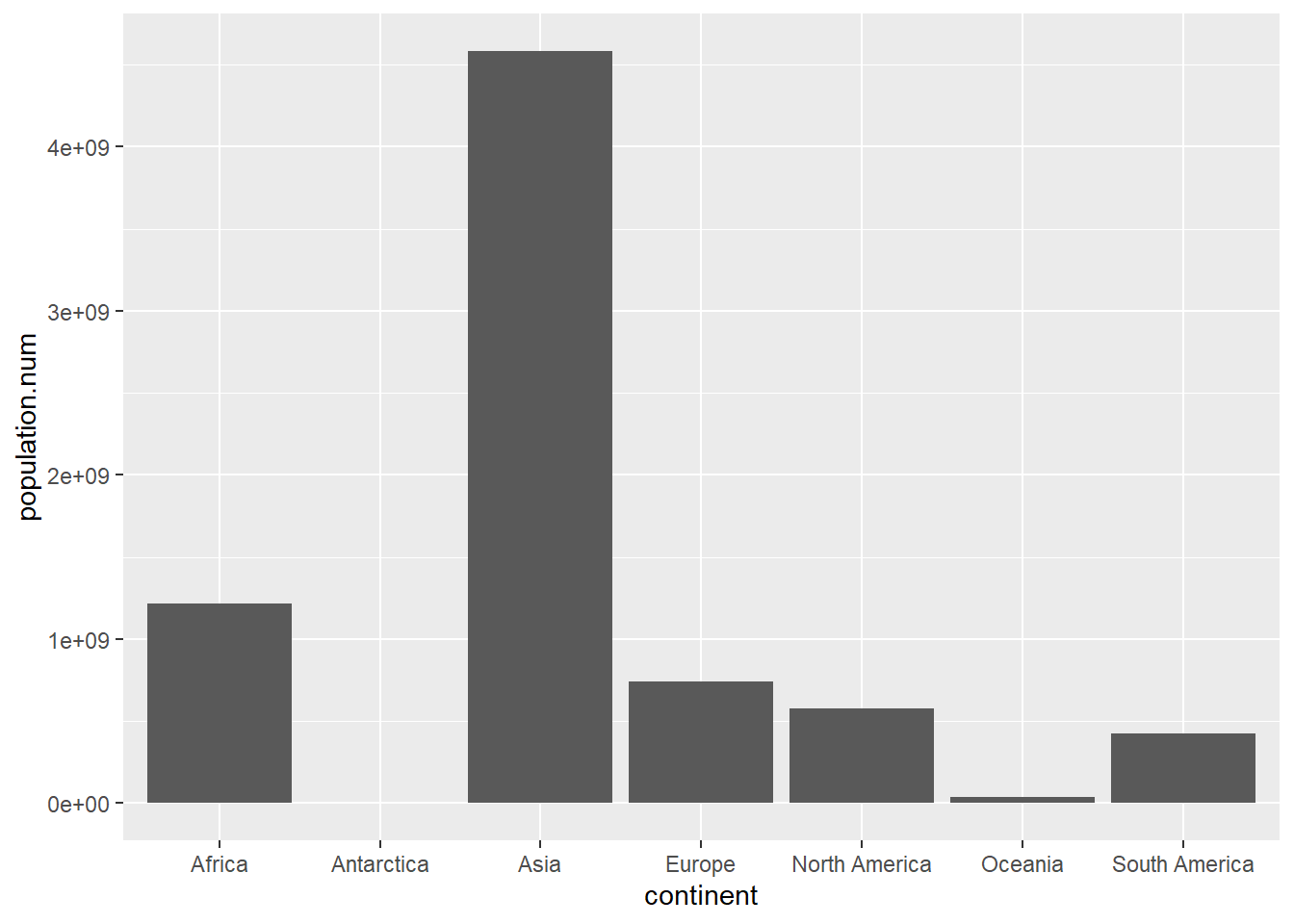
From this command, we learn that the variable we thought was a number – population – is actually a character. This is obviously not helpful for making this graph. So we need to make the character variable a number. There are two steps to doing this. First, we need to get rid of the commas, and then we need to make the character variable a number. (I state this as if it is obvious, but when I wrote the tutorial this took me about a half hour to figure out.)
To get rid of the commas, we use the gsub() command. In this command you tell R “whenever you find PATTERN, replace with REPLACEMENT.” In short, we look for commas and delete them, which is equivalent to replacing them with nothing. But this isn’t enough – this still leaves us with a character variable. So we then use the as.numeric() function which takes a character variable and transforms it into a numeric one. Putting these two together, we create a new variable population.num below, and then check the new dataframe with the str() command.
# make population numericcont$population.num <-as.numeric(gsub(pattern =",", replacement ="", cont$population))str(cont)
You should have a new numeric variable called population.num. It is unfortunately expressed in scientific notation; we will deal with this issue later. Now try the graph again with this variable, rather than population.
# with fixed populaton datacont.pop <-ggplot() +geom_col(data = cont,mapping =aes(x = continent, y = population.num))cont.pop
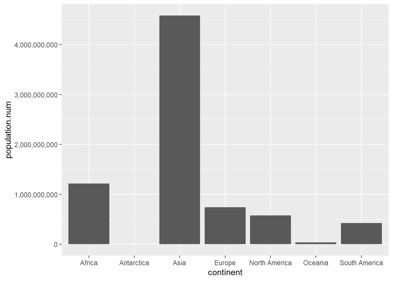
This looks reasonable – perhaps not beautiful, but certainly reasonable. Let’s next make the y-axis legible so that this graph is at least clear. To replace the scientific notation (the stuff with “e05”) with regular numbers, install the scales package. Recall that this means type install.packages("scales", dependencies = TRUE) one time in the console and then use the library() command in your script.
Now load the library
library(scales)
Attaching package: 'scales'
The following object is masked from 'package:purrr':

    discard
The following object is masked from 'package:readr':

    col_factor
The scales library allows you to easily change the type of number displayed on the axis with the comma option below. The comma option is embedded in the scale_y_continuous() option to which we will return in later tutorials. In short, this command gives you many many options to change the axis, when the axis is defined by a continuous variable.
## lets make y axis legiblecont.pop <-ggplot() +geom_col(data = cont,mapping =aes(x = continent, y = population.num)) +scale_y_continuous(labels = comma)cont.pop
This is now at least correct and legible. In the next section we build on these basics.
C. Building on geom_col() basics
This section presents variations on what we just covered, including equivalent commands, and then discusses fixing axis labels, flipping axes, and the lollipop parallel of a bar chart.
C.1. Equivalent commands
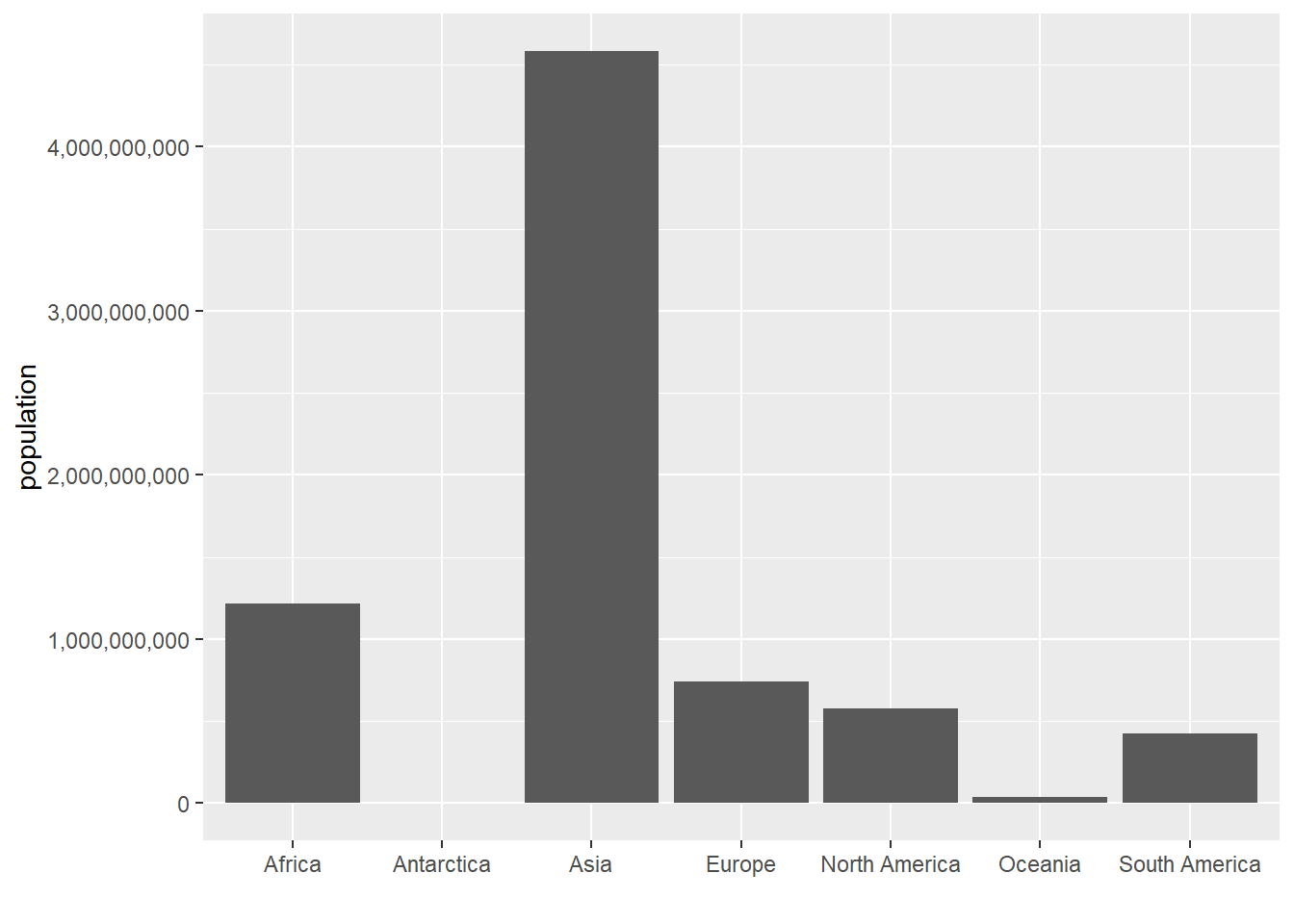
To show you the logic of ggplot(), below I present two additional commands that reach the same output, but are slightly different.
In the first, you see how you can put the data and mapping commands into the ggplot call, rather than in the geom_col() portion. This is helpful if you’re making a bunch of displays on the same graph that all rely on the same data and the same mapping.
# also is okcont.pop <-ggplot(data = cont, mapping =aes(x = continent, y = population.num)) +geom_col() +scale_y_continuous(labels = comma)cont.pop
Alternatively, you can use geom_bar() and tell ggplot that you are using data where you’ve already calculated the relevant numbers with the option stat = "identity" inside the geom_bar() portion of the function. I do not recommend this method; the previous method is clearer and shorter.
# and geom_bar with an additioncont.pop <-ggplot() +geom_bar(data = cont, mapping =aes(x = continent, y = population.num),stat ="identity") +scale_y_continuous(labels = comma)cont.pop
When should you use which command? It is generally good practice to use the simplest coding that gets to the desired end result – that’s why I generally prefer geom_col() to geom_bar() with an option. If you’re putting many versions of the same data on one chart, it is probably a good idea to put the data in the ggplot() command – that way you need change it once if you do need to change it, rather than in each geom_() command. If you’re not making multiple layers, it may be clearer to put the data directly into the geom_() portion.
C.2. Making Decent Axis Legends
Our graph is not yet totally functional, since it doesn’t have legible axis labels. To change axis labels, we use the ggplot option labs(x = "text of x label", y = "text of y label"). In the example below, I get rid of the x axis label – presuming it’s obvious that these are continents – and label population on the y axis.
Note that we now need to tell R that the labels we want to fix are on the x axis, rather than the y one. We also change the axis labeling.
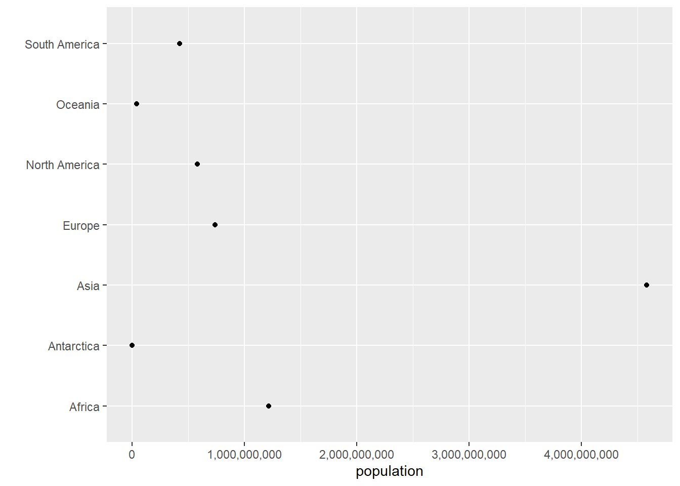
C.5. Lollipops
Sometimes a lollipop graph is easier to read than a bar graph. Here we build to the creation of a lollipop graph. We start by removing geom_col() and adding geom_point(), but with the same data and variable mapping. Basically, we’re telling R to draw a different geometric figure based on the same underlying data.
# just the dotcont.pop <-ggplot() +geom_point(data = cont, mapping =aes(x = population.num, y = continent)) +scale_x_continuous(labels = comma) +labs(x ="population",y ="") cont.pop
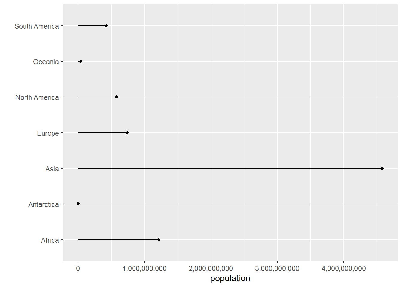
Though this format is sometimes useful, these points often seem like they are floating in space. To show that they are connected to the axis, we add an additional geometry – geom_segment() – for which you tell R the starting and ending points. Here we don’t want any variation in the x direction, so the x starting (x) and stopping (xend) points are the same. We want the y value – population to start at zero (y = 0) and end at the value of population (yend = population.num) as indicated below.
Recall that because this graph is “flipped,” the “x” variables appear on the y axis and vice versa. That’s why x = xend, but y = 0 and yend = population.num.
There are many ways to modify this chart, but this is as far as we’ll go today.
D. Bring in and prepare bigger data
So far, it was very easy to see how things worked with our seven-observation dataset. Now we want to be sure you can do these same commands with a much larger dataset.
D.1. Download crash data
Download a dataset of all vehicle crashes in Montgomery County, MD (just outside DC) from here. These data come from this website. Use this second link for data documentation. Make sure you use the first link to download data for this tutorial; that way what you produce should match what is here.
As before, use read.csv() to load these data. The path you put below should be the location where you saved the data.
Your number of observations (59,777; see first row of output above) should match mine.
This dataset has a lot of variables. For this tutorial, we’ll focus on variation by day of the week. To find the number of incidents by day of the week, we’d like to use group_by() and summarize() by day of the week. Unfortunately, there is no “day of the week” variable. However, there is a “date” variable. R has commands to get from a date to a day of the week.
Let’s start by looking at a few rows of the dataframe to see what the date variable looks like. These are commands we learned in the first tutorial:
# look at a few examplescrash[1:10,c("Crash.Date.Time")]
So we can see that the format of this variable is MM/DD/YYYY. That is, a two digit month, followed by a two digit day, followed by a four-digit year. Sadly, this is not one of R’s two default formats (one is YYYY/MM/DD). To get anything else to work we need to fix our data to make it in R’s format.
We start to do this by using R’s substr() function. Intuitively, you use the substring function to grab bits from a character variable. This function takes three key parts: the variable you want to grab things from, the position in the character string where you want to start taking from, and ending position where you want to stop collection.
From Crash.Date.Time, we create three new variables – month, day and year – as below. They are all character variables. We then use paste0() to stick them together with “/” separators. The paste0 command “pastes” together strings. These strings can be variables, so that you can, for all observations, paste together variables. The final command below prints a few observations so we can see if things look ok.
# find the parts of the datecrash$month <-substr(x = crash$Crash.Date.Time,start =1, stop =2)crash$day <-substr(x = crash$Crash.Date.Time,start =4, stop =5)crash$year <-substr(x = crash$Crash.Date.Time,start =7, stop =10)crash$date <-paste0(crash$year,"/",crash$month,"/",crash$day)crash[1:10,c("Crash.Date.Time","month","day","year","date")]
          Crash.Date.Time month day year       date
1  09/27/2019 09:38:00 AM    09  27 2019 2019/09/27
2  09/30/2019 10:15:00 AM    09  30 2019 2019/09/30
3  09/30/2019 07:00:00 PM    09  30 2019 2019/09/30
4  09/26/2019 07:20:00 AM    09  26 2019 2019/09/26
5  09/22/2019 03:15:00 PM    09  22 2019 2019/09/22
6  09/30/2019 03:01:00 PM    09  30 2019 2019/09/30
7  09/28/2019 11:10:00 AM    09  28 2019 2019/09/28
8  09/27/2019 07:30:00 PM    09  27 2019 2019/09/27
9  09/25/2019 08:17:00 AM    09  25 2019 2019/09/25
10 09/24/2019 07:55:00 AM    09  24 2019 2019/09/24
The final command here prints out a few rows of the dataframe so we can check our work. We can see that the variable date is the stuck together parts of month, day and year with slashes in between.
Now that we have the date in a R-approved format, we can create a R date (a special type of variable that we will discuss more in a later tutorial) and extract the day of the week (you can only do this from a date variable). We use as.Date() to tell R that a variable is a date and to create a new date-format variable (crash$date2). We then use the weekdays() function to get the day of the week from this new variable. Finally, check your work using table(). Does this new thing you created look like days of the week?
# make the new thing a datecrash$date2 <-as.Date(x = crash$date, optional =TRUE)# find the day of the weekcrash$day.of.week <-weekdays(x = crash$date2)# checktable(crash$day.of.week)
Now that we’ve created a “day of the week” variable, we can use this to find the number of accidents by day of the week. We load the dplyr package with the library command, and then use by group_by() and summarize() to find the number of crashes by day of the week. Note that we use the function n(), which counts the number of observations.
# make things by day of the weeklibrary(dplyr)crash <-group_by(.data = crash, day.of.week)crash.weekday <-summarize(.data = crash, num.crashes =n())crash.weekday
Make sure you understand what just happened. We took our dataset of almost 60,000 observations and created a 7-observation dataset (this is the type of aggregation I require for your policy brief).
E. Plot the aggregate data
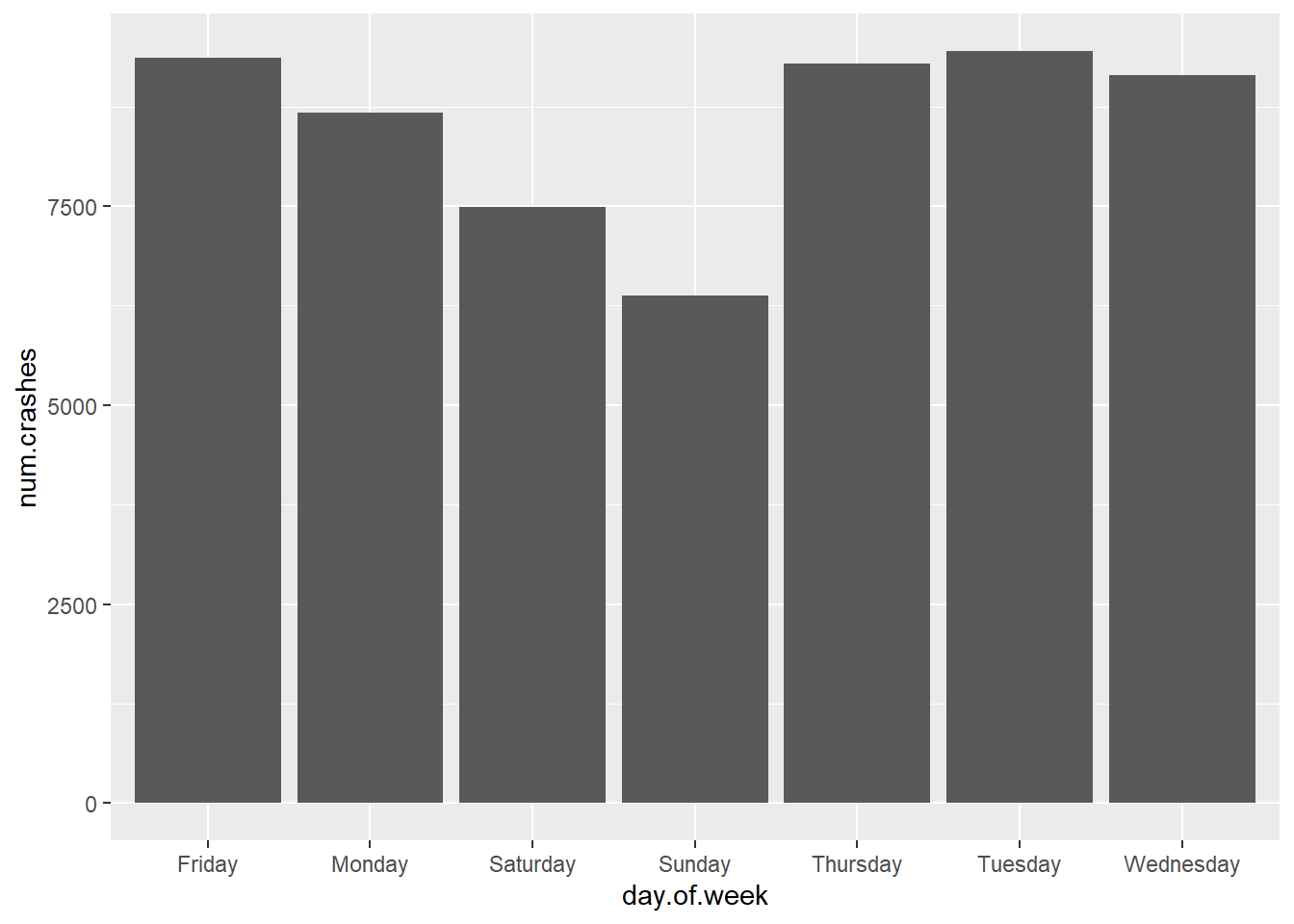
Let’s start by plotting the number of crashes by day. We use the new dataframe we just created (crash.weekday).
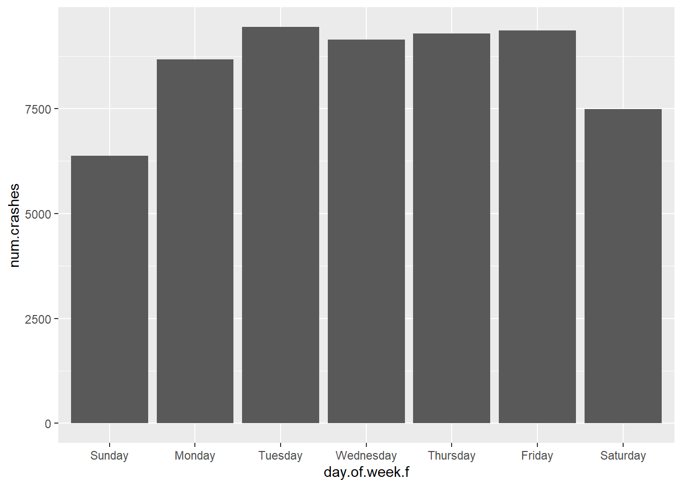
One particularly annoying feature of this graph is that the days of the week are not in day-of-the-week order. If you look at the data (str(crash.weekday)), you will see that the day.of.week variable is a factor. To get a factor to order differently in a graph, you need to “reorder” it. We do this below by specifically telling R using the factor() function that we want to reorder the variable crash.weekday$day.of.week, and that the order of the levels of the factor should follow the list in c(). Note that we are creating a new variable called day.of.week.f.
# re-order days of the weekcrash.weekday$day.of.week.f <-factor(x = crash.weekday$day.of.week,levels =c("Sunday","Monday","Tuesday","Wednesday","Thursday","Friday","Saturday"))
Now re-draw the graph and see if it looks better.
# try again with graphcdow <-ggplot() +geom_col(data = crash.weekday,mapping =aes(x = day.of.week.f, y = num.crashes))cdow
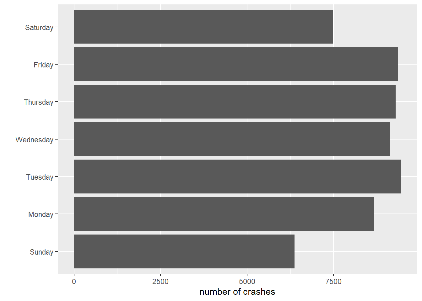
Now that this looks a bit more sensible, we use the labs() and coord_flip() commands from above to improve the look of the graph.
# fix a few more things upcdow <-ggplot() +geom_col(data = crash.weekday,mapping =aes(x = day.of.week.f, y = num.crashes)) +labs(x ="",y ="number of crashes") +coord_flip()cdow
This now leads to the days of the week starting at the bottom (Sunday) and going upward. You can fix this by creating another new factor and re-ordering.
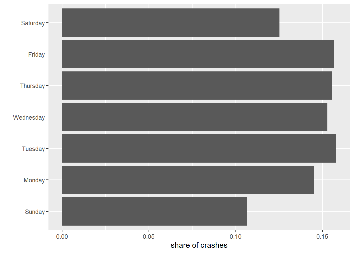
Sometimes we want to convey information about the absolute level, as above. Sometimes we are more interested in the share by category. We can show the share first by calculating it and then using geom_col().
We begin by calculating the share of crashes on each weekday. To find the share of crashes on each weekday, we are missing the total number of crashes on all days.
We can create a variable that has the total number of crashes on all days with a tidyverse command called mutate. This command is particularly useful if you want to create a new variable in a dataframe as a function of existing variables. Note that you can use but don’t need mutate() to add df1$a + df1$b (df$c <- df1$a + df1$b). However, you do need mutate() to create a column that reports the total across all rows. Once we have this total in hand, we then divide the number of crashes in a given day by the total number of crashes on all days of the week.
The syntax for mutate() is similar to that of summarize(). You need to specificy the input dataframe, the output dataframe and the variables you’d like to create.
# calculate shares by day of weeknewdf <-mutate(.data = INPUT DATAFRAME`, new.variable = function(VARIABLES IN DATAFRAME), another.new.variable = function(VARIABLES IN DATAFRAME))
Adapting this to our problem, we create a total.crashes variable that is the sum of weekday crashes for all days. We then create a daily share by dividing the daily value of crashes (num.crashes) by the total number of crashes for all days.
# calculate shares by day of weekcrash.weekday <-mutate(.data = crash.weekday,total.crashes =sum(num.crashes))crash.weekday$daily.share <- crash.weekday$num.crashes / crash.weekday$total.crashescrash.weekday
Do your shares look like they add up to 1? If no, something very bad has happened!
Now repeat the geom_col() commands to plot the shares you just created.
# plot sharescdow <-ggplot() +geom_col(data = crash.weekday,mapping =aes(x = daily.share, y = day.of.week.f)) +labs(x ="share of crashes",y ="") cdow
F. Stacked and grouped bars
In this final section, we make stacked and grouped bars. These bars make comparisons across two or more categories, as opposed to the bars above which compare across one category (day of the week).
F.1. Create data for stacked or grouped bars
To make stacked or grouped bars, you need a dataset in which each row has information on only one type of category pair. As we’ll discuss later in greater detail, this is a long dataset. If you have a wide dataset – one observation for one category, and a variable for each of the remaining category values – you need to modify the dataset.
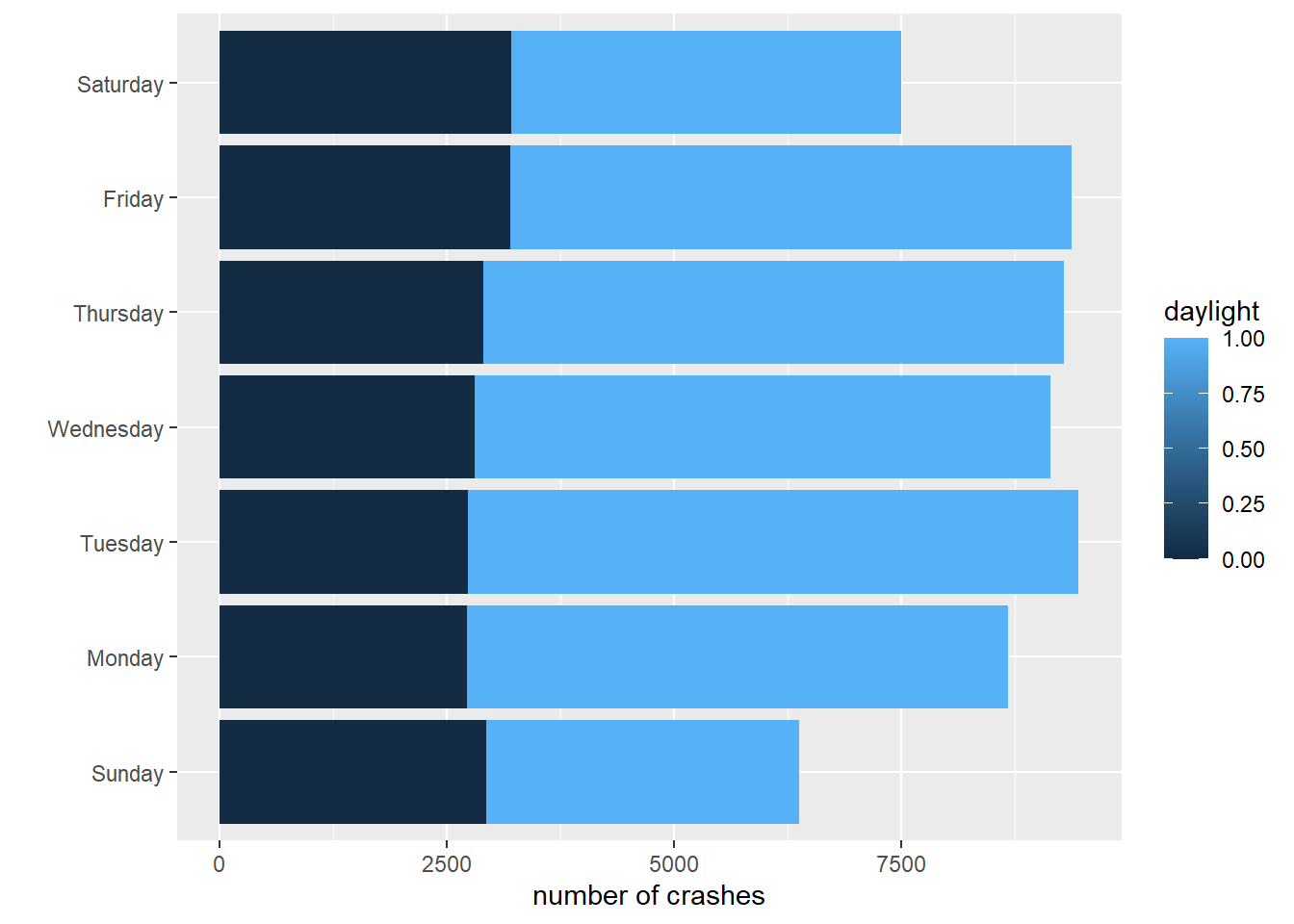
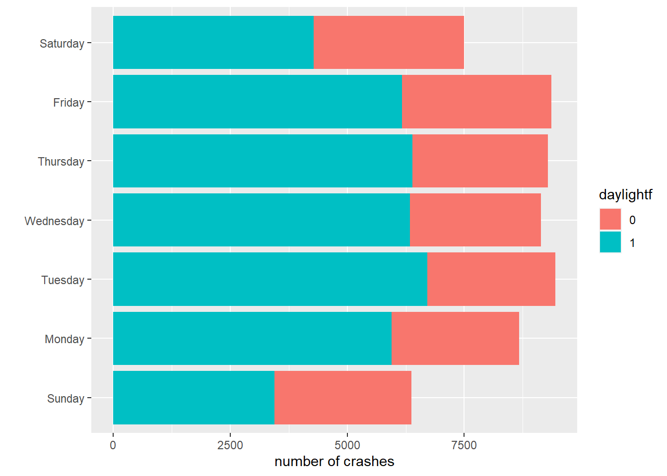
We’ll start by adding an extra category to our day of the week analysis, adding in the categorical variable daylight that we created from the variable Light. First we use ifelse() to set daylight equal to 1 if Light is equal to “DAYLIGHT” and zero otherwise (see Tutorial 2 for ifelse()). We then group the data both by day.of.week and by the just-created daylight. Finally, we count the number of crashes (observations) that occur in each of the 14 categories. As usual, we look at the dataframe to see if things look sensible.
# we need some additional -by- infotable(crash$Light)
DARK -- UNKNOWN LIGHTING           DARK LIGHTS ON           DARK NO LIGHTS
                     660                    13971                     2158
                    DAWN                 DAYLIGHT                     DUSK
                    1239                    39305                     1393
                     N/A                    OTHER                  UNKNOWN
                     497                      143                      411
The dataframe has 14 observations (7 days of the week * 2 types of daylight).
To make the graphs look better, we’ll once again re-order the day.of.week factor variable.
# re-order days of the weekcrash.weekday.light$day.of.week.f <-factor(x = crash.weekday.light$day.of.week,levels =c("Sunday","Monday","Tuesday","Wednesday","Thursday","Friday","Saturday"))
F.2 Stacked bars
With these data in hand, we can now make stacked bars, where each bar differentiates between the number of accidents in day and nighttime. The key difference in making this graph is that we add an option to the aesthetics portion of the command: fill = daylight. This tells R to fill in the bar by coloring by daylight.
# stack those barscdow <-ggplot() +geom_col(data = crash.weekday.light,mapping =aes(x = num.crashes, y = day.of.week.f, fill = daylight)) +labs(x ="number of crashes",y ="") cdow
This works for the bars, but the legend is wacky – daylight can only be 0 or 1, so a graduated scale is not correct. To tell R that daylight is a categorical variable, we create a new variable called daylightf and tell R to make it a factor using as.factor().
# but daylight is an either or -- not continuouscrash.weekday.light$daylightf <-as.factor(crash.weekday.light$daylight)
Re-do the previous graph, but with the factor version of the daylight variable:
# stack those barscdow <-ggplot() +geom_col(data = crash.weekday.light,mapping =aes(x = num.crashes, y = day.of.week.f, fill = daylightf)) +labs(x ="number of crashes",y ="") cdow
This may not be a beautiful graph, but at least it is now an accurate one.
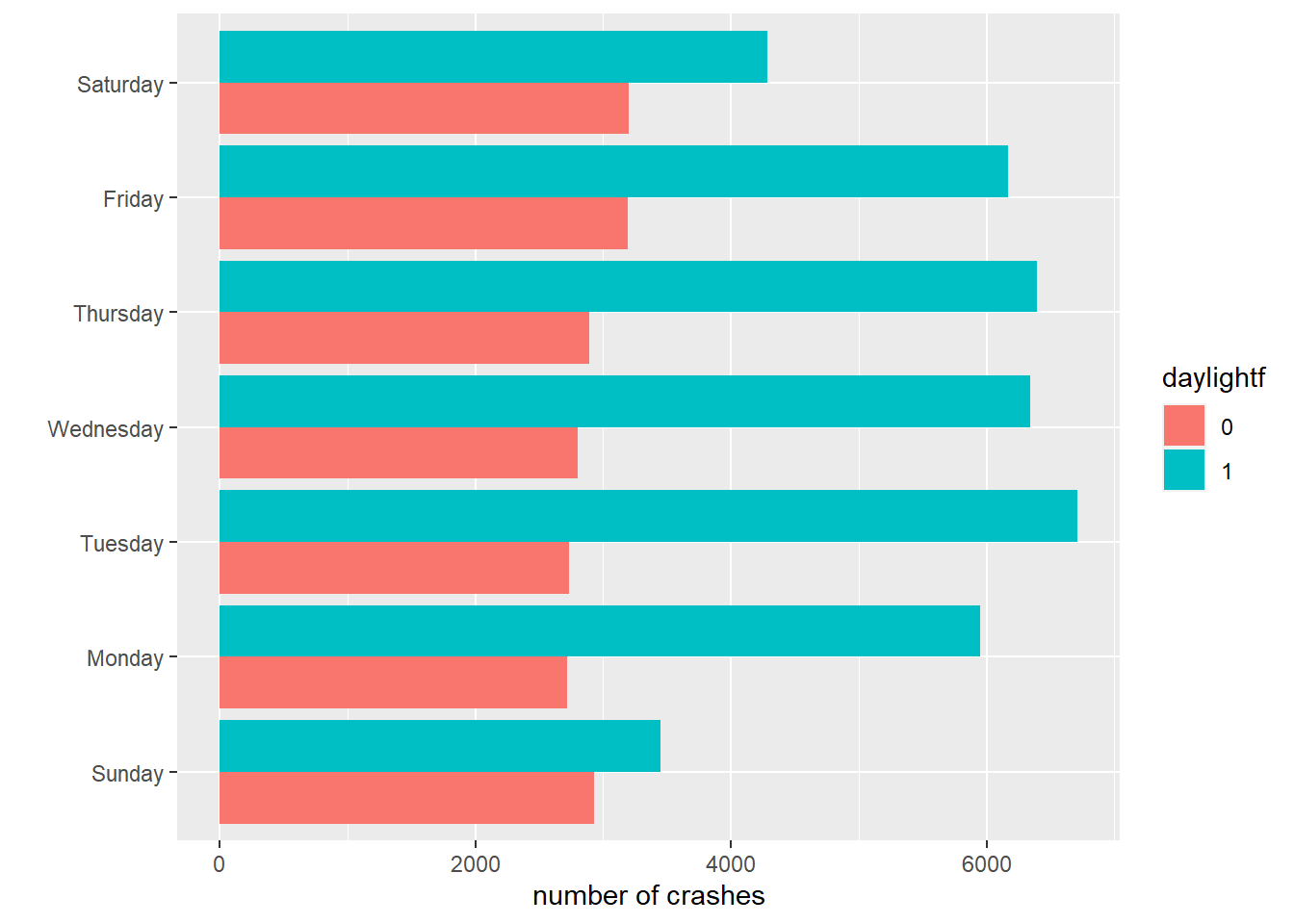
F.3. Grouped bars
As we discussed in class, stacked bars are infrequently useful for conveying comparisons. Grouped bars are frequently more useful. To make grouped bars, rather than stacked ones, we again use the fill= option, but also add position = position_dodge(), which tells R to put the bars next to each other.
Note that the position option is outside the mapping = aes() part of the geom_col command. This is because it does not define a fundamental definition of the graph.
cdow <-ggplot() +geom_col(data = crash.weekday.light,mapping =aes(x = num.crashes, y = day.of.week.f, fill = daylightf), position =position_dodge()) +labs(x ="number of crashes",y ="") cdow
The problem set asks which comparison is made more clear in the grouped vs stacked bars.
G. Problem Set 3
Why do the bar graphs for levels and shares of crashes by day of the week look so similar?
Which graph makes a more clear comparison: grouped bars (section F.3.) or stacked bars (section F.2.)? Why?
Find a (small is quite fine) dataset and make a simple bar or lollipop chart as we did in section C. All text should legible and axes should be labeled.
Use either the crashes data or another dataset to create a set of grouped or stacked bars. If using the crashes data, use two new categories (so, do not make graphs by either day of the week or daylight). Label axes.
To be more parsimonious, you can actually write aes(continent, population). While this saves space, it is less clear to read. Particularly when you are getting started, I’d recommend that you use the wordier formation so you can keep track of what is doing what in your code.↩︎