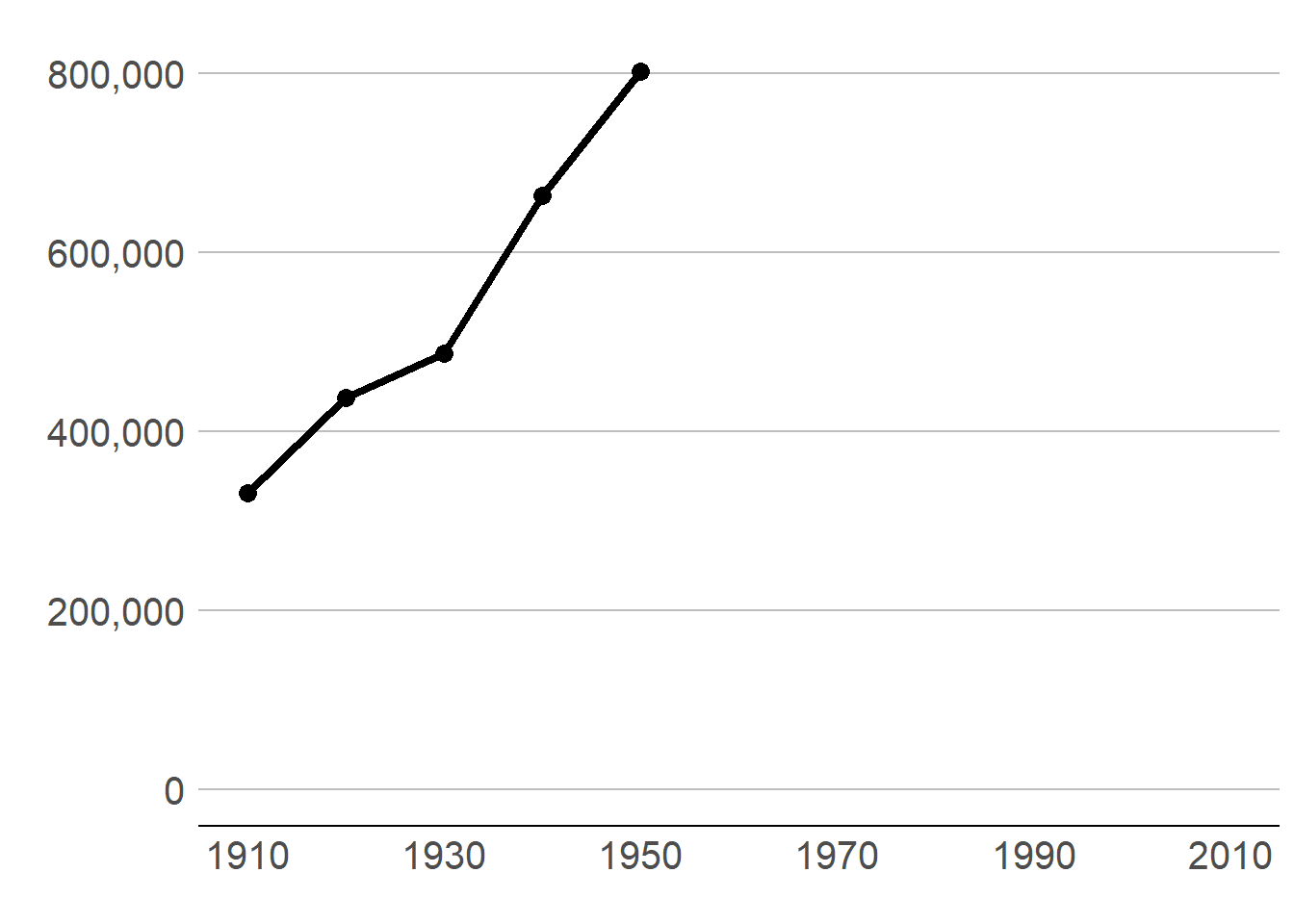
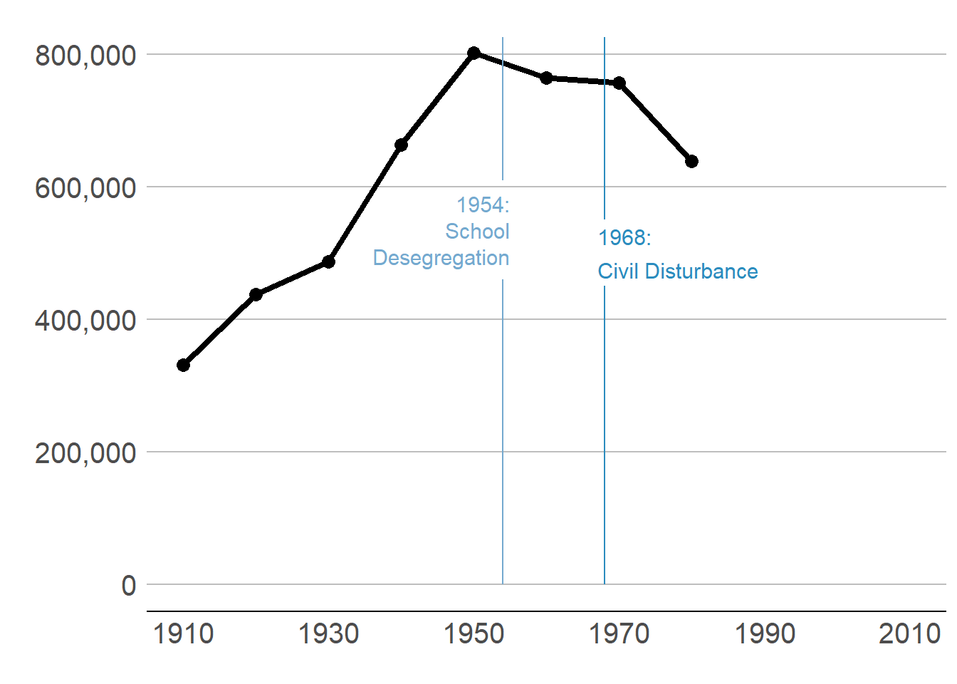
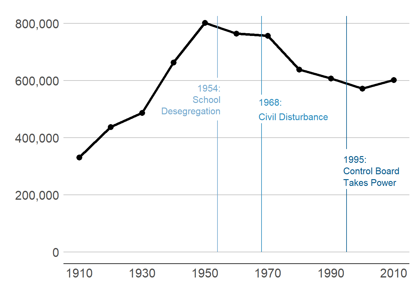
In my example of DC population over time in section B.1., I present the graph of three steps. Modify your code to make these same three steps.
Answer:
To break the graph into three parts, you need to make sure that you keep the x axis the same for each step so the graph looks like you are just adding a few years.
Linking to GEOS 3.9.1, GDAL 3.3.2, PROJ 7.2.1; sf_use_s2() is TRUE
library(scales)
Attaching package: 'scales'

The following object is masked from 'package:purrr':

    discard

The following object is masked from 'package:readr':

    col_factor
Now just limit the data to DC. You could do this in the ggplot call itself. However, in this case when we are only planning to use DC, this gives us a smaller dataset to work with and that speeds processing. This will also make the coding easier, since we won’t have to subset in each graph.
Take a look at the data after we subset to DC. Does it have the right number of observations?
# load datacounties <-read.csv("h:/pppa_data_viz/2019/tutorial_data/lecture08/counties_1910to2010_20180116.csv")# get just dcdct <- counties[which(counties$statefips ==11),]dim(dct)
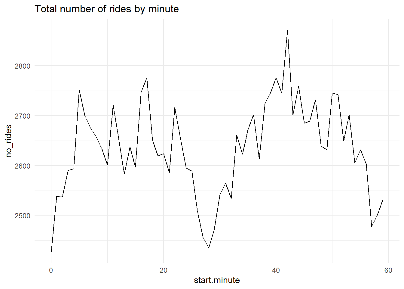
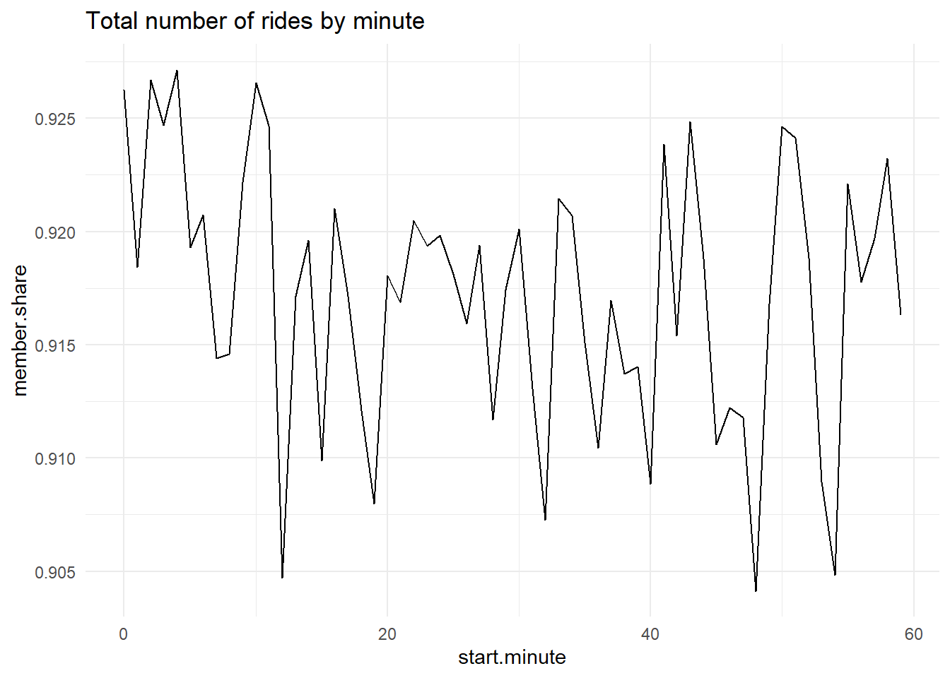
Re-do one of the by-hour pictures as a minute-by-minute picture showing total ridership
Use one of the y variables we used or an alternative one. Add some annotations to your graph to point out salient features.
Answer:
# load data cabi.201901<-read.csv("H:/pppa_data_viz/2019/tutorial_data/lecture08/201902-capitalbikeshare-tripdata/201902-capitalbikeshare-tripdata.csv")# check out variableshead(cabi.201901)
  Duration          Start.date            End.date Start.station.number
1      206 2019-02-01 00:00:20 2019-02-01 00:03:47                31509
2      297 2019-02-01 00:04:40 2019-02-01 00:09:38                31203
3      165 2019-02-01 00:06:34 2019-02-01 00:09:20                31303
4      176 2019-02-01 00:06:49 2019-02-01 00:09:45                31400
5      105 2019-02-01 00:10:41 2019-02-01 00:12:27                31270
6      757 2019-02-01 00:12:37 2019-02-01 00:25:14                31503
                                 Start.station End.station.number
1                     New Jersey Ave & R St NW              31636
2                   14th & Rhode Island Ave NW              31519
3 Tenleytown / Wisconsin Ave & Albemarle St NW              31308
4               Georgia & New Hampshire Ave NW              31401
5                                8th & D St NW              31256
6                        Florida Ave & R St NW              31126
                         End.station Bike.number Member.type
1 New Jersey Ave & N St NW/Dunbar HS      W21713      Member
2                      1st & O St NW      E00013      Member
3                39th & Veazey St NW      W21703      Member
4             14th St & Spring Rd NW      W21699      Member
5                     10th & E St NW      W21710      Member
6                11th & Girard St NW      W22157      Member
# preapre time variablescabi.201901$time.start <-as.POSIXct(strptime(x = cabi.201901$Start.date, format ="%Y-%m-%d %H:%M:%S"))cabi.201901$time.stop <-as.POSIXct(strptime(x = cabi.201901$End.date, format ="%Y-%m-%d %H:%M:%S"))# my duration calculationcabi.201901$my.duration <- cabi.201901$time.stop - cabi.201901$time.startcabi.201901$Duration.minutes <- cabi.201901$Duration /60summary(cabi.201901$Duration.minutes)
    Min.  1st Qu.   Median     Mean  3rd Qu.     Max.
   1.000    5.817    9.617   14.931   15.950 1435.000
# get the minute out of the date variablecabi.201901$start.minute <-as.numeric(format(cabi.201901$time.start, "%M"))summary(cabi.201901$start.minute)
   Min. 1st Qu.  Median    Mean 3rd Qu.    Max.
   0.00   15.00   30.00   29.59   45.00   59.00
# make an indicator for a member cabi.201901$member <-ifelse(cabi.201901$Member.type =="Member", 1, 0)# summarize to minute datacabi.201901<-group_by(cabi.201901, start.minute)cabisum <-summarize(.data = cabi.201901, no_rides =n(), mean_dur =mean(Duration),member_rides =sum(member))dim(cabisum)
[1] 60 4
# find member share of ridescabisum$member.share <- cabisum$member_rides / cabisum$no_rides# number of rides by minutec3 <-ggplot() +geom_line(data = cabisum, mapping =aes(x = start.minute, y = no_rides)) +labs(title ="Total number of rides by minute") +theme_minimal()c3
# member share of rides by minutec4 <-ggplot() +geom_line(data = cabisum, mapping =aes(x = start.minute, y = member.share)) +labs(title ="Total number of rides by minute") +theme_minimal()c4
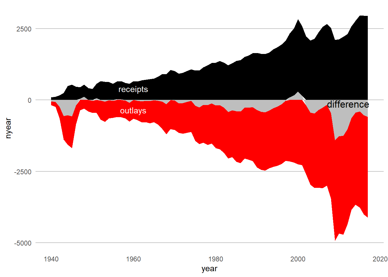
More stacked areas
Now you try to load your own budget data!
Use Table 1.3 (his01z3.xls), from which we want the year and columns E, F, G and columns I, J and K. Create a new excel document with just this information, and make one row at top with names that you’ll understand. Keep just through 2017, and make sure that you don’t have any junk at the bottom of the table. Save this file as csv (file, save as, choose “csv” option for file type).
Load it into R and make a stacked area graph of receipts, outlays and deficits over time.
Having done this myself, here are a few suggestions
make long data, as we did above
make year numeric, as we did for the social insurance revenue above
get rid of commas in the data. My command to do this, for one variable, is
# clean up variables for reshapehist01z3$nyear <-as.numeric(levels(hist01z3$year))[hist01z3$year]summary(hist01z3$nyear)
   Min. 1st Qu.  Median    Mean 3rd Qu.    Max.    NA's
     NA      NA      NA     NaN      NA      NA      79
# rename and make numeric for reshape# warning: you also need to get rid of commas in the numbers# see http://rfunction.com/archives/2354hist01z3$b1 <-as.numeric(gsub(",", "", hist01z3$cd.receipts, fixed =TRUE))hist01z3$b2 <-as.numeric(gsub(",", "", hist01z3$cd.outlays, fixed =TRUE))hist01z3$b3 <-as.numeric(gsub(",", "", hist01z3$cd.surplus, fixed =TRUE))# make a negative outlays for a more interesting charthist01z3$b4 <- hist01z3$b2 *-1# just keep the variabls we make longhist2 <- hist01z3[,c("year","b1","b2","b3","b4")]# reshape to longb.long <-pivot_longer(data = hist2, cols =c("b1", "b2","b3","b4"),names_to ="btype",values_to ="nyear")b.long[1:15,]
# give names for types# make a type of receipts variableb.long$bname <-ifelse(b.long$btype =="b1","receipts",ifelse(b.long$btype =="b2", "outlays",ifelse(b.long$btype =="b3", "surplus",ifelse(b.long$btype =="b4","outlays",""))))# make name factor for ease of useb.long$bname.fac <-as.factor(b.long$bname)# check outputsub.long <- b.long[which(b.long$btype %in%c("year","nyear","b1","b4","b3","bname.fac")),]table(sub.long$bname)
 outlays receipts  surplus
      79       79       79
# make year numericsub.long$year <-as.numeric(sub.long$year)
Warning: NAs introduced by coercion
### up and down chart of receipts/surplus/deficits ####### stacked chart of total receipts by type ##### without factor() this doesnt workhw5q2 <-ggplot() +geom_area(data = sub.long, mapping =aes(x=year, y=nyear, group = bname.fac, fill=bname.fac)) +scale_fill_manual(values =c("red", "black","grey")) +theme(panel.grid.major =element_blank(), panel.grid.minor =element_blank(),panel.background =element_blank(), panel.grid.major.y =element_line(color="gray"),axis.ticks.x =element_blank(), axis.ticks.y =element_blank(),legend.position ="none") +annotate("text", x=1960, y=400, label="receipts", color ="white") +annotate("text", x=1960, y=-350, label="outlays", color ="white") +annotate("text", x=2012.2, y=-130, label="difference", color ="black", size =4.5)hw5q2