Why do the bar graphs for levels and shares of crashes by day of the week look so similar?
Answer:
Suppose we add up the total number of crashes, which would be the total height of all the bars in the first graph. The height of each individual bar is the number of observations in a given group.
In the second graph, the height of each bar is the number of observations divided by the total number of observations.
Therefore, each bar in the first graph is a re-scaled version of the same bar in the second graph: \(\text{bar 1} = \alpha \text{bar 2}\), where \(\alpha\) is an integer.
Which graph makes a more clear comparison: grouped bars (section F.3.) or stacked bars (section F.2.)? Why?
Answer:
The better comparison here is the grouped bars. The stacked bars make it difficult to compare the second category across the different days of the week. In contrast, in the grouped bars, you can easily compare both day and night across all days of teh week.
Find a (small is quite fine) dataset and make a simple bar or lollipop chart as we did in section C. All text should legible and axes should be labeled.
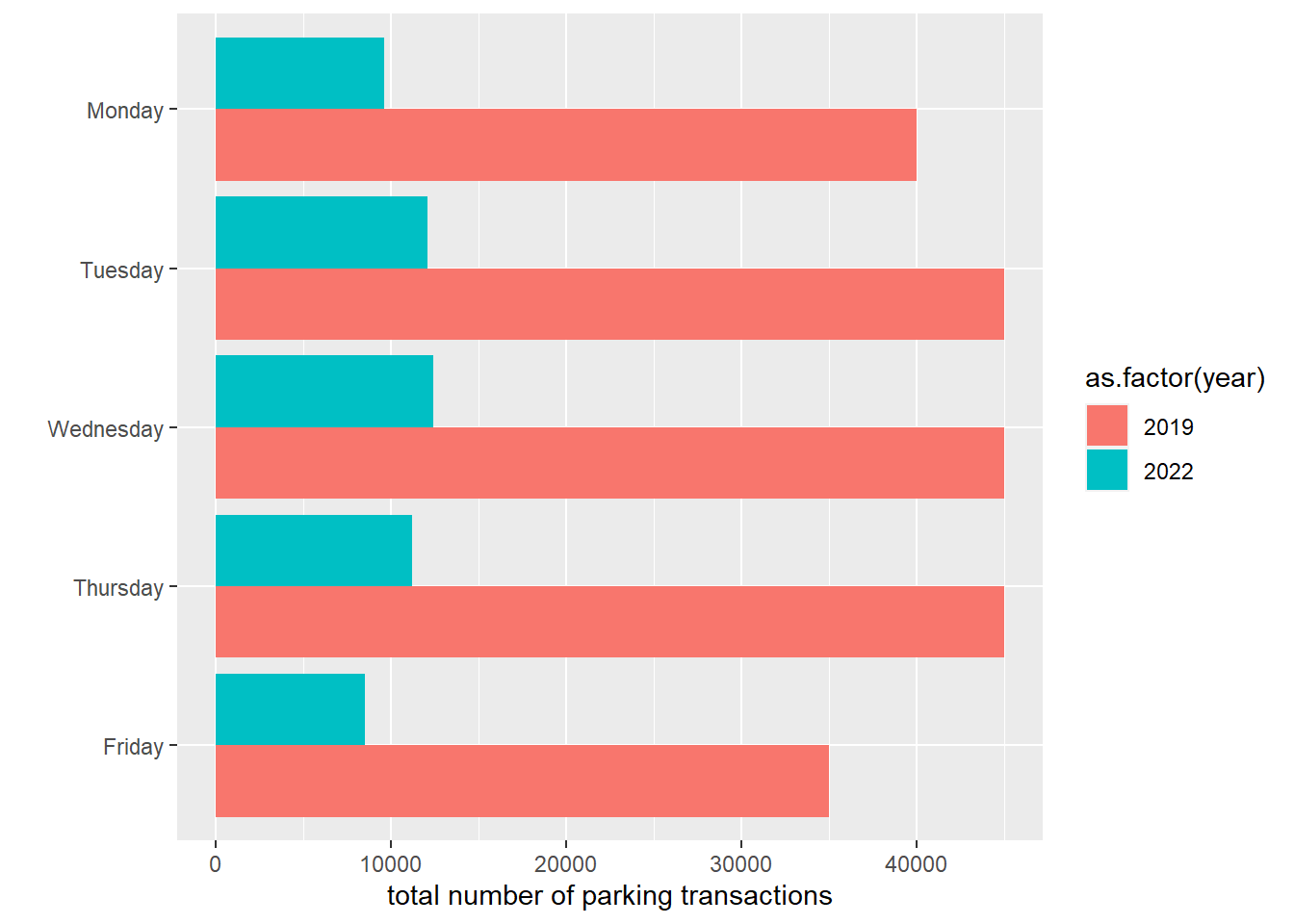
Here is a graph about parking transactions in the WMATA system by day, in 2019 and 2022.
# i found some data on parking transactions by day of the week from wmata# see site here# https://www.wmata.com/initiatives/ridership-portal/Parking-Data-Portal.cfm# create dataframe# i am reading these from the website, and they are rounded# could not figure out how to downloaddf <-data.frame(day.of.week =rep(c("Monday","Tuesday","Wednesday","Thursday","Friday"),2),year =c(rep(2019,5),rep(2022,5)),parks =c(40000, 45000, 45000, 45000, 35000,9600, 12100, 12400, 11200, 8500))# re-level the days of the weekdf$day.of.week.fac <-factor(df$day.of.week,levels =c("Friday","Thursday","Wednesday","Tuesday","Monday"))# now make a grouped bar chartgph <-ggplot() +geom_col(data = df,mapping =aes(x = parks, y = day.of.week.fac, group =as.factor(year), fill =as.factor(year)),position =position_dodge()) +labs(x ="total number of parking transactions",y ="")gph
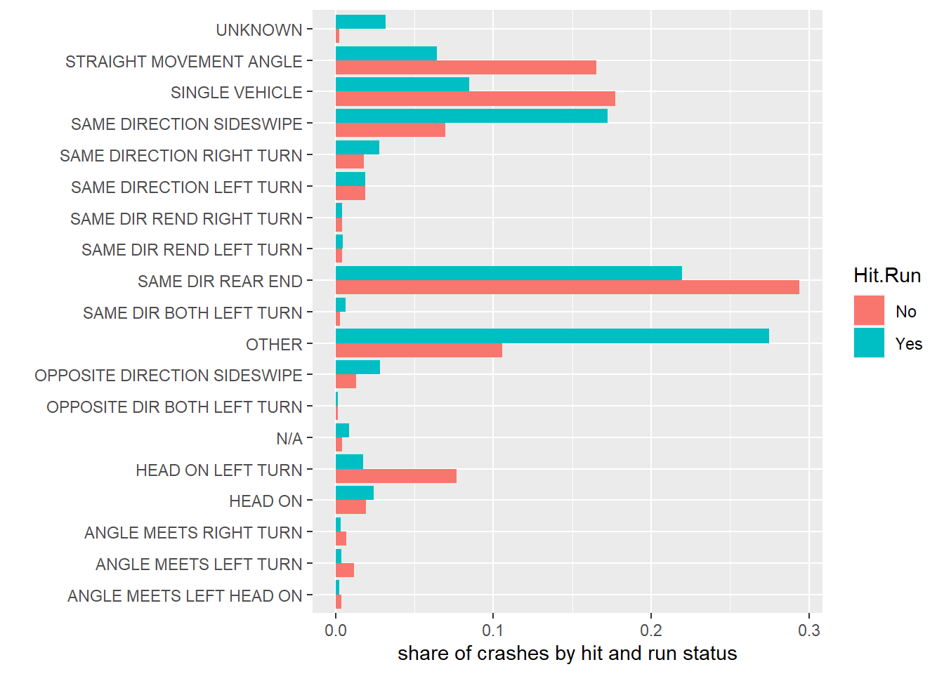
Use either the crashes data or another dataset to create a set of grouped or stacked bars. If using the crashes data, use two new categories (so, do not make graphs by either day of the week or daylight). Label axes.
Answer:
# load the crash datacrash <-read.csv("H:/pppa_data_viz/2020/tutorial_data/tutorial03/2020-01-26_crash_reporting_incidents.csv")# find the share of accidents by collision type, for each type of hit and run# look at both variablestable(crash$Collision.Type)
    ANGLE MEETS LEFT HEAD ON        ANGLE MEETS LEFT TURN
                         215                          620
      ANGLE MEETS RIGHT TURN                      HEAD ON
                         367                         1209
           HEAD ON LEFT TURN                          N/A
                        3985                          302
 OPPOSITE DIR BOTH LEFT TURN OPPOSITE DIRECTION SIDESWIPE
                          96                          944
                       OTHER      SAME DIR BOTH LEFT TURN
                        8040                          213
           SAME DIR REAR END      SAME DIR REND LEFT TURN
                       16814                          264
    SAME DIR REND RIGHT TURN     SAME DIRECTION LEFT TURN
                         259                         1122
   SAME DIRECTION RIGHT TURN     SAME DIRECTION SIDESWIPE
                        1172                         5195
              SINGLE VEHICLE      STRAIGHT MOVEMENT ANGLE
                        9661                         8852
                     UNKNOWN
                         447
table(crash$Hit.Run)
         No   Yes
    2 49639 10136
# i notice that there are two obs w/o any hit and run info# lets get rid of thesecrash <- crash[which(crash$Hit.Run !=""),]table(crash$Hit.Run)
   No   Yes
49639 10136
# now lets add up all the obs that are in each category of hit and run/collision typecrash2 <-group_by(.data = crash, Hit.Run, Collision.Type)sumup <-summarize(.data = crash2, number.of.crashes =n())
`summarise()` has grouped output by 'Hit.Run'. You can override using the
`.groups` argument.
# add up the total number of crashes by hit/run typesumup <-group_by(.data = sumup, Hit.Run)sumup <-mutate(.data = sumup,tot.hr =sum(number.of.crashes))sumup
# A tibble: 38 × 4
# Groups:   Hit.Run [2]
   Hit.Run Collision.Type               number.of.crashes tot.hr
   <chr>   <chr>                                    <int>  <int>
 1 No      ANGLE MEETS LEFT HEAD ON                   192  49639
 2 No      ANGLE MEETS LEFT TURN                      580  49639
 3 No      ANGLE MEETS RIGHT TURN                     333  49639
 4 No      HEAD ON                                    965  49639
 5 No      HEAD ON LEFT TURN                         3808  49639
 6 No      N/A                                        216  49639
 7 No      OPPOSITE DIR BOTH LEFT TURN                 79  49639
 8 No      OPPOSITE DIRECTION SIDESWIPE               659  49639
 9 No      OTHER                                     5253  49639
10 No      SAME DIR BOTH LEFT TURN                    146  49639
# … with 28 more rows
# find the share of crashes by each typesumup$crash.share <- sumup$number.of.crashes / sumup$tot.hr# now make a graph of this gph2 <-ggplot() +geom_col(data = sumup,mapping =aes(x = crash.share, y = Collision.Type,group = Hit.Run, fill = Hit.Run),position =position_dodge()) +labs(x ="share of crashes by hit and run status",y ="")gph2
If I were making this for a final product, I would combine a lot of categories that have very small shares. Also, a final product would have the legend directly on the graph, and a better overall theme.